如何在 Flexbox 中垂直和水平居中元素
以下是两种通用的定心解决方案。
一个用于垂直对齐的弹性项目 ( flex-direction: column),另一个用于水平对齐的弹性项目 ( flex-direction: row)。
在这两种情况下,居中 div 的高度可以是可变的、未定义的、未知的等等。居中 div 的高度无关紧要。
这是两者的 HTML:
<div id="container"><!-- flex container -->

    <div class="box" id="bluebox"><!-- flex item -->
        <p>DIV #1</p>
    </div>

    <div class="box" id="redbox"><!-- flex item -->
        <p>DIV #2</p>
    </div>

</div>
CSS(不包括装饰样式)
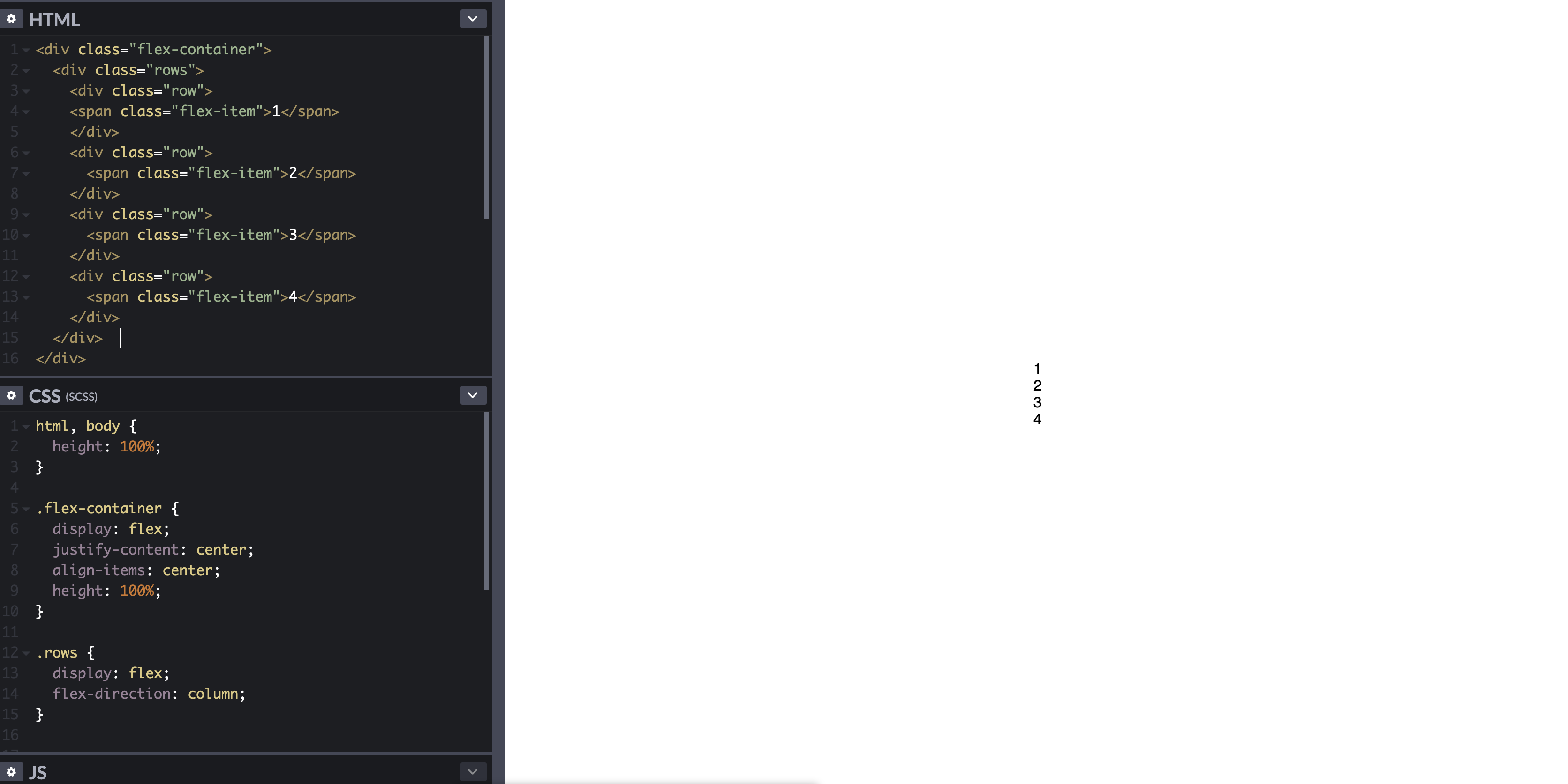
当弹性项目垂直堆叠时:
#container {
display: flex; /* establish flex container */
flex-direction: column; /* make main axis vertical */
justify-content: center; /* center items vertically, in this case */
align-items: center; /* center items horizontally, in this case */
height: 300px;
}
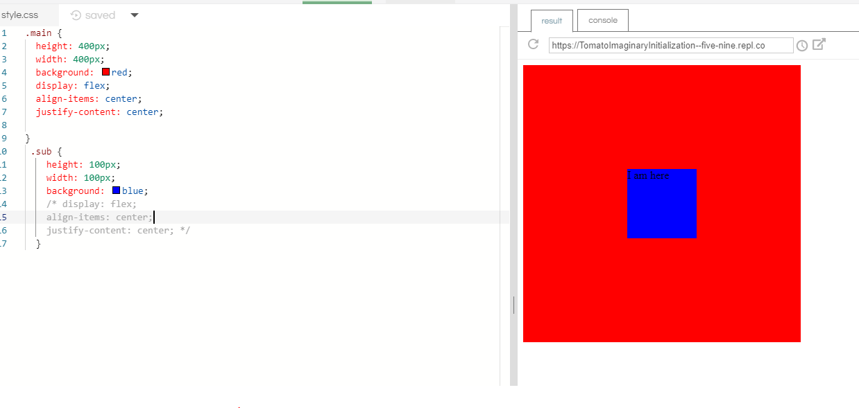
.box {
width: 300px;
margin: 5px;
text-align: center; /* will center text in <p>, which is not a flex item */
}

演示
当弹性项目水平堆叠时:
从上面的代码调整flex-direction规则。
#container {
    display: flex;
    flex-direction: row;     /* make main axis horizontal (default setting) */
    justify-content: center; /* center items horizontally, in this case */
    align-items: center;     /* center items vertically, in this case */
    height: 300px;
}

演示
将弹性项目的内容居中
flex 格式化上下文的范围仅限于父子关系。超出子元素的 flex 容器的后代不参与 flex 布局,并且将忽略 flex 属性。本质上,flex 属性不能在子级之外继承。
因此,您将始终需要将display: flex或display: inline-flex应用于父元素,以便将 flex 属性应用于子元素。
为了使弹性项目中包含的文本或其他内容垂直和/或水平居中,使项目成为(嵌套的)弹性容器,并重复居中规则。
.box {
    display: flex;
    justify-content: center;
    align-items: center;        /* for single line flex container */
    align-content: center;      /* for multi-line flex container */
}
更多细节在这里:如何在弹性框中垂直对齐文本?
或者,您可以应用margin: auto到弹性项目的内容元素。
p { margin: auto; }
在此处了解弹性auto边距:对齐弹性项目的方法(参见框#56)。
将多行弹性项目居中
当 flex 容器有多行时(由于环绕),该align-content属性将是横轴对齐所必需的。
从规范:
8.4. Packing Flex Lines:align-content
属性
当横轴上有额外空间时,该align-content属性在 flex 容器内对齐 flex 容器的线条,类似于在justify-content主轴内对齐单个项目的方式。
请注意,此属性对单行 flex 容器没有影响。
更多细节在这里:flex-wrap 如何与 align-self、align-items 和 align-content 一起工作?
浏览器支持
除了 IE < 10 之外,所有主流浏览器都支持 Flexbox 。一些最新的浏览器版本,例如 Safari 8 和 IE10,需要供应商前缀。要快速添加前缀,请使用Autoprefixer。此答案中的更多详细信息。
旧浏览器的居中解决方案
有关使用 CSS 表和定位属性的替代居中解决方案,请参阅此答案:https ://stackoverflow.com/a/31977476/3597276