31

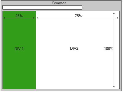
I have two DIVs inside a container div, where I need to set them both to fit to the browser window like below, but it doesn't fit in my code, please suggest me a solution

enter image description here

My Style Sheet code

 html, body {
                width: 100%;
                height: 100%;
                margin: 0;
                padding: 0;

            }

.container {
    height: auto;
    width: 100%;
}
.div1 {
    float: left;
    height: 100%;

    width: 25%;
}
.div2 {
    float: left;
    height: 100%;
    width: 75%;
}

Body

<body>
<div class="container">
  <div class="div1"></div>
  <div class="div2"></div>
</div>

4

6 回答 6

61

如果您不关心老式 IE,您也可以使用视口百分比。

height: 100vh;

于 2014-06-26T04:40:44.917 回答
39

为空 div 设置窗口全高

第一个绝对定位解决方案 - FIDDLE

.div1 {
  position: absolute;
  top: 0;
  bottom: 0;
  width: 25%;
}
.div2 {
  position: absolute;
  top: 0;
  left: 25%;
  bottom: 0;
  width: 75%;
}

静态(也可以使用相对)定位和 jQuery 的第二个解决方案 - FIDDLE

.div1 {
  float: left;
  width: 25%;
}
.div2 {
  float: left;
  width: 75%;
}

$(function(){
  $('.div1, .div2').css({ height: $(window).innerHeight() });
  $(window).resize(function(){
    $('.div1, .div2').css({ height: $(window).innerHeight() });
  });
});
于 2013-09-21T15:11:24.583 回答
4

伙计,试试最小高度。

.div1 {
    float: left;
    height: 100%;
    min-height: 100%;
    width: 25%;
}
.div2 {
    float: left;
    height: 100%;
    min-height: 100%;
    width: 75%;
}
于 2013-09-21T15:08:47.837 回答
2

您必须将 html 的高度一起声明为 div1 元素,例如:

html,
body,
.container,
.div1,
.div2 {
    height:100%;
}

演示:http: //jsfiddle.net/Ccham/

于 2013-09-21T15:14:04.900 回答
2

我不认为你需要浮动。

html,
body,
.container {
  width: 100%;
  height: 100%;
}

.div1, .div2 {
  display: inline-block;
  margin: 0;
  min-height: 100%;
}

.div1 {
  width: 25%;
  background-color: green;
}

.div2 {
  width: 75%;
  background-color: blue;
}
<div class="container">
  <div class="div1"></div><!--
  --><div class="div2"></div>
</div>

display: inline-block;用于将块显示为内联(就像跨度但保持块效果)

使用 html 中的注释是因为您有 75% + 25% = 100%。div 之间的空间很重要(所以你有 75% + 1%?+ 25% = 101%,意味着换行)

于 2016-01-19T10:31:24.340 回答
1

我认为最快的方法是使用带有分数的网格系统。所以你的容器有 100vw,它是窗口宽度的 100% 和 100vh,它是窗口高度的 100%。

使用分数或“fr”,您可以选择您喜欢的宽度。分数之和等于 100%,在本例中为 4fr。所以第一部分是 1fr (25%) 而 seconf 是 3fr (75%)

更多关于 fr 单位的信息

.container{
  width: 100vw;
  height:100vh; 
  display: grid;
  grid-template-columns: 1fr 3fr;
}

/*You don't need this*/
.div1{
  background-color: yellow;
}

.div2{
  background-color: red;
}
<div class='container'>
  <div class='div1'>This is div 1</div>
  <div class='div2'>This is div 2</div>
</div>

于 2021-01-26T16:40:44.370 回答