我有一个看起来像橙色方块的 div
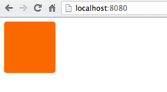
我想以某种方式在这个 div 中绘制一个白色 X,这样它看起来更像

无论如何要在 CSS 中执行此操作,还是在 Photoshop 中绘制它并将图像用作 div 背景会更容易?div 代码看起来像
div {
    height: 100px;
    width: 100px;
    background-color: #FA6900;
    border-radius: 5px;
}
我有一个看起来像橙色方块的 div
我想以某种方式在这个 div 中绘制一个白色 X,这样它看起来更像
无论如何要在 CSS 中执行此操作,还是在 Photoshop 中绘制它并将图像用作 div 背景会更容易?div 代码看起来像
div {
height: 100px;
width: 100px;
background-color: #FA6900;
border-radius: 5px;
}
您想要一个称为十字标记的实体:
http://www.fileformat.info/info/unicode/char/274c/index.htm
它的代码是❌,它显示为❌
如果你想要一个完美居中的十字标记,像这样:
尝试以下 CSS:
div {
    height: 100px;
    width: 100px;
    background-color: #FA6900;
    border-radius: 5px;
    position: relative;
}

div:after {
    position: absolute;
    top: 0;
    bottom: 0;
    left: 0;
    right: 0;
    content: "\274c"; /* use the hex value here... */
    font-size: 50px;
    color: #FFF;
    line-height: 100px;
    text-align: center;
}
十字标记实体不会在 Safari 或 Chrome 中显示。但是,相同的实体在 Firefox、IE 和 Opera 中显示良好。
使用较小但形状相似的乘号实体是安全的,×它显示为 ×。
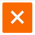
单元素解决方案: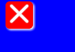
body{
    background:blue;
}

div{
    width:40px;
    height:40px;
    background-color:red;
    position:relative;
    border-radius:6px;
    box-shadow:2px 2px 4px 0 white;
}

div:before,div:after{
    content:'';
    position:absolute;
    width:36px;
    height:4px;
    background-color:white;
    border-radius:2px;
    top:16px;
    box-shadow:0 0 2px 0 #ccc;
}

div:before{
    -webkit-transform:rotate(45deg);
    -moz-transform:rotate(45deg);
    transform:rotate(45deg);
    left:2px;
}
div:after{
    -webkit-transform:rotate(-45deg);
    -moz-transform:rotate(-45deg);
    transform:rotate(-45deg);
    right:2px;
}<div></div>另一个基于@Bansoa 的纯 CSS解决方案(即不使用图像、字符或其他字体)是答案的答案。
我已经对其进行了简化并添加了一些Flexbox魔法以使其响应。
在这个例子中,Cross 自动缩放到任何方形容器,并改变其线条的粗细,只需调整height: 4px;(为了使 cross真正响应,您可能需要设置height百分比或其他相对单位)。
div {
    position: relative;
    height: 150px; /* this can be anything */
    width: 150px;  /* ...but maintain 1:1 aspect ratio */
    display: flex;
    flex-direction: column;
    justify-content: center;
}

div::before,
div::after {
    position: absolute;
    content: '';
    width: 100%;
    height: 4px; /* cross thickness */
    background-color: black;
}

div::before {
    transform: rotate(45deg);
}

div::after {
    transform: rotate(-45deg);
}<div></div>您可以将字母 X 放在 div 内的 HTML 中,然后使用 css 对其进行样式设置。
见 JSFiddle:http: //jsfiddle.net/uSwbN/
HTML:
<div id="orangeBox">
  <span id="x">X</span>
</div>
CSS:
#orangeBox {
  background: #f90;
  color: #fff;
  font-family: 'Helvetica', 'Arial', sans-serif;
  font-size: 2em;
  font-weight: bold;
  text-align: center;
  width: 40px;
  height: 40px;
  border-radius: 5px;
}
又一次尝试……这个使用×。此页面上的许多示例仅对我显示为一个框,但×有效
<div class="close"></div>
.close {
    height: 100px;
    width: 100px;
    background-color: #FA6900;
    border-radius: 5px;
}
.close:after {
    position:relative;
    content:"\d7";
    font-size:177px;
    color:white;
    font-weight:bold;
    top:-53px;
    left:-2px
}
你可以用 CSS 渐变制作一个漂亮的 X:

演示:https ://codepen.io/JasonWoof/pen/rZyRKR
代码:
<span class="close-x"></span>
<style>
    .close-x {
        display: inline-block;
        width: 20px;
        height: 20px;
        border: 7px solid #f56b00;
        background:
            linear-gradient(45deg, rgba(0,0,0,0) 0%,rgba(0,0,0,0) 43%,#fff 45%,#fff 55%,rgba(0,0,0,0) 57%,rgba(0,0,0,0) 100%),
            linear-gradient(135deg, #f56b00 0%,#f56b00 43%,#fff 45%,#fff 55%,#f56b00 57%,#f56b00 100%);
    }
</style>
您可以使用 CSS 属性“内容”:
div {
    height: 100px;
    width: 100px;
    background-color: #FA6900;
    border-radius: 5px;
}

div:after {
    content: "X";
    font-size: 2em;
    color: #FFF;
}
像这样:http: //jsfiddle.net/HKtFV/
#x{
    width: 20px;
    height: 20px;
    background-color:orange;
    position:relative;
    border-radius:2px;
}
#x::after,#x::before{
    position:absolute;
    top:9px;
    left:0px;
    content:'';
    display:block;
    width:20px;
    height:2px;
    background-color:red;

}
#x::after{
    -webkit-transform: rotate(45deg);
    -moz-transform: rotate(45deg);
    -ms-transform: rotate(45deg);
    -o-transform: rotate(45deg);
    transform: rotate(45deg);
}
#x::before{
    -webkit-transform: rotate(-45deg);
    -moz-transform: rotate(-45deg);
    -ms-transform: rotate(-45deg);
    -o-transform: rotate(-45deg);
    transform: rotate(-45deg);
}
<div id=x>
</div>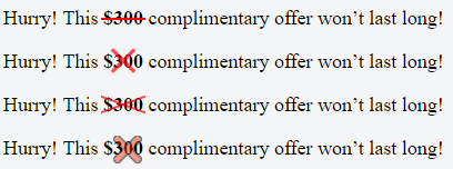
这是 SCSS (可以很容易地转换为 CSS):
$pFontSize: 18px;
p {
  font-size: $pFontSize;
}
span{
  font-weight: bold;
}
.x-overlay,
.x-emoji-overlay {
  position: relative;
}

.x-overlay,
.x-emoji-overlay {
  &:after {
    position: absolute;
    top: 0;
    bottom: 0;
    left: 0;
    right: 0;
    color: red;
    text-align: center;
  }
}

.x-overlay:after {
  content: '\d7';
  font-size: 3 * $pFontSize;
  line-height: $pFontSize;
  opacity: 0.7;
}

.x-emoji-overlay:after {
  content: "\274c";
  padding: 3px;
  font-size: 1.5 * $pFontSize;
  line-height: $pFontSize;
  opacity: 0.5;
}

.strike {
  position: relative;
  display: inline-block;
}

.strike::before {
  content: '';
  border-bottom: 2px solid red;
  width: 110%;
  position: absolute;
  left: -2px;
  top: 46%;
}

.crossed-out {
  /*inspired by https://www.tjvantoll.com/2013/09/12/building-custom-text-strikethroughs-with-css/*/
  position: relative;
  display: inline-block;
  &::before,
  &::after {
    content: '';
    width: 110%;
    position: absolute;
    left: -2px;
    top: 45%;
    opacity: 0.7;
  }
  &::before {
    border-bottom: 2px solid red;
    -webkit-transform: skewY(-20deg);
    transform: skewY(-20deg);
  }
  &::after {
    border-bottom: 2px solid red;
    -webkit-transform: skewY(20deg);
    transform: skewY(20deg);
  }
}
您可以通过设置“x”的样式来做到这一点
text-align: center;
font-size: 120px;
line-height: 100px;
color: white;
font-family: monospace;
这是一个不使用伪元素的单个 div 和动态大小版本。
body {
  display: flex;
  gap: 30px;
}

.x {
  --color: #444;
  --l: 5px; /* line-width */
  width: 50px;
  height: 50px;
  background: linear-gradient(to top right, transparent calc(50% - var(--l) / 2), var(--color) calc(50% - var(--l) / 2) calc(50% + var(--l) / 2), transparent calc(50% + var(--l) / 2)),
              linear-gradient(to bottom right, transparent calc(50% - var(--l) / 2), var(--color) calc(50% - var(--l) / 2) calc(50% + var(--l) / 2), transparent calc(50% + var(--l) / 2));

  --clip-path: polygon(var(--l) 0%, calc(100% - var(--l)) 0%, 100% var(--l), 100% calc(100% - var(--l)), calc(100% - var(--l)) 100%, var(--l) 100%, 0% calc(100% - var(--l)), 0% var(--l));
  -webkit-clip-path: var(--clip-path);
          clip-path: var(--clip-path);
}
<div class="x"></div>
<div class="x" style="--l: 10px;"></div>
<div class="x" style="--l: 15px; --color: red"></div>
<div class="x" style="--l: 15px; --color: dodgerblue; width: 100px; height: 100px;"></div>HTML
<div class="close-orange"></div>
CSS
.close-orange {
  height: 100px;
  width: 100px;
  background-color: #FA6900;
  border-radius: 5px;
}
.close-orange:before,.close-orange:after{
  content:'';
  position:absolute;
  width: 50px;
  height: 4px;
  background-color:white;
  border-radius:2px;
  top: 55px;
}
.close-orange:before{
  -webkit-transform:rotate(45deg);
  -moz-transform:rotate(45deg);
  transform:rotate(45deg);
  left: 32.5px;
}
.close-orange:after{
  -webkit-transform:rotate(-45deg);
  -moz-transform:rotate(-45deg);
  transform:rotate(-45deg);
  left: 32.5px;
}
这是@Gildas.Tambo 在本页其他地方提供的惊人解决方案的一个适应性版本。只需更改顶部变量的值即可更改“X”的大小。
解决方案本身的功劳归功于 Gildas。我所做的只是赋予它适应性数学。
:root {
  /* Width and height of the box containing the "X" */
  --BUTTON_W:             40px;
  /* This is the length of either of the 2 lines which form the "X", as a
  percentage of the width of the button. */
  --CLOSE_X_W:            95%;
  /* Thickness of the lines of the "X" */
  --CLOSE_X_THICKNESS:    4px;
}


body{
    background:blue;
}

div{
    width:           var(--BUTTON_W);
    height:          var(--BUTTON_W);
    background-color:red;
    position:        relative;
    border-radius:   6px;
    box-shadow:      2px 2px 4px 0 white;
}

/* The "X" in the button. "before" and "after" each represent one of the two lines of the "X" */
div:before,div:after{
    content:         '';
    position:        absolute;
    width:           var(--CLOSE_X_W);
    height:          var(--CLOSE_X_THICKNESS);
    background-color:white;
    border-radius:   2px;
    top:             calc(50% - var(--CLOSE_X_THICKNESS) / 2);
    box-shadow:      0 0 2px 0 #ccc;
}
/* One line of the "X" */
div:before{
    -webkit-transform:rotate(45deg);
    -moz-transform:   rotate(45deg);
    transform:        rotate(45deg);
    left:             calc((100% - var(--CLOSE_X_W)) / 2);
}
/* The other line of the "X" */
div:after{
    -webkit-transform:rotate(-45deg);
    -moz-transform:   rotate(-45deg);
    transform:        rotate(-45deg);
    right:            calc((100% - var(--CLOSE_X_W)) / 2);
}<div></div>检查 & 和交叉:
<span class='act-html-check'></span>
<span class='act-html-cross'><span class='act-html-cross'></span></span>

<style type="text/css">
span.act-html-check {
                display: inline-block;
                width: 12px;
                height: 18px;
                border: solid limegreen;
                border-width: 0 5px 5px 0;
                transform: rotate( 45deg);
            }


            span.act-html-cross {
                display: inline-block;
                width: 10px;
                height: 10px;
                border: solid red;
                border-width: 0 5px 5px 0;
                transform: rotate( 45deg);
                position: relative;
            }

            span.act-html-cross > span { {
                transform: rotate( -180deg);
                position: absolute;
                left: 9px;
                top: 9px;
            }
</style>