66

客观的

我想在这个标题元素上叠加一个颜色。我怎样才能用 CSS 做到这一点?
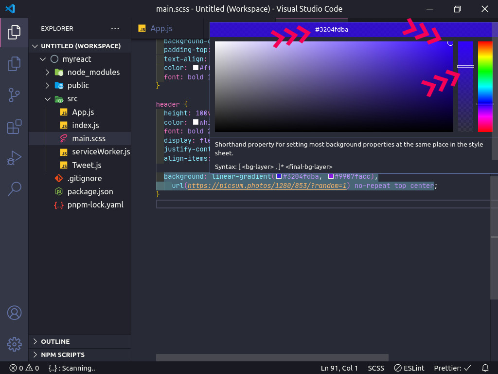
代码

#header {
  /* Original url */
  /*background: url(../img/bg.jpg) 0 0 no-repeat fixed;*/
  background: url(https://fakeimg.pl/250x100/) 0 0 no-repeat fixed;
  height: 100%;
  overflow: hidden;
  color: #FFFFFF
}
<header id="header">
  <div class="row">
    <div class="col-xs-12">
      ...
    </div>
  </div>
</header>

4

12 回答 12

68

You should use rgba for overlaying your element with photos.rgba is a way to declare a color in CSS that includes alpha transparency support. you can use .row as an overlayer like this:

#header {
    background: url(../img/bg.jpg) 0 0 no-repeat fixed;
    height: 100%;
    overflow: hidden;
    color: #FFFFFF
 }

.row{
    background: rgba(39,62,84,0.82);
    overflow: hidden;
    height: 100%;
    z-index: 2;
}
于 2013-09-15T17:22:39.590 回答
23

您可以在一行CSS中做到这一点。

background: linear-gradient(to top, #3204fdba, #9907facc), url(https://picsum.photos/1280/853/?random=1) no-repeat top center;

同样将鼠标悬停在VS Code中的颜色上,然后单击颜色为十六进制颜色,您可以轻松更改颜色的不透明度,而不是rgba (rgba(48, 3, 252, 0.902), rgba(153, 7, 250, 0.902)),它可以简写为 (#3204fde6, #9907fae6)

在此处输入图像描述

header {
  height: 100vh;
  width: 100%;
  color: white;
  font: bold 6.5em/2em monospace;
  display: flex;
  justify-content: center;
  align-items: center;
  
  background: linear-gradient(to top, #3204fdba, #9907facc), url(https://picsum.photos/1280/853/?random=1) no-repeat top center;
}
<header>Hello World</header>

这里

z

于 2020-02-20T12:38:26.463 回答
13

您可以使用负超厚半透明边框...

.red {
    outline: 100px solid rgba(255, 0, 0, 0.5) !important;
    outline-offset: -100px;
    overflow: hidden;
    position: relative;
    height: 200px;
    width: 200px;
}
<div class="red">Anything can be red.</div>
<h1>Or even image...</h1>
<img src="https://cdn.sstatic.net/Sites/stackoverflow/company/img/logos/so/so-logo.png?v=9c558ec15d8a" class="red"/>

此解决方案要求您知道被覆盖物体的确切尺寸。

于 2018-08-24T18:53:48.757 回答
10

您可以在属性中使用该hue-rotate功能。filter虽然这是一个非常模糊的测量,但您需要知道您需要围绕色轮移动多少度才能达到您想要的色调,例如:

header {
    filter: hue-rotate(90deg);
}

一旦你找到了正确的色调,你可以结合使用brightness和其中一个grayscalesaturate函数来找到正确的色调,例如:

header {
    filter: hue-rotate(90deg) brightness(10%) grayscale(10%);
}

filter属性在 Webkit 中具有供应商前缀,因此最终代码为:

header {
  -webkit-filter: hue-rotate(90deg) brightness(10%) grayscale(10%);
          filter: hue-rotate(90deg) brightness(10%) grayscale(10%);
}
于 2019-05-09T08:32:51.913 回答
6
#header.overlay {
    background-color: SlateGray;
    position:relative;
    width: 100%;
    height: 100%;
    opacity: 0.20;
    -moz-opacity: 20%;
    -webkit-opacity: 20%;
    z-index: 2;
}

像这样的东西。显然,只需将overlay类添加到标题中。

于 2013-09-15T17:18:49.243 回答
6

这是一个创造性的想法box-shadow

#header {
    background-image: url("apple.jpg");
    box-shadow: inset 0 0 99999px rgba(0, 120, 255, 0.5);
}

发生了什么

  1. background设置元素的背景。

  2. box-shadow是重要的一点。它基本上在元素内部设置了一个非常大的阴影,在背景之上,即半透明

于 2020-10-03T16:46:33.450 回答
4

在元素上使用 mutple backgorund,并通过将开始和结束颜色停止声明为相同的值来使用线性渐变作为颜色叠加层。

请注意,多背景声明中的图层的读取方式与从上到下的渲染方式非常相似,因此请先放置叠加层,然后再放置背景图像:

#header {
  background: 
    linear-gradient(to bottom, rgba(100, 100, 0, 0.5), rgba(100, 100, 0, 0.5)),
    url(../img/bg.jpg) 0 0 no-repeat fixed;
  height: 100%;
  overflow: hidden;
  color: #FFFFFF
}
于 2017-02-15T21:47:46.310 回答
3

您还可以使用此类设置添加其他类。覆盖不会重叠内容,也不需要额外的标签

.overlay {
  position: relative;
  z-index: 0;
}

.overlay::after {
    content: '';
    position: absolute;
    top: 0;
    left: 0;
    width: 100%;
    height: 100%;
    background: red;
    opacity: .6;
    /* !!! */
    z-index: -1;
}

https://codepen.io/zeroox003/pen/yLYbpOB

于 2020-04-26T17:50:13.117 回答
2

要添加叠加层,您可以使用 CSS background-blend-mode 属性,如下所示:

#header {
  background: url("img/image.jpg") 0 0 no-repeat fixed;
  height: 100%;
  overflow: hidden;
  background-color: hsl(206, 27%, 38%);
  background-blend-mode: multiply;
}
于 2021-10-04T17:32:00.680 回答
0

在 helpshift 中,他们使用类home-page作为

HTML

<div class="page home-page">...</div>

CSS

.home-page {
    background: transparent url("../images/backgrounds/image-overlay.png") repeat 0 0;
    background: rgba(39,62,84,0.82);
    overflow: hidden;
    height: 100%;
    z-index: 2;
}

你可以尝试类似这样

于 2013-09-15T17:35:09.560 回答
0

如果您不介意使用绝对定位,您可以定位背景图像,然后使用不透明度添加叠加层。

div {
    width:50px;
    height:50px;
    background:   url('http://images1.wikia.nocookie.net/__cb20120626155442/adventuretimewithfinnandjake/images/6/67/Link.gif');
    position:absolute;
    left:0;
    top:0;
}

.overlay {
   background:red;
   opacity:.5;
}

见这里:http: //jsfiddle.net/4yh9L/

于 2013-09-15T17:26:22.900 回答
0

如果您只想添加一个类来添加叠加层:

span {
  padding: 5px;
}

.green {
  background-color: green;
  color: #FFF;
}

.overlayed {
  position: relative;
}

.overlayed::before {
  content: ' ';
  z-index: 1;
  position: absolute;
  top: 0;
  bottom: 0;
  left: 0;
  right: 0;
  background-color: #00000080;
}

.stand-out {
  position: relative;
  z-index: 2;
}
<span class="green overlayed">with overlay</span>
<span class="green">without overlay</span>
<br>
<br>
<span class="green overlayed">
  <span class="stand-out">I stand out</span>
</span>

重要提示:您放置overlayed类的元素需要有一个position集合。如果没有,该::before元素将采用其他父元素的大小。在我的示例中,我通过.overlayed规则将位置设置为“相对”,但在您的用例中,您可能需要“绝对”或其他值。

此外,请确保类z-indexoverlayed高于容器的最终子元素,除非您真的希望那些“突出”而不被覆盖(与stand-out类的跨度一样,在我的代码片段中) )。

于 2020-04-24T13:30:54.507 回答