对于我正在参加的在线课程,我通过 heroku 创建了一个网络应用程序
这是网站:http ://sportmem.herokuapp.com/#
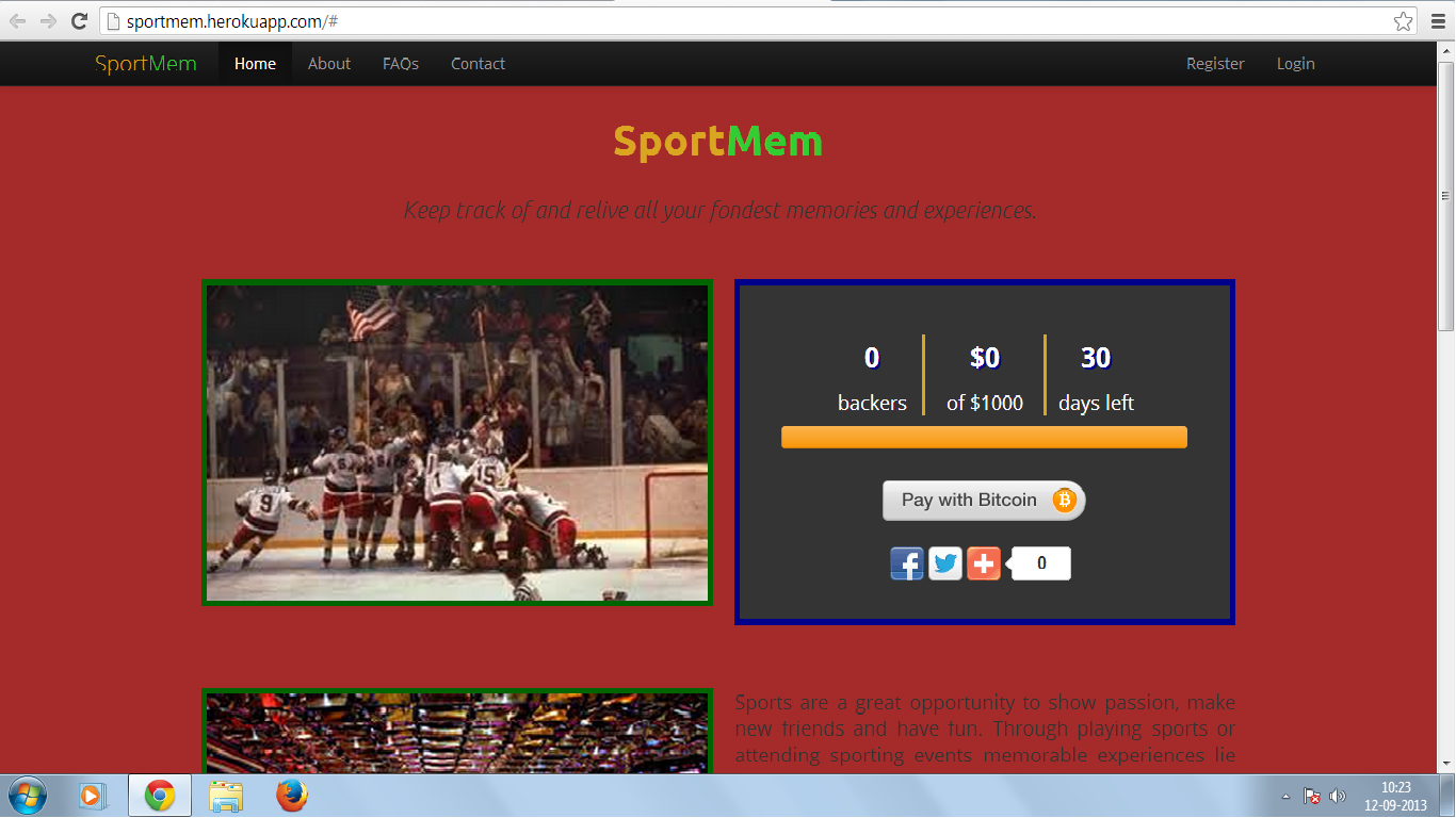
在顶部,我有一个导航栏,其中包含主页、关于、常见问题、联系方式、登录和注册等元素
我想将登录和注册元素移动到导航栏的右侧,以便登录下拉菜单看起来更好
这是我尝试过的代码
<div class = "navbar navbar-inverse navbar-fixed-top">
    <div class = "navbar-inner">
      <div class = "container">
        <button type = "button" class = "btn btn-navbar" data-toggle = "collapse" data-target = ".nav-collapse">
          <span class = "icon-bar"></span>
          <span class = "icon-bar"></span>
          <span class = "icon-bar"></span>
        </button>
        <a class = "brand" href = "#"><span class = "SportMem-sport">Sport</span><span class = "SportMem-mem">Mem</span></a>
        <div class = "nav-collapse collapse">
          <ul class = "nav">
            <li class = "active"><a href = "#">Home</a></li>
            <li><a href = "/about">About</a></li>
        <li><a href = "/faq">FAQs</a></li>
            <li><a href = "/contact">Contact</a></li>
        <li class = "login">
          <a id = "login-start" href = "#">
         Login<span></span>
          </a>
          <div id = "login-form">
        <form>
          <fieldset id = "inputs">
            <input id = "username" type = "email" name = "Email" placeholder = "Email Address" required>
            <input id = "password" type = "password" name = "Password" placeholder = "Password" required>
                  </fieldset>
          <fieldset id = "actions">
            <input type = "submit" id = "submit" value = "Log-in">
            <label><input type = "checkbox" checked = "checked"> Keep me logged-on</label>
                  </fieldset>
                </form>
              </div>
        </li>
        <li class = "register.html"><a href = "#register">Register</a></li>
          </ul>
          </div>
      </div>
    </div>
我尝试将元素浮动到右侧,但我尝试过的没有任何效果
有人可以帮我找到解决方案吗?
非常感谢帮助
编辑:如果您想知道,这是整个 CSS 代码
<style type = "text/css">
      @media (min-width: 980px) {
        body {
          padding-top: 60px;
        }
        .linediv-l {
          border-right: 3px #DAA520 solid;
        }
        .linediv-r {
          border-left: 3px #DAA520 solid;
        }
      }

      @media (max-width: 480px) {
        .copy {
          padding: 2.5% 10%;
        }
        .linediv-l {
          border-bottom: 3px #DAA520 solid;
        }
        .linediv-r {
          border-top: 3px #DAA520 solid;
        }
      }

      a:hover {
        text-decoration: none;
        color: gold;
      }

      a:link {
        text-decoration: none;
        color: black;
      }

      a:visited {
        text-decoration: none;
        color: black;
      }

     .navbar {
        position: fixed;
      }

      #login-form {
        display:none;
        position: absolute;
      }

      ul > li {
        display: inline;
        color: white;
      }

      body {
        background-color: #A52A2A;
        font-family: 'Open Sans', Helvetica, Arial, sans-serif;
      }

      .heading, .subheading {
        font-family: 'Ubuntu', Helvetica, Arial, sans-serif;
        text-align: center;
      }

      .brand {
        display: inline;
      }

      .SportMem-sport {
        color:#DAA520;
      }

      .SportMem-mem {
        color: #32CD32;
      }

      .subheading {
        font-style: italic;
        font-size: 12px;
      }

      p.lead {
        padding-top: 1.5%;
        line-height: 30px;
      }

      p {
        font-size: 18px;
        line-height: 24px;
      }

      .pitch {
        padding: 2.5% 0%;
      }

      .order {
        padding: 2% 0%;
      }

      .actions {
        background-color: #343434;
        padding: 3% 0%;
        border: 5px solid #00008B;
      }

      .actions:hover {
        border: 5px solid #4B0082;
      }

      img {
        border: 5px solid #006400;
      }

      img:hover {
        border: 5px solid #DAA520;
      }

      .video, .thermometer, .order, .social, .statistics {
        text-align: center;
      }

      .statistics h3, .statistics p {
        color: white;
      }

      .copy {
        padding-top: 2.5%;
        padding-bottom: 2.5%;
        text-align: justify;
      }

      .asset {
        padding: 2.5% 0%;
      }

      h3 {
        text-align: center;
        color: #FFD700;
        text-shadow: 2px 2px #00008B;
      }

      h3:hover {
        color: #20B2AA;
        text-shadow: 2px 2px #F8F8FF;
      }

      .footer li {
        color: #cccccc;
        text-align: center;
        display: inline;
      }

      div.addthis_toolbox {
        width:180px;
        margin: 0 auto;
      }
没有浮动:找到左侧
不知道那个人是怎么想出来的