精简版
使用flex-flow: column wrapanddisplay: inline-flex时,它不会像这样收缩包装inline-block:
(function() {
  var ascending = true;
  setInterval(function() {
    var parent = document.getElementById('flex');
    if (ascending) {
      var child = document.createElement('p');
      child.innerHTML = "foo";
      parent.appendChild(child);
    } else {
      parent.removeChild(parent.children[0]);
    }
    if (parent.children.length <= 1) ascending = true;
    if (parent.children.length >= 40) ascending = false;
  }, 20);
})();
(function() {
  var ascending = true;
  setInterval(function() {
    var parent = document.getElementById('failex');
    if (ascending) {
      var child = document.createElement('p');
      child.innerHTML = "foo";
      parent.appendChild(child);
    } else {
      parent.removeChild(parent.children[0]);
    }
    if (parent.children.length <= 1) ascending = true;
    if (parent.children.length >= 40) ascending = false;
  }, 20);
})();
#flexdesc {position: absolute; top: 25px;}
#flex {
top: 50px;
position: absolute;
display: inline-flex;
flex-flow: row wrap;
outline: 1px solid black;
padding: 3px;
max-height: 100%;
max-width: 180px;
align-content: flex-start;
transform: matrix(0, 1, 1, 0, 0, 0);
transform-origin: top left;
}
#flex > p {
margin: 0;
outline: 1px solid black;
height: 30px;
width: 30px;
align-self: flex-start;
transform: matrix(0, 1, 1, 0, 0, 0);
}
#failexdesc {position: absolute; top: 275px;}
#failex {
top: 300px;
position: absolute;
display: flex;
flex-flow: column wrap;
outline: 1px solid black;
padding: 3px;
max-height: 200px;
align-content: flex-start;
transform-origin: top left;
}
#failex > p {
margin: 0;
outline: 1px solid black;
height: 30px;
width: 30px;
align-self: flex-start;
}<!DOCTYPE html>
<html>
<head>
<meta charset=utf-8 />
<title>JS Bin</title>
</head>
<body>
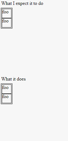
<div id="flexdesc">What I expect it to do</div>
<div id="flex">
<p>foo</p>
<!-- add extra "<p>foo</p>" here. -->
</div>
<div id="failexdesc">What it does</div>
<div id="failex">
<p>foo</p>
</div>
</body>
</html>注意每个 flex 容器的大小如何变化(或不变!)
我想要这种行为,因为我想将这些元素并排放置以用于水平滚动的网站。
为什么不收缩包装?我如何使它收缩包装?
原始问题
flex-flow: row wrap很简单,可以理解。如果没有什么是“弯曲”的,它的作用类似于内联元素;它向右流动,直到它不能再这样做,此时它会形成一个新行。
flex-flow: column wrap与display: flex相似。它向下流动,直到它不能再向下流动(max-width?),然后开始一个新的列。当然,由于父级是 display: flex,它是一个块级元素,因此该列将由于align-content默认为stretch. 我可以轻松地更改它以flex-start使新列与前一个相邻。
...但容器仍然太宽。它仍然是一个块,并填充它的父级的宽度。
我需要 flexbox 收缩以适应它的列。为什么?我正在尝试在水平滚动的网站中使用 flexbox。当然,我可以让孩子们溢出,但溢出往往会……破坏事物。所以我想我flex-flow: column wrap需要display: inline-flex. 我希望有一个“从上到下,从左到右”的效果,父母没有空白空间。
......然后这发生了。在 chrome 中,父宽度等于子宽度之和,否则,换行是正常的。在 firefox 中,父级是全宽的,只是为了容纳元素而变得更高(我不认为 firefox 支持换行)。在 IE11 中,宽度是正确的,但是孩子们只是向下溢出(甚至超出了身体)。
我很混乱。
我在这里做错了什么?我知道 flexbox 是一个较新的功能,但我不知道这在多大程度上是我与浏览器的错。
顺便说一句,我正在用 chrome 对此进行测试。我可以使用仅限 chrome 的解决方案。(但一个优雅的包罗万象的解决方案总是很好!)
这是我链接到的演示的代码,以防 jsbin 出现故障:
var ascending = true;
   setInterval(function() {
     var parent = document.getElementById('flex');
     if (ascending) {
       var child = document.createElement('p');
       child.innerHTML = "f";
       parent.appendChild(child);
     } else {
       parent.removeChild(parent.children[0]);
     }
     if (parent.children.length <= 1) ascending = true;
     if (parent.children.length >= 30) ascending = false;
   }, 200);
#flex {
display: inline-flex;
flex-flow: column wrap;
outline: 1px solid black;
padding: 3px;
max-height: 100%;
align-content: flex-start;
}
p {
margin: 0;
outline: 1px solid black;
width: 10px;
}
body {
height: 150px;
width: 300px;
outline: 1px dashed black
}<!DOCTYPE html>
<html>
<head>
<meta charset=utf-8 />
<title>JS Bin</title>
</head>
<body>
<div id="flex">
<p>f</p>
<!-- add extra "<p>foo</p>" here. -->
</div>
</body>
</html>