如何仅在 CSS3 中制作十字 (X) 以用作关闭按钮?
我已经搜索了很长时间,但找不到如何....当我在使用它的网站上查看源代码时,总是有一些奇怪的东西使我使用的代码无法使用。
我想要的 X 按钮:http: //tympanus.net/Tutorials/ThumbnailGridExpandingPreview/
当您单击图像时,这是右侧的十字:

我认为如果有人可以发布一个简单的通用 CSS 代码来在 CSS3 中制作一个简单的 X 交叉,那将是很棒的。
如何仅在 CSS3 中制作十字 (X) 以用作关闭按钮?
我已经搜索了很长时间,但找不到如何....当我在使用它的网站上查看源代码时,总是有一些奇怪的东西使我使用的代码无法使用。
我想要的 X 按钮:http: //tympanus.net/Tutorials/ThumbnailGridExpandingPreview/
当您单击图像时,这是右侧的十字:
我认为如果有人可以发布一个简单的通用 CSS 代码来在 CSS3 中制作一个简单的 X 交叉,那将是很棒的。
作为关闭或“时间”符号的纯 CSS解决方案,您可以将 ISO 代码与content属性一起使用。我经常将它用于 :after 或 :before 伪选择器。
内容代码是\00d7。
例子
div:after{
  display: inline-block;
  content: "\00d7"; /* This will render the 'X' */
}
然后,您可以以任何您想要的方式设置和定位伪选择器。希望这可以帮助某人:)。
在 CSS 中试试这个十字架
.close {
  position: absolute;
  right: 32px;
  top: 32px;
  width: 32px;
  height: 32px;
  opacity: 0.3;
}
.close:hover {
  opacity: 1;
}
.close:before, .close:after {
  position: absolute;
  left: 15px;
  content: ' ';
  height: 33px;
  width: 2px;
  background-color: #333;
}
.close:before {
  transform: rotate(45deg);
}
.close:after {
  transform: rotate(-45deg);
}
<a href="#" class="close">您正在寻找的要点是:
.tag-remove::before {
  content: 'x'; // here is your X(cross) sign.
  color: #fff;
  font-weight: 300;
  font-family: Arial, sans-serif;
}
仅供参考,您可以很容易地自己制作一个关闭按钮:
#mdiv {
  width: 25px;
  height: 25px;
  background-color: red;
  border: 1px solid black;
}

.mdiv {
  height: 25px;
  width: 2px;
  margin-left: 12px;
  background-color: black;
  transform: rotate(45deg);
  Z-index: 1;
}

.md {
  height: 25px;
  width: 2px;
  background-color: black;
  transform: rotate(90deg);
  Z-index: 2;
}
<div id="mdiv">
<div class="mdiv">
<div class="md"></div>
</div>
</div>这里有多种尺寸和悬停动画供您选择..演示(链接)
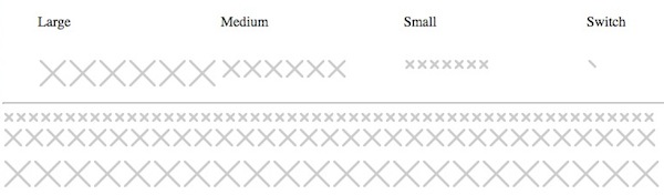
<ul>
  <li>Large</li>
  <li>Medium</li>
  <li>Small</li>
  <li>Switch</li>
</ul>

<ul>
  <li class="ele">
    <div class="x large"><b></b><b></b><b></b><b></b></div>
    <div class="x spin large"><b></b><b></b><b></b><b></b></div>
    <div class="x spin large slow"><b></b><b></b><b></b><b></b></div>
    <div class="x flop large"><b></b><b></b><b></b><b></b></div>
    <div class="x t large"><b></b><b></b><b></b><b></b></div>
    <div class="x shift large"><b></b><b></b><b></b><b></b></div>
  </li>
  <li class="ele">
    <div class="x medium"><b></b><b></b><b></b><b></b></div>
    <div class="x spin medium"><b></b><b></b><b></b><b></b></div>
    <div class="x spin medium slow"><b></b><b></b><b></b><b></b></div>
    <div class="x flop medium"><b></b><b></b><b></b><b></b></div>
    <div class="x t medium"><b></b><b></b><b></b><b></b></div>
    <div class="x shift medium"><b></b><b></b><b></b><b></b></div>

  </li>
  <li class="ele">
    <div class="x small"><b></b><b></b><b></b><b></b></div>
    <div class="x spin small"><b></b><b></b><b></b><b></b></div>
    <div class="x spin small slow"><b></b><b></b><b></b><b></b></div>
    <div class="x flop small"><b></b><b></b><b></b><b></b></div>
    <div class="x t small"><b></b><b></b><b></b><b></b></div>
    <div class="x shift small"><b></b><b></b><b></b><b></b></div>
    <div class="x small grow"><b></b><b></b><b></b><b></b></div>

  </li>
  <li class="ele">
    <div class="x switch"><b></b><b></b><b></b><b></b></div>
  </li>
</ul>
css
.ele div.x {
-webkit-transition-duration:0.5s;
  transition-duration:0.5s;
}

.ele div.x.slow {
-webkit-transition-duration:1s;
  transition-duration:1s;
}

ul { list-style:none;float:left;display:block;width:100%; }
li { display:inline;width:25%;float:left; }
.ele { width:25%;display:inline; }
.x {
  float:left;
  position:relative;
  margin:0;
  padding:0;
  overflow:hidden;
  background:#CCC;
  border-radius:2px;
  border:solid 2px #FFF;
  transition: all .3s ease-out;
  cursor:pointer;
}
.x.large {
  width:30px;
  height:30px;
}

.x.medium {
  width:20px;
  height:20px;
}

.x.small {
  width:10px;
  height:10px;
}

.x.switch {
  width:15px;
  height:15px;
}
.x.grow {

}

.x.spin:hover{
  background:#BB3333;
  transform: rotate(180deg);
}
.x.flop:hover{
  background:#BB3333;
  transform: rotate(90deg);
}
.x.t:hover{
  background:#BB3333;
  transform: rotate(45deg);
}
.x.shift:hover{
  background:#BB3333;
}

.x b{
  display:block;
  position:absolute;
  height:0;
  width:0;
  padding:0;
  margin:0;
}
.x.small b {
  border:solid 5px rgba(255,255,255,0);
}
.x.medium b {
  border:solid 10px rgba(255,255,255,0);
}
.x.large b {
  border:solid 15px rgba(255,255,255,0);
}
.x.switch b {
  border:solid 10px rgba(255,255,255,0);
}

.x b:nth-child(1){
  border-top-color:#FFF;
  top:-2px;
}
.x b:nth-child(2){
  border-left-color:#FFF;
  left:-2px;
}
.x b:nth-child(3){
  border-bottom-color:#FFF;
  bottom:-2px;
}
.x b:nth-child(4){
  border-right-color:#FFF;
  right:-2px;
}
您可以使用 svg。
<svg viewPort="0 0 12 12" version="1.1"
     xmlns="http://www.w3.org/2000/svg">
    <line x1="1" y1="11"
          x2="11" y2="1"
          stroke="black"
          stroke-width="2"/>
    <line x1="1" y1="1"
          x2="11" y2="11"
          stroke="black"
          stroke-width="2"/>
</svg>易于调整图标的最终结果:
JSfiddle 演示:https ://jsfiddle.net/allenski/yr5gk3cm/
简单的 HTML:
<a href="#" class="close" tabindex="0" role="button">close</a>
笔记:
tabindex属性有助于 iOS 触摸设备的可访问性焦点。role属性是让屏幕阅读器用户知道这是一个按钮。- 这个词
close也是供屏幕阅读器提及的。
CSS 代码:
.close {
    position: absolute;
    top: 0;
    right: 0;
    display: block;
    width: 50px;
    height: 50px;
    font-size: 0;
}
.close:before,
.close:after {
    position: absolute;
    top: 50%;
    left: 50%;
    width: 5px;
    height: 20px;
    background-color: #F0F0F0;
    transform: rotate(45deg) translate(-50%, -50%);
    transform-origin: top left;
    content: '';
}
.close:after {
    transform: rotate(-45deg) translate(-50%, -50%);
}
要调整关闭 X 图标的粗细,请更改width属性。更薄图标的示例:
.close:before,
.close:after {
    width: 2px;
}
要调整关闭 X 图标的长度,请更改height属性。例子:
.close:before,
.close:after {
    height: 33px;
}
.close-btn {
  font-size: 60px;
  font-weight: bold;
  color: #000;
}
<span class="close-btn">×</span>具有适当语义和可访问性设置的真正 CSS。
它是一个<button>,它有屏幕阅读器的文本。
https://codepen.io/specialweb/pen/ExyWPYv?editors=1100
button {
  width: 2rem;
  height: 2rem;
  padding: 0;
  position: absolute;
  top: 1rem;
  right: 1rem;
  cursor: pointer;
}

.sr-only {
  position: absolute;
  width: 1px;
  height: 1px;
  padding: 0;
  margin: -1px;
  overflow: hidden;
  clip: rect(0,0,0,0);
  border: 0;
}

button::before,
button::after {
    content: '';
    width: 1px;
    height: 100%;
    background: #333;
    display: block;
    transform: rotate(45deg) translateX(0px);
    position: absolute;
    left: 50%;
    top: 0;
}

button::after {
    transform: rotate(-45deg) translateX(0px);
}


/* demo */
body {
  background: black;
}
.pane {
  margin: 0 auto;
  width: 50vw;
  min-height: 50vh;
  background: #FFF;
  position: relative;
  border-radius: 5px;
}
<div class="pane">
<button type="button"><span class="sr-only">Close</span></button>
</div>这是完美居中的圆形 X 图标按钮的一个很好的插入式解决方案
width和height.close::before, .close::afteraria-labelcurrentColor适应按钮或祖先上指定的当前文本颜色。.close {
vertical-align: middle;
border: none;
color: inherit;
border-radius: 50%;
background: transparent;
position: relative;
width: 32px;
height: 32px;
opacity: 0.6;
}
.close:focus,
.close:hover {
opacity: 1;
background: rgba(128, 128, 128, 0.5);
}
.close:active {
background: rgba(128, 128, 128, 0.9);
}
/* tines of the X */
.close::before,
.close::after {
content: " ";
position: absolute;
top: 50%;
left: 50%;
height: 20px;
width: 4px;
background-color: currentColor;
}
.close::before {
transform: translate(-50%, -50%) rotate(45deg);
}
.close::after {
transform: translate(-50%, -50%) rotate(-45deg);
}<div style="padding: 15px">
<button class="close" aria-label="Close"></button>
</div>
<div style="background: black; color: white; padding: 15px">
<button class="close" aria-label="Close"></button>
</div>
<div style="background: orange; color: yellow; padding: 15px">
<button class="close" aria-label="Close"></button>
</div><div style="width: 10px; height: 10px; position: relative; display: flex; justify-content: center;">
<div style="width: 1.5px; height: 100%; background-color: #9c9f9c; position: absolute; transform: rotate(45deg); border-radius: 2px;"></div>
<div style="width: 1.5px; height: 100%; background-color: #9c9f9c; position: absolute; transform: rotate(-45deg); border-radius: 2px;"></div>
</div>