根据我的需要,我发现了一些粘性页脚。但现在我面临一个问题。当我增加分辨率大于我的正常分辨率时,代码工作正常。但容器 div 和页脚 div 之间有间距。在这里,我还附上了我得到的和我想要的屏幕。
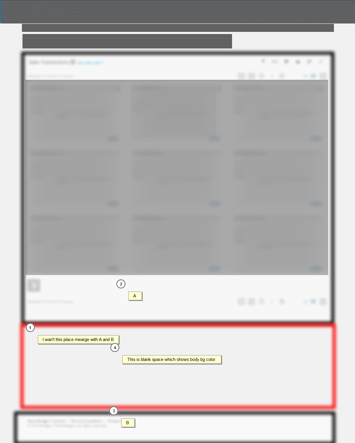
因此,根据图像,我想将(A)和(B)粘在一起。所以整个部分显示为一个单一的。在这里,我还添加了我的 css 代码。由于繁重的 HTML 和 CSS 代码。我无法使用 JSfiddle。我使用 Twitter Bootstrap 框架。
    html {
        position: relative;
        min-height: 100%;
    }
    body {
        margin: 0 0 100px; /* bottom = footer height */
    }
    footer {
        background: none repeat scroll 0 0 #FFFFFF;
        border-left: 1px solid #E1E1E1;
        border-right: 1px solid #E1E1E1;
        border-bottom: 1px solid #E1E1E1;
        position: absolute;
        bottom: 0;
        height: 100px;
    }

    #wrap {
        min-height: 100%;
        height: auto !important;
        height: 100%;
        margin: 0 auto -142px;
    }