我浏览了该网站上的其他答案,但无法准确找到我需要的内容。我正在构建一个使用宽度作为 div 和表格的百分比的网站。我认为这将帮助我保持站点的布局静态,无论查看器使用什么屏幕分辨率。但是,我注意到当我调整窗口大小时,发生了两件我不希望发生的事情:
1) 文本元素跳到新行并摆脱了整个布局。我真的很想阻止它这样做,但不确定这是否不利于使用百分比。
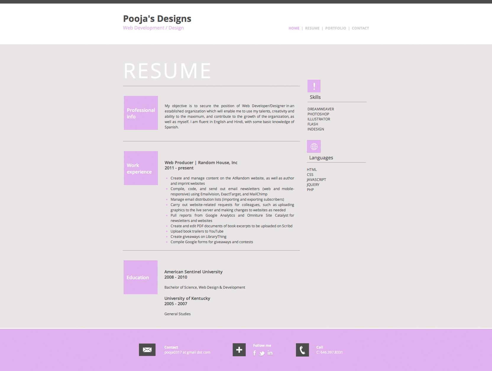
2) 我在某些元素上使用了绝对定位,因为它们并没有真正以表格格式工作(特别是右侧的技能和语言部分——见下面的截图)。但是,如果我调整窗口大小,它们不会与其他所有东西保持一致......它们只会留在一个地方。我知道这是他们应该做的,但我只是想知道是否有办法让它在调整大小时与其他所有东西保持一致并且仍然是绝对的(或固定的?静态的?)。
我使用百分比作为宽度的原因是因为我希望我的网站根据分辨率填充屏幕,同时将所有内容保持在屏幕中间。如果我调整窗口大小,一切都会搞砸,甚至一个浮动到右侧的导航栏也会出现在我的徽标上方的屏幕另一侧。这令人难以置信的沮丧。
我不知道答案是什么,但这里是页面在我的浏览器上的外观(即它应该看起来如何)和我的代码(如下)的屏幕截图。我真的很感激人们能给我关于如何更好地设计这个网站的任何见解。我似乎无法做我想做的所有事情,而且我知道这可能比我做的要简单得多。请让我知道你的想法。谢谢!
普加
<!DOCTYPE html PUBLIC "-//W3C//DTD XHTML 1.0 Transitional//EN"
"http://www.w3.org/TR/xhtml1/DTD/xhtml1-transitional.dtd">
<html xmlns="http://www.w3.org/1999/xhtml">
<head>
<meta http-equiv="Content-Type" content="text/html; charset=UTF-8" />
<title>Pooja's Designs :: Resume</title>
<style type="text/css">
body#home {
text-align:center;
margin:0px;
padding:0px;
width:100%;
height:100%;
font-family:Open Sans;
}
body#home a#nav-home,
body#resume a#nav-resume,
body#portfolio a#nav-portfolio,
body#contact a#nav-contact
{
color: #dfadec;
text-decoration:none;
}
#container {
background-color:#eae5e5;
width:100%;
text-align:left;
margin: 0 auto;
height:auto;
}
#main {
padding-top:40px !important;
padding-bottom:35px !important;
width:50%;
margin: 0 auto;
color:#4d4d4f;
}
#header {
border-top:solid 15px #4d4d4f;
font-size:30px;
color:#4d4d4f;
background-color:#FFF;
width:100%;
padding-bottom:45px;
}
#title {
padding-top:30px;
}
#footer {
color:#FFF;
font-size:12px;
background-color:#dfadec;
width:100%;
padding-bottom:45px;
padding-top:45px;
margin: 0 auto;
height: 100%;
border-top:solid white 3px;
}
#nav {
font-size:12px;
color:#CCC;
float:right;
margin-top:-18px;
}
#nav a:link {
color:#CCC;
text-decoration:none;
}
#nav a:hover {
color:#dfadec;
text-decoration:none;
}
#nav a:visited {
color:#CCC;
text-decoration:none;
}
h1 {
font-size:60px;
color:#4d4d4f;
margin-top:-150px;
}
h2 {
font-size:40px;
color:#4d4d4f;
font-weight:normal;
margin-top:-40px;
}
#resume-title {
color:#FFF;
letter-spacing:5px;
font-size:70px;
}
img#icon {
background-color:#4d4d4f;
padding:12px;
}
#prof_info {
width:115px;
height:115px;
background-color:#dfadec;
margin-top:30px;
}
#prof_info p {
color:#FFF;
font-size:16px;
padding-left:10px;
letter-spacing:0px;
vertical-align:middle;
padding-top:37px;
font-weight:600;
}
#work_exp {
width:115px;
height:115px;
background-color:#dfadec;
margin-top:30px;
}
#work_exp p {
color:#FFF;
font-size:16px;
padding-left:10px;
letter-spacing:0px;
vertical-align:middle;
padding-top:37px;
font-weight:600;
}
#education {
width:115px;
height:115px;
background-color:#dfadec;
margin-top:30px;
}
#education p {
color:#FFF;
font-size:16px;
padding-left:10px;
letter-spacing:0px;
vertical-align:middle;
padding-top:47px;
font-weight:600;
}
#contact {
width:45%;
margin: 0 auto;
}
#title-nav {
width:50%;
margin: 0 auto;
}
.position {
font-size:14px;
font-weight:600;
}
ul {
margin:0;
padding:0;
padding-left:20px;
}
ul li {
color:#dfadec;
}
</style>
</head>
<body id="home">
<div id="container">
<div id="header">
<div id="title-nav">
<div id="title">
<strong>Pooja's Designs</strong><br />
<span style="font-size:16px; color:#dfadec;">Web Development / Design</span>
</div>
<div id="nav">
<strong><a href="http://www.poojasdesigns.com/" id="nav-
home">HOME</a> | <a href="http://www.poojasdesigns.com/resume"
id="nav-resume">RESUME</a> | <a
href="http://www.poojasdesigns.com/portfolio" id="nav-
portfolio">PORTFOLIO</a> | <a
href="http://www.poojasdesigns.com/contact" id="nav-contact">CONTACT</a></strong>
</div>
</div>
</div>
<div id="main">
<div id="resume-title">
RESUME
</div>
<div style="border-bottom:solid #999 1px; width:72%; height:5px;"> </div>
<div style="position: absolute; left: 1040px; top: 273px;">
<img id="icon" src="exclamation.png" style="padding-left:17px; padding-right:17px;
padding-top:10px; padding-bottom:8px; background-color:#dfadec; vertical-align:middle;
margin-bottom:5px;" /><br />
Skills
<div style="border-bottom:solid #999 1px; width:200px; height:5px; margin
-bottom:15px;"> </div>
<span style="font-size:12px;">DREAMWEAVER<br />
PHOTOSHOP<br />
ILLUSTRATOR<br />
FLASH<br />
INDESIGN</span>
</div>
<div style="position: absolute; left: 1038px; top: 477px;">
<img id="icon" src="globe.png" style="padding:6px; padding-left:5px; background-
color:#dfadec; vertical-align:middle; margin-bottom:5px;" /><br />
Languages
<div style="border-bottom:solid #999 1px; width:200px; height:5px; margin-
bottom:15px;"> </div>
<span style="font-size:12px;">HTML<br />
CSS<br />
JAVASCRIPT<br />
JQUERY<br />
PHP</span>
</div>
<table width="70%">
<tr>
<td>
<div id="prof_info">
<p>Professional<br />
info</p>
</div>
</td>
<td style="padding-left:20px; font-size:12px; text-align:justify; line-height:18px;"
valign="bottom">
My objective is to secure the position of Web Developer/Designer in an established
organization which will enable me to use my talents, creativity and ability to the
maximum, and contribute to the growth of the organization, as well as myself. I am
fluent in English and Hindi, with some basic knowledge of Spanish.
</td>
</tr>
</table>
<div style="border-bottom:solid #999 1px; width:72%; height:5px; padding-
top:30px;"> </div>
<table width="70%">
<tr>
<td valign="top">
<div id="work_exp">
<p>Work<br />
experience</p>
</div>
</td>
<td style="padding-left:20px; padding-top:60px; font-size:12px; text-align:justify;
line-height:18px;">
<span class="position">Web Producer | Random House, Inc<br />
2011 - present</span><br /><br />
<ul>
<li><span style="color:#4d4d4f;">Create and manage content on the AtRandom website, as
well as author and imprint websites</span></li>
<li><span style="color:#4d4d4f;">Compile, code, and send out email newsletters (web and
mobile-responsive) using Emailvision, ExactTarget, and MailChimp</span></li>
<li><span style="color:#4d4d4f;">Manage email distribution lists (importing and
exporting subscribers)</span></li>
<li><span style="color:#4d4d4f;">Carry out website-related requests for colleagues, such
as uploading graphics to the live server and making changes to websites as
needed</span></li>
<li><span style="color:#4d4d4f;">Pull reports from Google Analytics and Omniture Site
Catalyst for newsletters and websites</span></li>
<li><span style="color:#4d4d4f;">Create and edit PDF documents of book excerpts to be
uploaded on Scribd</span></li>
<li><span style="color:#4d4d4f;">Upload book trailers to YouTube</span></li>
<li><span style="color:#4d4d4f;">Create giveaways on LibraryThing</span></li>
<li><span style="color:#4d4d4f;">Compile Google forms for giveaways and
contests</span></li>
</ul>
</td>
</tr>
</table>
<div style="border-bottom:solid #999 1px; width:72%; height:5px; padding-
top:30px;"> </div>
<table width="56%">
<tr>
<td valign="top">
<div id="education">
<p>Education</p>
</div>
</td>
<td style="padding-top:60px; font-size:12px; text-align:justify; line-height:18px;">
<span class="position">American Sentinel University<br />
2008 - 2010</span><br /><br />
Bachelor of Science, Web Design & Development<br /><br />
<span class="position">University of Kentucky<br />
2005 - 2007</span><br /><br />
General Studies
</td>
</tr>
</table>
</div>
<div id="footer">
<div id="contact">
<table width="100%" style="padding-left:10px;">
<tr>
<td>
<img id="icon" src="mail-icon.png" />
</td>
<td>
<strong>Contact</strong><br />
myemail at gmail dot com
</td>
<td>
<img id="icon" src="add-icon.png" />
</td>
<td style="padding-right:25px;">
<strong>Follow me</strong><br />
<a href="" target="_blank"><img
src="Pace_Social_Icon_Set/PNG/facebook.png" width="25" border="0" style="margin-left:-
8px;" /></a><a href="" target="_blank"><img
src="Pace_Social_Icon_Set/PNG/twitter.png" width="25" border="0" /></a><a
href="" target="_blank"><img
src="Pace_Social_Icon_Set/PNG/linkedin.png" width="30" border="0" /></a>
</td>
<td>
<img id="icon" src="call-icon.png" style="padding:8px; padding-left:12px; padding-
right:12px;" />
</td>
<td>
<strong>Call</strong><br />
C: 123.456.7890
</td>
</tr>
</table>
</div>
</div>
</div>
</body>
</html>