我看过下面的例子:
.arrow {
   height: 0;
   width: 0;
   border: 4px solid transparent;
}
.arrow.up {
   border-bottom-color: #000;
}
.arrow.down {
   border-top-color: #000;
}
但是我无法理解它是如何创建箭头的。有人可以为我解释一下吗?
我看过下面的例子:
.arrow {
height: 0;
width: 0;
border: 4px solid transparent;
}
.arrow.up {
border-bottom-color: #000;
}
.arrow.down {
border-top-color: #000;
}
但是我无法理解它是如何创建箭头的。有人可以为我解释一下吗?
我以前不知道这个技巧,但我想我明白了。底部边框不是方形的,它的侧面是斜面的。左边框将在顶部和底部倾斜。这是如此不同颜色的边界干净地相遇。因为箭头元素的高度和宽度为 0,所以边框段的底部宽度与您在边框规则中指定的一样宽,但会缩小到 0px 的宽度(容器的大小)。
您可以通过设置不同的边框粗细或更改边框规则的“边”来发挥效果。“箭头”总是指向与规则中设置的方向相反的方向。底部边框“指向”上方;右边界“点”左。
这是一个快速图表:
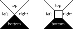
左是箭头技巧。右是一个更典型的边界,其中容器有一些尺寸。
Take a box. Say it's 5 pixels high and 5 pixels wide. Now say it has a 4px border. Here's what you should envision: http://jsfiddle.net/FrsGR/190.
.arrow { // box
   height: 5px;
   width: 5px;
   border: 4px solid blue;
}
Now imagine that the box doesn't have a width or height, so you are just left with the borders: http://jsfiddle.net/FrsGR/885/.
.arrow { // box with no width/height
   height: 0;
   width: 0;
   border: 4px solid blue;
}
They now overlap one another, and this is where the magic happens with creating arrows. The overlap line is drawn diagonally from each corner to the center. So, the end result is transparent triangles on the top, left, and right, with a black triangle on the bottom. Hope that helped!
Great reference: How do CSS triangles work?
CSS is creating a border around a point (with no width/height but some x,y coordinate) with dimension of 4px as specified in .arrow. This is like creating a circle with radius of 4px, except due to the nature of CSS's borders, the "circle" is actually a square.
You can see all four quandrants of the 4px radius square this way:
.arrow.up {
    border-top-color:blue;
    border-right-color:green;
    border-left-color:red;
   border-bottom-color: #000;
}
Here's a zoomed in example using a size of 40px instead of 4px: