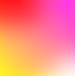
是否可以在 CSS 中生成以下渐变:

在你的情况下
方法一:
div{
overflow: hidden;
background: #f06;
background: linear-gradient(45deg, #fff722, #ff26f9);
min-height: 100%;
width: 256px;
height: 256px;
position: relative;
z-index: 1;
box-shadow: inset -20px 0 38px -18px #ff26f9,inset -3px -13px 65px -18px yellow;
}

div:before,div:after{
    content:'';
    position:absolute;
    width:100%;
    height:100%;
}
div:before{
    background: red;
    box-shadow: 0 0 140px 64px red;
    z-index:2;
    top: -96%;
left: -72%;
    opacity: 0.8;
}
div:after {
background: white;
z-index: 3;
bottom: -96%;
right: -72%;
box-shadow: 0 0 140px 64px white;
opacity: 1;
border-radius: 100%;
}
方法二:
div{
overflow: hidden;
background: #f06;
background: linear-gradient(45deg, #fff722, #ff26f9);
min-height: 100%;
width:256px;
height:256px;
position:relative;
    z-index:1;
}

div:before,div:after{
    content:'';
    position:absolute;
    width:100%;
    height:100%;
}
div:before{
    background: red;
    box-shadow: 0 0 140px 64px red;
    z-index:2;
    top: -96%;
left: -72%;
    opacity: 0.8;
}
div:after {
background: white;
z-index: 3;
bottom: -96%;
right: -72%;
box-shadow: 0 0 140px 64px white;
opacity: 1;
border-radius: 100%;
}
方法三:多重背景:
div{
background: #f06;
background: linear-gradient(45deg, #fff722, #ff26f9),linear-gradient(142deg, transparent, white),linear-gradient(108deg, red, transparent);
min-height: 100%;
width:256px;
height:256px;
position:relative;
    z-index:1;
}
方法四:伪元素
div{
background: #f06;
background: linear-gradient(45deg, #fff722, #ff26f9);
min-height: 100%;
width:256px;
height:256px;
position:relative;
    z-index:1;
}

div:before,div:after{
    content:'';
    position:absolute;
    width:100%;
    height:100%;
    opacity: 0.8;
}
div:before{
    background: linear-gradient(108deg, red, transparent);
    z-index:2;
    top:0;
    left:0;
}
div:after{
    background: linear-gradient(142deg, transparent, white);
    z-index:3;
    bottom:0;
    right:0;
}
标记:
<div></div>
方法五:
div{
overflow: hidden;
background: #f06;
background: linear-gradient(45deg, #fff722, #ff26f9);
min-height: 100%;
width:256px;
height:256px;
position:relative;
    z-index:1;
}

div:before,div:after{
    content:'';
    position:absolute;
    width:100%;
    height:100%;
}
div:before{
    background: linear-gradient(108deg, red, transparent);
    z-index:2;
    top:0;
    left:0;
    opacity: 0.8;
}
div:after {
background: white;
z-index: 3;
bottom: -96%;
right: -72%;
box-shadow: 0 0 110px 54px white;
opacity: 1;
border-radius: 100%;
}
更新:非常感谢Ana-Maria Tudor <3
body{
position:fixed;
top:0;
right:0;
bottom:0;
left:0;
}

body:before {
  content: '';
  position:absolute;
  top:0;
  right:0;
  bottom:0;
  left:0;
  display: block;
  width: 100%;
  height: 600px;
  border-radius: 0%;
  background:
    radial-gradient(circle at 50% 0,
         rgba(255,0,0,.5), rgba(255,0,0,0) 70.71%),
    radial-gradient(circle at 6.7% 75%,
         rgba(0,0,255,.5), rgba(0,0,255,0) 70.71%),
    radial-gradient(circle at 93.3% 75%,
         rgba(0,255,0,.5), rgba(0,255,0,0) 70.71%);
}
只需将此background样式用于您的div元素:
.myDiv {
  width: 256px;
  height: 256px;
  background: linear-gradient(to top left, white, rgba(255, 153, 150, 0), red), linear-gradient(to top right, yellow, rgba(255, 153, 150, 0), magenta) rgba(255, 153, 150, 1);
}
<div class="myDiv"></div>rgba(255, 153, 150, _ )中心的颜色在哪里div,我们在底部使用它,a=1 和渐变,a=0 用于 Safari 兼容性(对于其他渐变浏览器,我们可以更改rgba(255, 153, 150, 0)为transparetn 50%)。
我们需要添加并设置 div:after伪元素的样式:
.myDiv {
  width: 256px;
  height: 256px;
  background: linear-gradient(to bottom, red, yellow);
}

.myDiv::after {
  content: "";
  position: absolute;
  width: inherit;
  height: inherit;
  background: linear-gradient(to bottom, magenta, white);
  -webkit-mask-image: linear-gradient(to left, white, transparent);
}
<div class="myDiv"></div>工作,易于编辑的例子在这里。来自TheDarkln 答案的想法(我制作了纯 CSS 版本)。
.myDivC{
    overflow: hidden;
    background: linear-gradient(45deg, yellow, magenta);
    width:256px; height:256px;
    position:relative;
    z-index:1;
}

.myDivC:before,.myDivC:after{
    content:'';
    position:absolute;
    width:100%;
    height:100%;
}
.myDivC:before{
    background: red;
    box-shadow: 0 0 140px 64px red;
    z-index:2;
    top: -96%;
    left: -72%;
    opacity: 0.8;
}
.myDivC:after {
    background: white;
    z-index: 3;
    bottom: -96%;
    right: -72%;
    box-shadow: 0 0 100px 64px white;
    opacity: 1;
    border-radius: 100%;
}
<div class="myDivC"></div>盒子阴影和更多的伪元素 -在这里易于编辑代码。来自Gildas.Tambo 答案的想法(我选择第二个解决方案 - 首先在左下角有人工制品“黑色阴影”,其他解决方案不适用于 Edge)。
经过测试的版本:
简单 - 在Safari(低但可接受的质量)、Chrome、Firefox和Edge上
中Safari、Chrome、Firefox(不适用于Edge)。
复杂的铬,边缘。在Safari和Firefox中,左上角有“红框”伪影 - 可以通过更改来减少,.myDivC:before{ ... top: -96% ...}但top: -100%我们会稍微降低红色强度(这里),
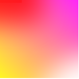
以下是 chrome 上 3 个版本的比较:

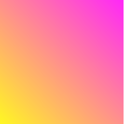
在简单的解决方案中,我们看到更多的“线性”,介质具有最好的质量。复杂的质量较低:左上角的不对称和人工红色矩形 - 当我们在所有解决方案中将黄色变为黑色时,可以更清楚地看到 -这里:

最近我开发的解决方案兼具:高品质和便携性——在这里。
在那个答案中,我比较了三种解决方案 - 但我发现了第四种解决方案,它可以产生高质量的图像并适用于 Chrome、Safari、Firefox 和 Edge - 这里是:
.myDiv {
    width: 256px; height: 256px;
    background-size: 100% 100%;
    background-image: url("data:image/svg+xml;utf8,%3Csvg preserveAspectRatio='none' viewBox='0 0 1 1' version='1.1' xmlns='http://www.w3.org/2000/svg'%3E%3Cdefs%3E%3ClinearGradient id='g'%3E%3Cstop offset='0' stop-color='%23fff' stop-opacity='0'%3E%3C/stop%3E%3Cstop offset='1' stop-color='%23fff' stop-opacity='1'%3E%3C/stop%3E%3C/linearGradient%3E%3Cmask id='m'%3E%3Crect x='0' y='0' width='1' height='1' fill='url(%23g)'%3E%3C/rect%3E%3C/mask%3E%3ClinearGradient id='a' gradientTransform='rotate(90)'%3E%3Cstop offset='0' stop-color='magenta'%3E%3C/stop%3E%3Cstop offset='1' stop-color='white'%3E%3C/stop%3E%3C/linearGradient%3E%3ClinearGradient id='b' gradientTransform='rotate(90)'%3E%3Cstop offset='0' stop-color='yellow'%3E%3C/stop%3E%3Cstop offset='1' stop-color='red'%3E%3C/stop%3E%3C/linearGradient%3E%3C/defs%3E%3Crect x='0' y='0' width='1' height='1' fill='url(%23a)' mask='url(%23m)'%3E%3C/rect%3E%3Crect x='0' y='0' width='1' height='1' fill='url(%23b)' mask='url(%23m)' transform='translate(1,1) rotate(180)'%3E%3C/rect%3E%3C/svg%3E");
}
<div class="myDiv"></div>在这个解决方案中,我们将 SVG dataurl 图像注入 CSS 样式。我们可以自由更改width和height输入myDiv(以允许我们在 svg 中使用它preserveAspectRatio='none',并且还background-size: 100% 100%;可以用于firefox 支持)。svg 中使用的颜色magenta, white, yellow, red可以更改为任何 css 格式的颜色。为了与 MS Edge 兼容,在解决方案 SVG 中,我们更改了以下字符:"to '、<to %3C、>to%3E和#to %23(来自这里的信息)。

通过使用蒙版图像和线性渐变,我们可以实现无缝的 4 色角渐变,只需要一个::after伪元素。
HTML
<div id="quad">
</div>
SASS
@mixin QuadVertexColors($v0, $v1, $v2, $v3) {

  background: linear-gradient(to bottom, $v0, $v2);

  &::after {

    content: "";
    position: absolute;
    width: inherit;
    height: inherit;
    background: linear-gradient(to bottom, $v1, $v3);
    -webkit-mask-image: linear-gradient(to left, white, transparent);
  }
}

body {

  background-color: #111111;
  padding: 0;
  margin: 0;

  #quad {

    $size: 100vh;

    width: $size;
    height: $size;

    @include QuadVertexColors(red, magenta, yellow, white);
  }
}