4

我有一个用户变量字符串,它的范围可以从一个单词到几个句子(并且可能包含任何有效的 Unicode 字符),我想在可变宽度框中显示它。

在代码中,我想要看起来像这样带有任何其他 CSS 或 JS 的 HTML:

<div style="width: 100%; height: 80%" id="text">
    <!--<some more divs or something>-->
        {{content}}
    <!--</some more divs or something>-->
</div>

{{content}}在可能的情况下应该变大,达到某个最大字体大小(可变);当它更长到某个最小值(变量)时更小,然后在那个点之后被切断。

在任何一种情况下,我都需要它在视觉上居中,并且比框长的单词应该连字符。

我尝试过结合 flexboxes 和 JavaScript 来破解一些东西,但不知道如何解决所有的错误。

除了最新版本的移动/桌面 Chrome/Safari/Firefox 之外,浏览器支持并不重要。

样机盒@2x

4

5 回答 5

4

好吧,我相信这就是你想要完成的。代码如下,注释块中有描述。在 chrome 中,您将使用该-webkit-line-clamp属性,在 firefox 中,您将使用淡出方法,因为 Firefox 不支持clamp 属性。您可以根据自己的喜好调整 CSS 中的淡出。截止点的“...”也将仍然存在于 firefox 中(请参阅.clamp:aftercss 中的属性)。

这是更新的jsFiddle

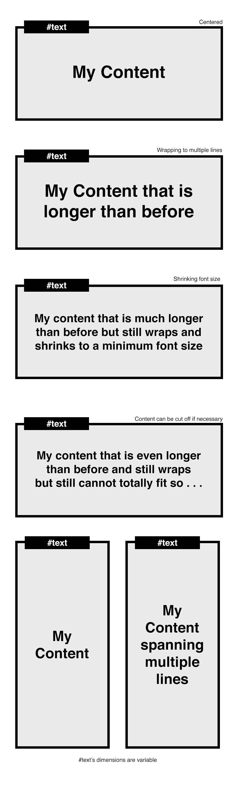
HTML(要查看更改,只需删除文本,直到 div 中显示一行)

<div id="textparent">
    <div id="text">
        {{content}}  adkf kfjg; ;akdfg fbfbf egdf hajkh  
        kajfhdg lakjfg  kafd gjkahf   jahfkjadlfh alkgj akjdhg fkafg
    </div>
</div>

CSS

注意:-webkit-line-clamp:3;(这是您想要显示的行数)

#text{ 
    width:100%;
    position:relative;
    height:auto;
    text-overflow:ellipsis;
    font-size:25px;
    line-height:1.1;
    display:block;
    display: -webkit-box;
    -webkit-box-orient: vertical;
    -webkit-line-clamp:3;
    overflow:hidden;
    margin:0 auto;
    box-sizing:border-box;
}

#textparent{
    margin:0 auto;
    width:300px;
    background:#eee;
    top:50px;
    padding:10px;
    height:auto;
    text-align:center;
    position:relative;
    height:100px;
    display:-webkit-box;
    -webkit-box-pack:center;
    -webkit-box-align:center;
}

/*FIREFOX will make use of the clamp class*/
.clamp:after {
    background: linear-gradient(to right, rgba(255, 255, 255, 0), #eeeeee 50%) repeat scroll 0 0 rgba(0, 0, 0, 0);
    bottom: 0;
    content: "...";
    padding: 0 5px 1px 25px;
    position: absolute;
    right: 0;
}

.clamp {
    height: 5.6em;
    line-height: 1.4em;
    overflow: hidden;
    position: relative;
}

Javascript/JQUERY:您可能想要更改或使用的主要变量是 [min_font_size] 和 [num_line_to_show],尽管 [num_line_to_show] 已经在 CSS 中设置。

var t = $('#text');

// get the font-size of the div
var font_size = Number(t.css('font-size').replace('px', ''));

// get the line-height of the div (Note: in Chrome this returns the actual height) 
var line_height = Number(t.css('line-height').replace('px', ''));

// minimum height of #text div
// 
// Note: if you were in a browser and the line-height var didn't return the full 
// height as it does in chrome, you would need to do this:
// var min_h = font-size * line_height
var min_h = line_height;

// number of lines to show. basically just retrieving the "-webkit-line-clamp"
// property in the css, otherwise will default to 3, which you can change.
var num_line_to_show = Number(t.css('-webkit-line-clamp')) || 3;

// the maximum height for the #text div. (the added 5 at the end is just
// personal preference)
var max_h = line_height * num_line_to_show * font_size + 5;

// get the height of the div
var h = $('#text').height();

// set this if you want the font to be set at a minimum size 
// when the text is longer than one line
var min_font_size = 20;

注意:您也可以尝试动态设置最小字体大小,如下所示:

// change this to make the font smaller
var shrink_rate = 3;
var min_font_size = font_size - (Math.round((h/min_h)) * shrink_rate;

继续:

// for detecting firefox
var is_ff = navigator.userAgent.toLowerCase().indexOf('firefox');

// if the height of the div is larger than the minimum height, meaning there
// is more than one line now, the font size of the div becomes smaller.
if (h > min_h){
    t.css({'font-size' : min_font_size});

    // if in Firefox browser
    if(is_ff > -1){
        // get the new max height of #text based on the number of lines 
        // with the new minimum font-size
        var txt_max_h = ((line_height-font_size) / num_line_to_show) * min_font_size * num_line_to_show;

        // the new height is greater than the maximum height allowed for the
        // smaller font size
        if (t.height() > txt_max_h){
            // reset the height of #text div to a fixed height
            t.height((min_font_size * num_line_to_show) + 5); 

            // add the clamp class and css will the rest
            t.addClass('clamp');
        }
    }
}

// if firefox, always run this to center the #text div based on its height
if(is_ff > -1){
    t.css({top: ($('#textparent').height() - t.height()) / 2});
}

希望这可以帮助!

于 2014-05-11T06:05:10.483 回答
4

及时。

看到这个小提琴

我想我成功地做你想做的事。它适用于 Chrome、Firefox 和 Safari。

HTML:

<div id="container">
    <div id="text">my Text !!</div>
</div>

JS:

var maxFontSize=68; // I think we cannot have bigger than that.
var minFontSize=12;
$('#text').on({
    // setting an event to resize text
    resize:function(e){
        // if no text => return false;
        if (!$(this).html().trim()) return;

        // if already running => return false;
        if (this.running) return;

        this.running = true;

        // get max-height = height of the parent element       
        var h = $(this).parent().height();

        // clone the text element and apply some css
        var clone = $(this).clone()
                               .removeAttr('id')
                               .css({'font-size':0,
                                     'width':$(this).width(),
                                     'opacity':0,
                                     'position':'fixed',
                                     'left':-1000})
                               .appendTo($('body'));   

        // Set the max font size for the clone to fit the max height; 
        var fontSize = minFontSize;
        do {
            $(this).css('font-size', fontSize+'px');
            fontSize=fontSize+1;
            clone.css('font-size', fontSize+'px');
        } while (h > clone.height() && maxFontSize > fontSize) ;

        // Set the '...' if still bigger 
        //start by setting back the good size to the clone.
        fontSize=fontSize-1;
        clone.css('font-size', fontSize+'px');

        // while max-height still bigger than clone height
        if (h < clone.height() && minFontSize == fontSize) {
            var content = clone.html();
            // try to remove the last words, one by one.
            while (h < clone.height()) {
                content = content.replace(/(\s[^\s]*)$/g,'...');
                clone.html(content);
            }
            // then replace the #text content
            $(this).html(clone.html());
        }

        // then remove the clone
        clone.remove();

        this.running = false;
    }
})
.trigger('resize');
于 2014-05-14T21:58:02.193 回答
1

有一个跨浏览器 (IE9+) 以 css 为中心的文本和连字符为webkit, codepen

HTML:

<div class="box">
  <p>
     You can also position your element only in the vertical or horizontal. 
     This work in IE9+. This text can be also hyphenated.
  </p>
</div>

CSS:

.box {
  border: #3071a9 solid 1px;
  position: absolute;
  top: 50%;
  left: 50%;
  -webkit-transform: translate(-50%, -50%);
  -ms-transform: translate(-50%, -50%);
  -o-transform: translate(-50%, -50%);
  transform: translate(-50%, -50%);
  color: #222;
  font-size: 26px;
  font-family: arial;
  height: 50%;
  padding: 20px;
  width: 50%;
}
.box p {
  text-overflow:ellipsis;
  display: -webkit-box;
  -webkit-box-orient: vertical;
  -webkit-line-clamp:3;
  overflow: hidden;
  position: absolute;
  top: 50%;
  -webkit-transform: translate(0, -50%);
  -ms-transform: translate(0, -50%);
  -o-transform: translate(0, -50%);
  transform: translate(0, -50%);
}
于 2014-05-15T08:20:20.373 回答
1

Russ Painter 的Jquery Textfill 插件可以派上用场。

这是小提琴

 <div>
  <div>
    <label for="dyntext">Content:</label>
    <input type="text" id="dyntext" value="Hello!"></input>
  </div>
  <div>
    <label for="maxsize">Maximal font size in pixels?</label>
    <input type="text" id="maxsize" value="0"></input>
  </div>
  <hr />
  <div class="content">
    <div class="jtextfill">
      <span class="dyntextval">Hello!</span>
    </div>
  </div>

function update() {
  var size = parseInt($('#maxsize').val(), 10);
  if (!isNaN(size)) {
  $('.dyntextval').html($('#dyntext').val());
  $('.jtextfill').textfill({debug: true, maxFontPixels: size});
  }
}

$(function () {
  $('#maxsize').keyup(update);
  $('#dyntext').keyup(update);
  update()
});


.content .jtextfill {
 width: 150px;
 height: 100px;
 background-color: #fff;
 text-align: center;
 border:1px solid #333;
 padding-top:40px;
 padding-bottom:40px;
 }
于 2014-05-15T13:42:01.483 回答
0

中心部分真的很简单,你可以用 flexbox、display:table-cell 等来完成

字体大小部分很棘手,但过去在这里已经得到了回答:https ://stackoverflow.com/a/6112914/1877754

于 2014-05-11T06:48:11.410 回答