110

我一直在寻找一段时间来解决我的粘性侧边栏问题。我对我希望它如何行动有一个具体的想法;实际上,我希望它在您向下滚动时粘在底部,然后一旦您向上滚动,我希望它以流畅的运动(不跳跃)粘在顶部。我找不到我想要达到的目标的示例,所以我创建了一个图像,希望能更清楚地说明这一点:

粘性侧边栏:向下滚动时固定在底部,向上滚动时固定在顶部

  1. 侧边栏位于标题下方。
  2. 当您向下滚动时,侧边栏与页面内容保持水平,以便您可以滚动浏览侧边栏和内容。
  3. 到达侧边栏的底部,侧边栏粘在视口的底部(大多数插件只允许粘在顶部,一些允许粘在底部的插件不允许两者都允许)。
  4. 到达底部,侧边栏位于页脚上方。
  5. 当您向上滚动时,侧边栏与内容保持水平,因此您可以再次滚动浏览内容和侧边栏。
  6. 到达侧边栏的顶部,侧边栏粘在视口的顶部。
  7. 到达顶部,侧边栏位于标题下方。

我希望这是足够的信息。我创建了一个 jsfiddle 来测试任何插件/脚本,我已经为这个问题重置了:http: //jsfiddle.net/jslucas/yr9gV/2/ .

4

9 回答 9

30

+1非常漂亮和说明性的图像。

我知道这是一个老问题,但我偶然发现你在forum.jquery.com 上发布了同样的问题,并且有一个答案(by@tucker973),建议了一个不错的库来做这个,并想在这里分享。

它被@leafo称为sticky-kit

在这里,您有我准备的一个非常基本的示例的代码和一个可以查看结果的工作演示。

/*!
 * Sticky-kit
 * A jQuery plugin for making smart sticky elements
 *
 * Source: http://leafo.net/sticky-kit/
 */

$(function() {
  $(".sidebar").stick_in_parent({
    offset_top: 10
  });
});
* {
  font-size: 10px;
  color: #333;
  box-sizing: border-box;
}
.wrapper,
.header,
.main,
.footer {
  padding: 10px;
  position: relative;
}
.wrapper {
  border: 1px solid #333;
  background-color: #f5f5f5;
  padding: 10px;
}
.header {
  background-color: #6289AE;
  margin-bottom: 10px;
  height: 100px;
}
.sidebar {
  position: absolute;
  padding: 10px;
  background-color: #ccc;
  height: 300px;
  width: 100px;
  float: left;
}
.main {
  background-color: #ccc;
  height: 600px;
  margin-left: 110px;
}
.footer {
  background-color: #6289AE;
  margin-top: 10px;
  height: 250px;
}
.top {
  position: absolute;
  top: 10px;
}
.bottom {
  position: absolute;
  bottom: 10px;
}
.clear {
  clear: both;
  float: none;
}
<script src="https://ajax.googleapis.com/ajax/libs/jquery/1.11.1/jquery.min.js"></script>
<script src="http://leafo.net/sticky-kit/src/jquery.sticky-kit.js"></script>
<div class="wrapper">
  <div class="header"> <a class="top">header top</a>
    <a class="bottom">header bottom</a>

  </div>
  <div class="content">
    <div class="sidebar"> <a class="top">sidebar top</a>
      <a class="bottom">sidebar bottom</a>

    </div>
    <div class="main"> <a class="top">main top</a>
      <a class="bottom">main bottom</a>

    </div>
    <div class="clear"></div>
  </div>
  <div class="footer"> <a class="top">footer top</a>
    <a class="bottom">footer bottom</a>

  </div>
</div>

当然,所有功劳都归插件的创建者所有,我只是做了这个例子来展示它。我需要完成与您相同的结果,并发现此插件非常有用。

于 2014-12-05T12:45:58.880 回答
15

感谢伟大的图形。我也在寻找解决这个挑战的方法!

不幸的是,此处发布的另一个答案没有解决要求能够顺利滚动回侧边栏的要求#5。

我创建了一个实现所有要求的小提琴:http: //jsfiddle.net/bN4qu/5/

需要实现的核心逻辑是:

If scrolling up OR the element is shorter than viewport Then
  Set top of element to top of viewport If scrolled above top of element
If scrolling down then
  Set bottom of element at bottom of viewport If scrolled past bottom of element

在小提琴中,我使用 CSS3 变换来移动目标元素,因此它在例如 IE<9 中不起作用。尽管使用不同的方法,但逻辑是合理的。

另外,我修改了您的小提琴,使粘性侧边栏具有渐变背景。这有助于表明正在表现出正确的行为。

我希望这对某人有用!

于 2014-07-29T21:43:08.817 回答
13

以下是如何实现此功能的示例:

JavaScript:

$(function() {

var $window = $(window);
var lastScrollTop = $window.scrollTop();
var wasScrollingDown = true;

var $sidebar = $("#sidebar");
if ($sidebar.length > 0) {

    var initialSidebarTop = $sidebar.position().top;

    $window.scroll(function(event) {

        var windowHeight = $window.height();
        var sidebarHeight = $sidebar.outerHeight();

        var scrollTop = $window.scrollTop();
        var scrollBottom = scrollTop + windowHeight;

        var sidebarTop = $sidebar.position().top;
        var sidebarBottom = sidebarTop + sidebarHeight;

        var heightDelta = Math.abs(windowHeight - sidebarHeight);
        var scrollDelta = lastScrollTop - scrollTop;

        var isScrollingDown = (scrollTop > lastScrollTop);
        var isWindowLarger = (windowHeight > sidebarHeight);

        if ((isWindowLarger && scrollTop > initialSidebarTop) || (!isWindowLarger && scrollTop > initialSidebarTop + heightDelta)) {
            $sidebar.addClass('fixed');
        } else if (!isScrollingDown && scrollTop <= initialSidebarTop) {
            $sidebar.removeClass('fixed');
        }

        var dragBottomDown = (sidebarBottom <= scrollBottom && isScrollingDown);
        var dragTopUp = (sidebarTop >= scrollTop && !isScrollingDown);

        if (dragBottomDown) {
            if (isWindowLarger) {
                $sidebar.css('top', 0);
            } else {
                $sidebar.css('top', -heightDelta);
            }
        } else if (dragTopUp) {
            $sidebar.css('top', 0);
        } else if ($sidebar.hasClass('fixed')) {
            var currentTop = parseInt($sidebar.css('top'), 10);

            var minTop = -heightDelta;
            var scrolledTop = currentTop + scrollDelta;

            var isPageAtBottom = (scrollTop + windowHeight >= $(document).height());
            var newTop = (isPageAtBottom) ? minTop : scrolledTop;

            $sidebar.css('top', newTop);
        }

        lastScrollTop = scrollTop;
        wasScrollingDown = isScrollingDown;
    });
}
});

CSS:

#sidebar {
  width: 180px;
  padding: 10px;
  background: red;
  float: right;
}

.fixed {
  position: fixed;
  right: 50%;
  margin-right: -50%;
}

演示:http: //jsfiddle.net/ryanmaxwell/25QaE/

这在所有场景中都按预期工作,并且在 IE 中也得到了很好的支持。

于 2014-10-30T19:57:39.160 回答
3

你也可以使用Sticky Sidebar JS 插件来达到你想要的效果。它有一个关于“如何使用”的小而简单的文档。我也想要类似的滚动效果,而且效果很好。

https://abouolia.github.io/sticky-sidebar/

于 2021-06-24T12:23:16.280 回答
3

示例两个方向的粘性侧边栏。

如果有人需要一个不基于 jQuery 的轻量级解决方案,我邀请您熟悉此代码: GitHub 上的 Two-direction-Sticky-Sidebar

//aside selector
const aside = document.querySelector('[data-sticky="true"]'), 
//varibles
startScroll = 0;
var endScroll = window.innerHeight - aside.offsetHeight -500,
currPos = window.scrollY;
screenHeight = window.innerHeight,
asideHeight = aside.offsetHeight;
aside.style.top = startScroll + 'px';
//check height screen and aside on resize
window.addEventListener('resize', ()=>{
    screenHeight = window.innerHeight;
    asideHeight = aside.offsetHeight;
});
//main function
document.addEventListener('scroll', () => {
    endScroll = window.innerHeight - aside.offsetHeight;
    let asideTop = parseInt(aside.style.top.replace('px;', ''));
    if(asideHeight>screenHeight){
        if (window.scrollY < currPos) {
            //scroll up
            if (asideTop < startScroll) {
                aside.style.top = (asideTop + currPos - window.scrollY) + 'px';
            } else if (asideTop >= startScroll && asideTop != startScroll) {
                aside.style.top = startScroll + 'px';
            }
        } else {
            //scroll down
            if (asideTop > endScroll) {
                aside.style.top = (asideTop + currPos - window.scrollY) + 'px';
            } else if (asideTop < (endScroll) && asideTop != endScroll) {
                aside.style.top = endScroll + 'px';
            }
        }
    }
    currPos = window.scrollY;
}, {
    capture: true,
    passive: true
});
body{
  padding: 0 20px;
}
#content {
  height: 2000px;
}
header {
  width: 100%;
  height: 150px;
  background: #aaa;
}
main {
  float: left;
  width: 65%;
  height: 100%;
  background: #444;
}
aside {
  float: right;
  width: 30%;
  position: sticky;
  top: 0px;
  background: #777;
}
li {
  height: 50px;
}
footer {
  width: 100%;
  height: 300px;
  background: #555;
  position: relative;
  bottom: 0;
}
<!DOCTYPE html>
    <head>
        <link href="/src/style.css" rel="preload" as="style"/>
    </head>
    <body>
        <header>Header</header>
            <div id="content">
            <main>Content</main>
            <aside data-sticky="true">
              <lu>
                <li>Top</li>
                <li>sidebar</li>
                <li>sidebar</li>
                <li>sidebar</li>
                <li>sidebar</li>
                <li>sidebar</li>
                <li>sidebar</li>
                <li>sidebar</li>
                <li>sidebar</li>
                <li>sidebar</li>
                <li>sidebar</li>
                <li>sidebar</li>
                <li>sidebar</li>
                <li>sidebar</li>
                <li>sidebar</li>
                <li>sidebar</li>
                <li>Bottom</li>
              </lu>
            </aside>
            </div>
        <footer>Footer</footer>
        <script src='/src/script.js' async></script>
    </body>
</html>

于 2021-01-04T16:12:03.963 回答
1

香草 JS 选项!

在想用 Vanilla JS 做这件事一段时间后,我终于破解了它。它肯定可以做一些整理,但它有效!

  const sidebar = document.querySelector('#sidebar');

  let lastScrollTop = 0;
  let scrollingDown;
  let isAbsolute = false;

  let absolutePosition = 0;
  let windowTop;
  let sidebarTop;
  let windowBottom;
  let sidebarBottom;

  function checkScrollDirection() {
    if (lastScrollTop <= window.scrollY) {
      scrollingDown = true
    } else {
      scrollingDown = false
    }
    lastScrollTop = window.scrollY;
  }      

  function fixit(pos,top,bottom,isAb) {

    sidebar.style.position = pos;
    sidebar.style.top = top;
    sidebar.style.bottom = bottom;
    isAbsolute = isAb;
  }

  function scrolling() {
    //optional width check
    if (window.innerHeight <= sidebar.offsetHeight && window.innerWidth > 996) {
      checkScrollDirection();
      windowTop = window.scrollY;
      sidebarTop = sidebar.offsetTop;
      windowBottom = window.scrollY + window.innerHeight;
      sidebarBottom = sidebar.offsetHeight + sidebar.offsetTop;

      if(!scrollingDown && windowTop <= sidebarTop) {
        //fixToTop
        fixit("fixed",0,"unset",false)
      }

      if(scrollingDown && windowBottom >= sidebarBottom) {
        //fixToBottom
        fixit("fixed","unset",0,false)
      }

      if((!isAbsolute && windowTop > sidebarTop) || !isAbsolute && windowBottom < sidebarBottom) {
        //fixInPlace
        let absolutePosition = (windowTop + sidebar.offsetTop) + "px";
        fixit("absolute",absolutePosition,"unset",true)
      }
    }
  }

  window.addEventListener('scroll', scrolling);
于 2021-07-13T08:52:25.247 回答
0

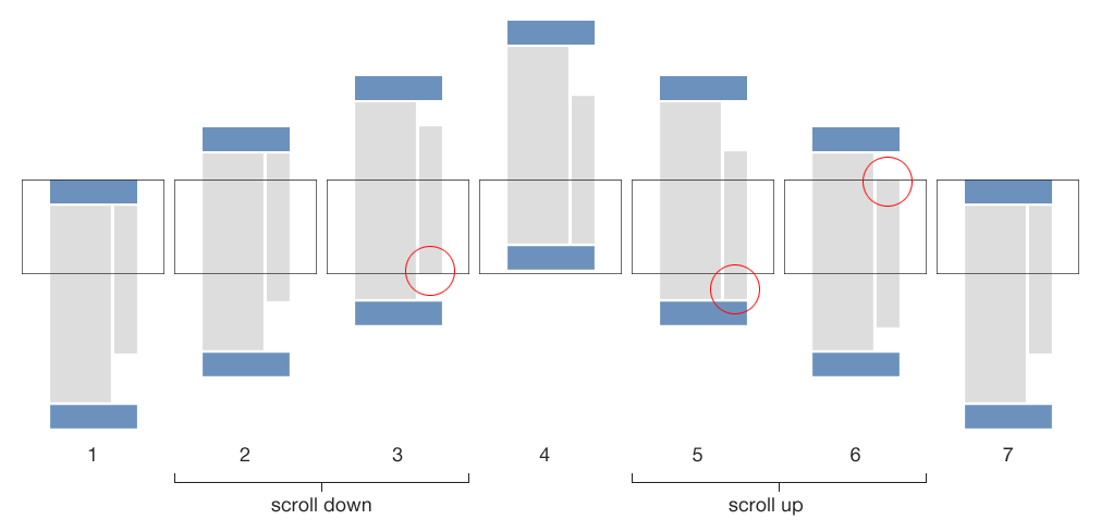
我一直在寻找完全相同的东西。显然,我需要搜索一些晦涩的术语才能找到与图形类似的问题。原来这正是我想要的。我找不到任何插件,所以我决定自己制作。希望有人会看到并改进它。

这是我正在使用的快速而肮脏的示例 html。

<div id="main">
    <div class="col-1">
    </div>
    <div class="col-2">
        <div class="side-wrapper">
            sidebar content
        </div>
    </div>
</div>

这是我制作的 jQuery:

var lastScrollPos = $(window).scrollTop();
var originalPos = $('.side-wrapper').offset().top;
if ($('.col-2').css('float') != 'none') {
    $(window).scroll(function(){
        var rectbtfadPos = $('.rectbtfad').offset().top + $('.rectbtfad').height();
        // scroll up direction
        if ( lastScrollPos > $(window).scrollTop() ) {
            // unstick if scrolling the opposite direction so content will scroll with user
            if ($('.side-wrapper').css('position') == 'fixed') {
                $('.side-wrapper').css({
                    'position': 'absolute',
                    'top': $('.side-wrapper').offset().top + 'px',
                    'bottom': 'auto'
                });
            } 
            // if has reached the original position, return to relative positioning
            if ( ($(window).scrollTop() + $('#masthead').height()) < originalPos ) {
                $('.side-wrapper').css({
                    'position': 'relative',
                    'top': 'auto',
                    'bottom': 'auto'
                });
            } 
            // sticky to top if scroll past top of sidebar
            else if ( ($(window).scrollTop() + $('#masthead').height()) < $('.side-wrapper').offset().top && $('.side-wrapper').css('position') == 'absolute' ) {
                $('.side-wrapper').css({
                    'position': 'fixed',
                    'top': 15 + $('#masthead').height() + 'px', // padding to compensate for sticky header
                    'bottom': 'auto'
                });
            }
        } 
        // scroll down
        else {
            // unstick if scrolling the opposite direction so content will scroll with user
            if ($('.side-wrapper').css('position') == 'fixed') {
                $('.side-wrapper').css({
                    'position': 'absolute',
                    'top': $('.side-wrapper').offset().top + 'px',
                    'bottom': 'auto'
                });
            } 
            // check if rectbtfad (bottom most element) has reached the bottom
            if ( ($(window).scrollTop() + $(window).height()) > rectbtfadPos && $('.side-wrapper').css('position') != 'fixed' ) {
                $('.side-wrapper').css({
                    'width': $('.col-2').width(),
                    'position': 'fixed',
                    'bottom': '0',
                    'top': 'auto'
                });
            }
        }
        // set last scroll position to determine if scrolling up or down
        lastScrollPos = $(window).scrollTop();

    });
}

一些注意事项:

  • .rectbtfad 是我侧边栏中最底部的元素
  • 我正在使用 #masthead 的高度,因为它是一个粘性标题,因此需要对其进行补偿
  • 由于我使用的是响应式设计并且不希望在较小的屏幕上激活它,因此检查了 col-2 浮动

如果有人可以再改进一点,那就太好了。

于 2014-02-12T04:19:55.837 回答
0

Wordpress 存储库中有一个相对不为人知的插件,称为 WP Sticky Sidebar。该插件完全符合您的要求(粘性侧边栏:向下滚动时粘在底部,向上滚动时粘在顶部)WP 粘性侧边栏 Wordpress 存储库链接:https ://wordpress.org/plugins/mystickysidebar/

于 2018-03-16T09:42:53.410 回答
0
function fixMe(id) {
    var e = $(id);
    var lastScrollTop = 0;
    var firstOffset = e.offset().top;
    var lastA = e.offset().top;
    var isFixed = false;
    $(window).scroll(function(event){
        if (isFixed) {
            return;
        }
        var a = e.offset().top;
        var b = e.height();
        var c = $(window).height();
        var d = $(window).scrollTop();
        if (b <= c - a) {
            e.css({position: "fixed"});
            isFixed = true;
            return;
        }           
        if (d > lastScrollTop){ // scroll down
            if (e.css("position") != "fixed" && c + d >= a + b) {
                e.css({position: "fixed", bottom: 0, top: "auto"});
            }
            if (a - d >= firstOffset) {
                e.css({position: "absolute", bottom: "auto", top: lastA});
            }
        } else { // scroll up
            if (a - d >= firstOffset) {
                if (e.css("position") != "fixed") {
                    e.css({position: "fixed", bottom: "auto", top: firstOffset});
                }
            } else {
                if (e.css("position") != "absolute") {
                    e.css({position: "absolute", bottom: "auto", top: lastA});
                }               
            }
        }
        lastScrollTop = d;
        lastA = a;
    });
}

fixMe("#stick");

工作示例: https ://jsfiddle.net/L7xoopst/6/

于 2015-09-21T00:11:56.267 回答