当其流体宽度(基于百分比)容器太小而无法显示整个图像时,如何使图像保持居中?

如何将图像居中在它的容器内
这意味着当容器太小时它应该显示图像的中间而不是侧面。
当其流体宽度(基于百分比)容器太小而无法显示整个图像时,如何使图像保持居中?
如何将图像居中在它的容器内
这意味着当容器太小时它应该显示图像的中间而不是侧面。
您可能有一个容器,其中包含一些内容,例如两个<div>彼此相邻的 50% 宽的 s。对于这个例子,我们可以只说明容器的一个子容器:
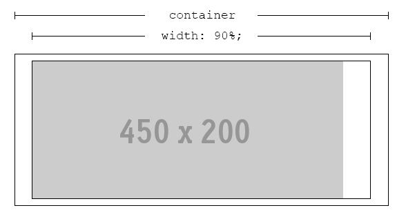
我们将命名外部矩形.container、内部矩形.content和图像img。这种排列非常好,只要.content总是比 宽img。
由于我们正在处理百分比并且可能使用响应式设计,因此可能并非总是如此。如果.content比 更薄img,将发生裁剪:
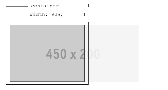
如果最有趣的部分img在中心,我们需要让浏览器均匀地裁剪两个边缘 - 让它的最佳部分可见,无论宽度.content是多少。
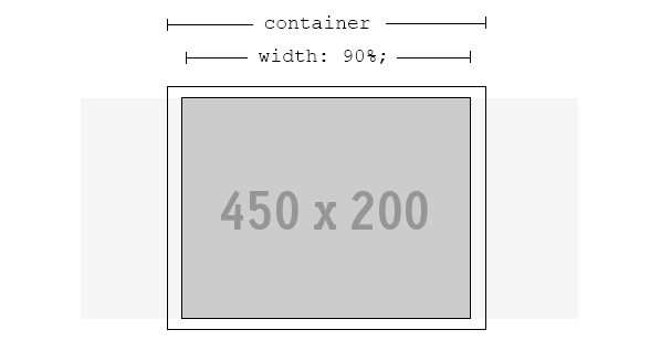
幸运的是,解决方案是可能的。更好的是,不需要额外的标记。
.content {
    width: 90%; /* or whatever is required */
    text-align: center; /* ensures the image is always in the h-middle */
    overflow: hidden; /* hide the cropped portion */
}

img {
    position: relative; /* allows repositioning */
    left: 100%; /* move the whole width of the image to the right */
    margin-left: -200%; /* magic! */
}
对于新的浏览器,您可以翻译它
figure{
    width: 100%;
    text-align: center;
    overflow: hidden;
}
img{
    position: relative;
    left: 50%;
    transform: translate(-50%,0)
}
要支持 IE8,您仍然可以使用上面由 @BryceHanscomb 提供的技术。
.no-csstransforms figure img {
    left: 100%; /* move the whole width of the image to the right */
    margin-left: -200%; /* magic! */
}
如果你预计要显示的图像会比显示容器长很多,设置 left: 100%; 和左边距:-200%;(来自布莱斯的回答)可能不足以获得图像的中心部分。只需为两者设置更大的百分比即可。确保另一个是另一个的一半。
left: 500%;
margin-left: -1000%;
我遇到了同样的问题,但这里的解决方案对我没有帮助(因为我在表格内显示并且因为我希望图像可以更改,而不必每次都手动缩放它,因为图像是由客户发送的)
这是我发现的,更有效和更容易:
img {
 object-fit: cover;
 width: 150px;
 height: 150px;
 }