4

我正在尝试css3基于图像模型在元素上添加一些样式。经过多次搜索,我已经能够得到一些结果,但不是我需要的全部。

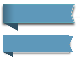
您可以在下图中看到: http: //soultherapy.free.fr/img/css3_need_screen.png

在此处输入图像描述

=> 在顶部:我试图在css3
=> 中重现的效果在底部:我只能实现的效果css3:离完美还很远^^

如您所见,右箭头的边框和阴影存在问题......

这是html代码:

<div class="span6">
   <a href="#" class="arrow-box">the text<b></b></a>
</div>

和CSS代码:

.arrow-box, .arrow-box:hover {        
    position: relative;
    display: inline-block; 
    font-weight: bold;     
    padding: 6px 12px 6px 30px;
    margin: 10px 10px 10px -18px;
    color: #fff !important;
    background-color: #5e98ba;  
    -webkit-box-shadow: 3px 2px 4px rgba(0,0,0,.5);
    -moz-box-shadow: 3px 2px 4px rgba(0,0,0,.5);
    box-shadow: 3px 2px 4px rgba(0,0,0,.5);

    outline: 1px solid #5e98ba;

    box-sizing:border-box;
    -moz-box-sizing:border-box;
    -webkit-box-sizing:border-box;
    border:1px solid #c4c7c9;
    border-left: 0;
    }  


.arrow-box:before{
    content: ' ';
    position: absolute;
    width: 0;
    height: 0;
    left: 0px;
    top: 100%;
    border-width: 5px 10px;
    border-style: solid;
    border-color: #315164 #315164 transparent transparent;
}

.arrow-box:after{
    content: ' ';
    position: absolute;
    width: 0;
    height: 0;
    right: -10px;
    top: 0;
    border-width: 10px 5px;
    border-style: solid;
    border-color: #5e98ba transparent transparent #5e98ba  ;
}
.arrow-box b {
    position: absolute;
    width: 0;
    height: 0;
    right: -10px;
    bottom: 0;
    border-width: 10px 5px;
    border-style: solid;
    border-color:  transparent transparent #5e98ba #5e98ba ; 
}

你认为我想做的事情只有 css3 才有可能吗?
如果是这样,你能帮我找到正确的css3代码吗?

小提琴:http: //jsfiddle.net/2cDnV/1/

4

4 回答 4

1

我知道我的解决方案看起来与您的图像不完全相同,但可能会帮助您入门。

你可以玩弄一下代码来获得你想要的东西并给它带来优雅。

你可以在这里找到 jsFiddle

HTML:

<div class="marginer">
    <div class="box">
        <div class="boxIn">This is text</div>
        <div class="boxArrowUp">
            <div class="boxArrowUpIn"></div>
        </div>
        <div class="boxArrowDown">
            <div class="boxArrowDownIn"></div>
        </div>
    </div>
</div>

CSS:

.marginer {
    margin: 20px;
}
.boxIn {
    float: left;
    border: 1px solid #fff;
    border-right: 0;
    padding: 6px 12px 6px 30px;
    box-shadow: 1px 2px 0px #5e98ba, 1px -1px 0px #5e98ba;
}
.box {
    position: relative;
    display: inline-block;
    font-weight: bold;
    margin: 10px 10px 10px -18px;
    color: #fff !important;
    background-color: #5e98ba;
    -webkit-box-shadow: 3px 2px 4px rgba(0, 0, 0, .5);
    -moz-box-shadow: 3px 2px 4px rgba(0, 0, 0, .5);
    box-shadow: 8px 3px 6px rgba(0, 0, 0, .5);
}
.box:before {
    content:' ';
    position: absolute;
    width: 0;
    height: 0;
    left: 0px;
    top: 100%;
    border-width: 5px 10px;
    border-style: solid;
    border-color: #315164 #315164 transparent transparent;
}
.boxArrowUp {
    content:' ';
    position: absolute;
    width: 0;
    height: 0;
    right: -10px;
    top: 0;
    border-width: 10px 5px;
    border-style: solid;
    border-color: #5e98ba transparent transparent #5e98ba;
}
.boxArrowUpIn:before {
    content:' ';
    position: absolute;
    width: 10px;
    height: 20px;
    top: -10px;
    left: -5px;
    border-top: 1px solid #fff;
    border-right: 0px;
    box-shadow: 0px 0px 0px #5e98ba, 0px -1px 0px #5e98ba;
}
.boxArrowUpIn:after {
    content:' ';
    position: absolute;
    width: 2px;
    height: 20px;
    top: -11px;
    left: -1px;
    background: #5e98ba;
    border-left: 1px solid #fff;
    -moz-transform:rotate(28deg);
    -webkit-transform:rotate(28deg);
    -o-transform:rotate(28deg);
    -ms-transform:rotate(28deg);
    z-index: 2;
    box-shadow: 3px 2px 4px rgba(0, 0, 0, .5);
}
.boxArrowDown {
    content:' ';
    position: absolute;
    width: 0;
    height: 0;
    right: -10px;
    bottom: 0;
    border-width: 10px 5px;
    border-style: solid;
    border-color: transparent transparent #5e98ba #5e98ba;
}
.boxArrowDownIn:before {
    content:' ';
    position: absolute;
    width: 10px;
    height: 20px;
    bottom: -10px;
    left: -5px;
    border-bottom: 1px solid #fff;
    border-right: 0px;
    box-shadow: 0px 2px 0px #5e98ba, 0px 0px 0px #5e98ba;
}
.boxArrowDownIn:after {
    content:' ';
    position: absolute;
    width: 2px;
    height: 19px;
    bottom: -11px;
    left: -1px;
    background: #5e98ba;
    border-left: 1px solid #fff;
    -moz-transform:rotate(332deg);
    -webkit-transform:rotate(332deg);
    -o-transform:rotate(332deg);
    -ms-transform:rotate(332deg);
    z-index: 2;
    box-shadow: 1px 4px 3px rgba(0, 0, 0, .5);
}

我玩了一些阴影和变换来达到效果。

让我知道它是否对您有帮助。

于 2013-07-24T13:44:54.927 回答
1

这是获得与原始图像完全相同的结果的最终代码:http: //jsfiddle.net/developpeuse_web/TSFMT/1/

HTML:

    <div class="box">
        <div class="left-shadow"></div>
        <div class="boxIn"></div>
        <div class="boxArrowUp">
            <div class="boxArrowUpIn"></div>
        </div>
        <div class="boxArrowDown">
            <div class="boxArrowDownIn"></div>
        </div>
    </div>

CSS:

.left-shadow {
    position: absolute;
    height: 100%;
    width: 23px;
    left: 0px;
    top: 0px;
    background-image: -webkit-gradient(linear, left top, right top, from(#333333), to(transparent));
    background-image: -webkit-linear-gradient(left, #333333, transparent);
    background-image: -moz-linear-gradient(left, #333333, transparent);
    background-image: -o-linear-gradient(left, #333333, transparent);
    background-image: linear-gradient(left, #333333, transparent);
    opacity: 0.44;
    filter : alpha(opacity=44);
} 
.boxIn {
    float: left;
    border: 1px solid #fff;
    width: 100px;
    height: 20px;
    border-right: 0;
    padding: 6px 12px 6px 30px;
    box-shadow: 1px 2px 0px #5e98ba, 1px -1px 0px #5e98ba;
}

.box {
    position: relative;
    display: inline-block;
    font-weight: bold;
    margin: 10px 10px 10px -18px;
    color: #fff !important;
    background-color: #5e98ba;
    -webkit-filter: drop-shadow(2px 2px 4px rgba(0,0,0,0.45));
}
.box:before {
    content:' ';
    position: absolute;
    width: 0;
    height: 0;
    left: 0px;
    top: 100%;
    border-width: 5px 10px;
    border-style: solid;
    border-color: #315164 #315164 transparent transparent;
}
.boxArrowUp {
    content:' ';
    position: absolute;
    width: 0;
    height: 0;
    right: -10px;
    top: 0;
    border-width: 10px 5px;
    border-style: solid;
    border-color: #5e98ba transparent transparent #5e98ba;
}
.boxArrowUpIn:before {
    content:' ';
    position: absolute;
    width: 10px;
    height: 20px;
    top: -10px;
    left: -5px;
    border-top: 1px solid #fff;
    border-right: 0px;
    box-shadow: 0px 0px 0px #5e98ba, 0px -1px 0px #5e98ba;
}
.boxArrowUpIn:after {
    content:' ';
    position: absolute;
    width: 2px;
    height: 20px;
    top: -11px;
    left: -1px;
    background: #5e98ba;
    border-left: 1px solid #fff;
    -moz-transform:rotate(28deg);
    -webkit-transform:rotate(28deg);
    -o-transform:rotate(28deg);
    -ms-transform:rotate(28deg);
    z-index: 2;
}
.boxArrowDown {
    content:' ';
    position: absolute;
    width: 0;
    height: 0;
    right: -10px;
    bottom: 0;
    border-width: 10px 5px;
    border-style: solid;
    border-color: transparent transparent #5e98ba #5e98ba;
}
.boxArrowDownIn:before {
    content:' ';
    position: absolute;
    width: 10px;
    height: 20px;
    bottom: -10px;
    left: -5px;
    border-bottom: 1px solid #fff;
    border-right: 0px;
    box-shadow: 0px 2px 0px #5e98ba, 0px 0px 0px #5e98ba;
}
.boxArrowDownIn:after {
    content:' ';
    position: absolute;
    width: 2px;
    height: 19px;
    bottom: -11px;
    left: -1px;
    background: #5e98ba;
    border-left: 1px solid #fff;
    -moz-transform:rotate(332deg);
    -webkit-transform:rotate(332deg);
    -o-transform:rotate(332deg);
    -ms-transform:rotate(332deg);
    z-index: 2;
}

谢谢哈沙德!

于 2013-07-24T17:44:24.797 回答
0

谢谢...当然它对我有很大帮助!如果它不完美,那么它非常接近:)

作为补充,我刚刚找到了另一种生成阴影的方法,即使用“-webkit-filter: drop-shadow”。所以我将此属性添加到 .box 元素,并删除所有其他元素(.box、.boxArrowUpIn:after、.boxArrowDownIn:after)上的灰色框阴影:http: //jsfiddle.net/developpeuse_web/TSFMT/

.marginer {
    margin: 20px;
}
.boxIn {
    float: left;
    border: 1px solid #fff;
    border-right: 0;
    padding: 6px 12px 6px 30px;
    box-shadow: 1px 2px 0px #5e98ba, 1px -1px 0px #5e98ba;
}
.box {
    position: relative;
    display: inline-block;
    font-weight: bold;
    margin: 10px 10px 10px -18px;
    color: #fff !important;
    background-color: #5e98ba;
    /* -webkit-box-shadow: 3px 2px 4px rgba(0, 0, 0, .5);
    -moz-box-shadow: 3px 2px 4px rgba(0, 0, 0, .5);
    box-shadow: 8px 3px 6px rgba(0, 0, 0, .5); */
    -webkit-filter: drop-shadow(2px 2px 4px rgba(0,0,0,0.45));
}
.box:before {
    content:' ';
    position: absolute;
    width: 0;
    height: 0;
    left: 0px;
    top: 100%;
    border-width: 5px 10px;
    border-style: solid;
    border-color: #315164 #315164 transparent transparent;
}
.boxArrowUp {
    content:' ';
    position: absolute;
    width: 0;
    height: 0;
    right: -10px;
    top: 0;
    border-width: 10px 5px;
    border-style: solid;
    border-color: #5e98ba transparent transparent #5e98ba;
}
.boxArrowUpIn:before {
    content:' ';
    position: absolute;
    width: 10px;
    height: 20px;
    top: -10px;
    left: -5px;
    border-top: 1px solid #fff;
    border-right: 0px;
    box-shadow: 0px 0px 0px #5e98ba, 0px -1px 0px #5e98ba;
}
.boxArrowUpIn:after {
    content:' ';
    position: absolute;
    width: 2px;
    height: 20px;
    top: -11px;
    left: -1px;
    background: #5e98ba;
    border-left: 1px solid #fff;
    -moz-transform:rotate(28deg);
    -webkit-transform:rotate(28deg);
    -o-transform:rotate(28deg);
    -ms-transform:rotate(28deg);
    z-index: 2;
    /* box-shadow: 3px 2px 4px rgba(0, 0, 0, .5); */
}
.boxArrowDown {
    content:' ';
    position: absolute;
    width: 0;
    height: 0;
    right: -10px;
    bottom: 0;
    border-width: 10px 5px;
    border-style: solid;
    border-color: transparent transparent #5e98ba #5e98ba;
}
.boxArrowDownIn:before {
    content:' ';
    position: absolute;
    width: 10px;
    height: 20px;
    bottom: -10px;
    left: -5px;
    border-bottom: 1px solid #fff;
    border-right: 0px;
    box-shadow: 0px 2px 0px #5e98ba, 0px 0px 0px #5e98ba;
}
.boxArrowDownIn:after {
    content:' ';
    position: absolute;
    width: 2px;
    height: 19px;
    bottom: -11px;
    left: -1px;
    background: #5e98ba;
    border-left: 1px solid #fff;
    -moz-transform:rotate(332deg);
    -webkit-transform:rotate(332deg);
    -o-transform:rotate(332deg);
    -ms-transform:rotate(332deg);
    z-index: 2;
    /* box-shadow: 1px 4px 3px rgba(0, 0, 0, .5); */
}

不知道这是否是浏览器兼容性的更好解决方案,但看起来更干净一些。

我认为我要做的最后一个细节是在左边框上添加一个内阴影,这正是我所需要的。我将在这里发布最终代码。

非常感谢 !

于 2013-07-24T14:50:34.070 回答
0

参加比赛是否为时已晚?

的HTML

<div id="mysolution">MY SOLUTION<div id="arrow"></div></div> 

CSS

#mysolution {
    color: red;
    padding: 10px 9px 10px 25px;
    position: relative; 
    display: block;
    z-index: 1;
    width: 170px;
    height: 30px;
    overflow: hidden;
}

#mysolution:after, #mysolution:before {
    content: " "; 
    display: block; 
    left: -20px;
    position: absolute;
    width: 80%; 
} 

#mysolution:before { 
    z-index: -2; 
    height: 30%;
    top: 11%;
    -webkit-transform: skewX(-35deg); 
    background-image: linear-gradient(55deg, black, rgb(94, 152, 186) 30%); 
    border-right: 1px solid white;
    border-top: 1px solid white;
    box-shadow: 1.52px -1px 0px #5e98ba, 4px 4px 5px rgb(110, 110, 110);
}

#mysolution:after { 
    z-index: -1; 
    height: 28%;
    bottom: 28.95%;
    -webkit-transform: skewX(35deg); 
    background-image: linear-gradient(125deg, black, rgb(94, 152, 186) 30%); 
    padding-right: .8px;
    border-right: 1px solid white;
    border-bottom: 1px solid white;
    box-shadow: 1.52px 1px 0px #5e98ba, 1.52px 0.5px 0px #5e98ba,-2px 4px 5px rgb(110, 110, 110);
}

#arrow {
    position: absolute;
    width: 0px;
    height: 0px;
    left: 0px;
    top: 37px;
    border-width: 5px 10px;
    border-style: solid;
    border-color: #315164 #315164 transparent transparent;
    z-index: -3;
    -webkit-filter: drop-shadow(2px 2px 4px rgba(0,0,0,0.45));
}

小提琴

只是试图用更少的 div 和更少的 CSS 来做到这一点。(并从已经完成的工作中挑选想法...... :-)

于 2013-07-24T20:45:29.240 回答