I'm trying to create a responsive layout, with a left-hand sidebar that collapses on narrower screens. Something a bit like http://purecss.io/ but with a fixed top header as well.
My work so far (the code is really too long to reproduce here): http://jsbin.com/uhalic/3/edit
There are two problems that I'm struggling to fix (NB you'll need to make the HTML section wider than 450px to reproduce these):
(1) The last elements of the list are being shifted sideways, for no reason I can understand.
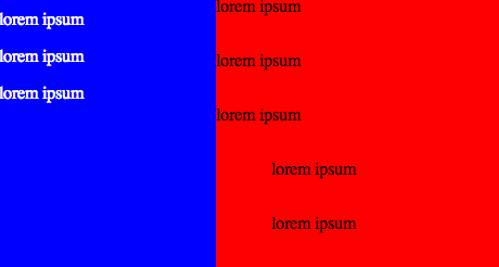
(2) The footer should be visually contained entirely within the #main (red section), and indeed that's where it is semantically, but the text is falling partly into the #sidebar (blue section).

What am I doing wrong?