为了使<tbody>元素可滚动,我们需要更改它在页面上的显示方式,即使用display: block;将其显示为块级元素。
由于我们更改了 的display属性tbody,我们也应该更改thead元素的该属性,以防止破坏表格布局。
所以我们有:
thead, tbody { display: block; }

tbody {
    height: 100px;       /* Just for the demo          */
    overflow-y: auto;    /* Trigger vertical scroll    */
    overflow-x: hidden;  /* Hide the horizontal scroll */
}
默认情况下, Web 浏览器将thead和tbody元素显示为行组( table-header-groupand table-row-group)。
一旦我们改变它,内部tr元素就不会填满容器的整个空间。
为了解决这个问题,我们必须计算列的宽度并通过 JavaScripttbody将相应的值应用于列。thead
自动宽度列
这是上述逻辑的 jQuery 版本:
// Change the selector if needed
var $table = $('table'),
    $bodyCells = $table.find('tbody tr:first').children(),
    colWidth;

// Get the tbody columns width array
colWidth = $bodyCells.map(function() {
    return $(this).width();
}).get();

// Set the width of thead columns
$table.find('thead tr').children().each(function(i, v) {
    $(v).width(colWidth[i]);
});
这是输出(在 Windows 7 Chrome 32 上):

工作演示。
全宽表,相对宽度列
根据原始海报的需要,我们可以将其扩展table到其容器的 100% width,然后对表的每一列使用相对值(百分比) 。width
table {
    width: 100%; /* Optional */
}

tbody td, thead th {
    width: 20%;  /* Optional */
}
由于表格具有(某种)流畅的布局thead,我们应该在容器调整大小时调整列的宽度。
因此,一旦调整窗口大小,我们应该设置列的宽度:
// Adjust the width of thead cells when *window* resizes
$(window).resize(function() {
    /* Same as before */
}).resize(); // Trigger the resize handler once the script runs
输出将是:

工作演示。
浏览器支持和替代品
我已经通过新版本的主要 Web 浏览器(包括 IE10+)在 Windows 7 上测试了上述两种方法,并且成功了。
但是,它在 IE9及更低版本上无法 正常工作。
这是因为在表格布局中,所有元素都应该遵循相同的结构属性。
通过使用display: block;for<thead>和<tbody>元素,我们打破了表格结构。
通过 JavaScript 重新设计布局
一种方法是重新设计(整个)表格布局。使用 JavaScript 动态创建新布局并动态处理和/或调整单元格的宽度/高度。
例如,看看下面的例子:
嵌套表
这种方法使用两个嵌套表,其中包含一个 div。第一个table只有一个具有 的单元格,div第二个表格放置在该div元素内。
检查CSS Play中的垂直滚动表。
这适用于大多数网络浏览器。我们也可以通过 JavaScript 动态地完成上述逻辑。
滚动时带有固定标题的表格
由于添加垂直滚动条的目的是在每一行的顶部<tbody>显示表格标题,我们可以将元素定位在屏幕顶部。theadfixed
这是Julien执行的这种方法的工作演示。
它有一个很有前途的网络浏览器支持。
这里是Willem Van Bockstal的纯CSS实现。
纯 CSS 解决方案
这是旧答案。当然,我添加了一个新方法并改进了 CSS 声明。
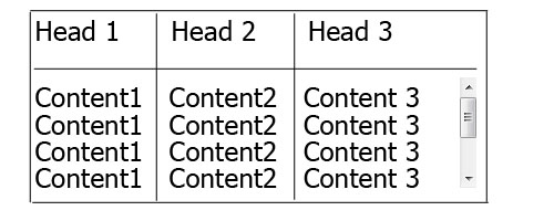
固定宽度的表格
在这种情况下,table应该有一个固定的width (包括列的宽度和垂直滚动条的宽度之和)。
每列应该有一个特定的宽度,元素的最后一列thead需要更大的宽度,等于其他列的宽度+垂直滚动条的宽度。
因此,CSS 将是:
table {
    width: 716px; /* 140px * 5 column + 16px scrollbar width */
    border-spacing: 0;
}

tbody, thead tr { display: block; }

tbody {
    height: 100px;
    overflow-y: auto;
    overflow-x: hidden;
}

tbody td, thead th {
    width: 140px;
}

thead th:last-child {
    width: 156px; /* 140px + 16px scrollbar width */
}
这是输出:

工作演示。
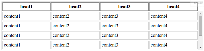
100% 宽度的表格
在这种方法中, 的table宽度为100%和 对于每个th和td,width属性的值应小于100% / number of cols。
另外,我们需要减小垂直滚动条宽度的thead值。
为此,我们需要使用 CSS3calc()函数,如下所示:
table {
    width: 100%;
    border-spacing: 0;
}

thead, tbody, tr, th, td { display: block; }

thead tr {
    /* fallback */
    width: 97%;
    /* minus scroll bar width */
    width: -webkit-calc(100% - 16px);
    width:    -moz-calc(100% - 16px);
    width:         calc(100% - 16px);
}

tr:after {  /* clearing float */
    content: ' ';
    display: block;
    visibility: hidden;
    clear: both;
}

tbody {
    height: 100px;
    overflow-y: auto;
    overflow-x: hidden;
}

tbody td, thead th {
    width: 19%;  /* 19% is less than (100% / 5 cols) = 20% */
    float: left;
}
这是在线演示。
注意:如果每列的内容都换行,这种方法会失败,即每个单元格的内容应该足够短。
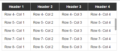
下面是我在回答这个问题时创建的两个简单的纯 CSS 解决方案示例。
这是jsFiddle 演示v2。
旧版本:jsFiddle Demo v1