-2

Simply :


(source: d.pr)

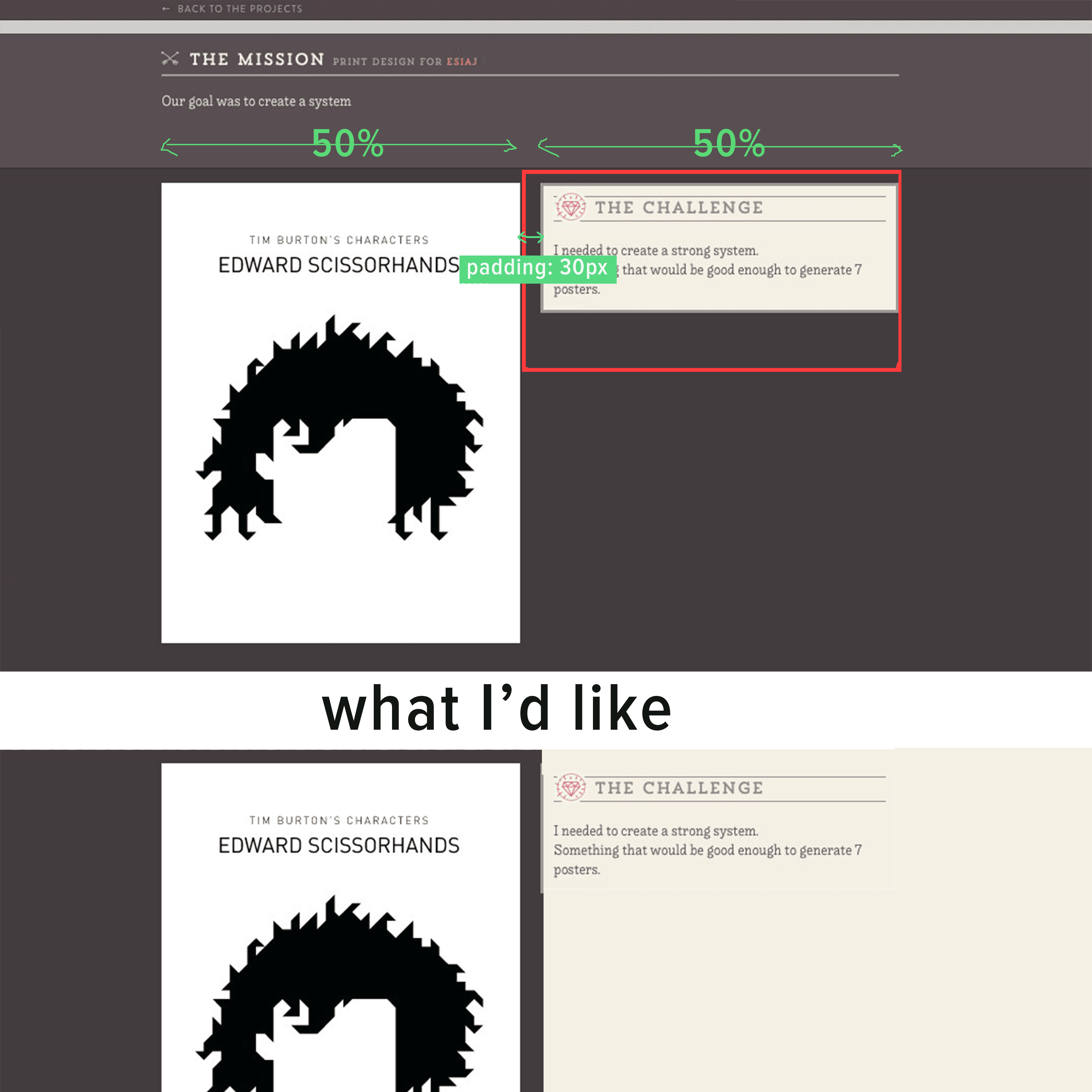
This is what I'd like to achieve the cleanest way possible. I'm using Inuit.css here.

It should be pretty simple but the padding makes it more complicated.

(I didn't think it was relevant to add the markup here.)

EDIT:

I was wrong. Here:

<div class="content content--work"> 
  <div class="container--bigger">
    <div class="grid">
      <div class="grid__item one-half">
        <div class="work-main">
          <img src="img/work/timburton-1.svg" alt="">
        </div>
      </div>
      <div class="grid__item one-half">
        <div class="challenge">
          <h3 class="work-title">The challenge</h3>
          I needed to create a strong system.<br>
          Something that would be good enough to generate 7 posters.
        </div>
     </div>
   </div>
 </div><!-- container bigger -->

One-half are inline blocks that take up half the size of the container. The gutter is made with the padding. (border-box)

grid__item {
  display: inline-block;
  padding-left: 30px;
}

one-half {
  width: 50%;
}

* EDIT 2 :*

I came up with this. Doesn't work very well.

The border between the gradient is not at the intersection if we resize the window. Also, I've tried to make it with a gradient, doesn't work very well in my opinion. (percent vs fixed width)

Here is the css: (same html):

.challenge
    background: #f4f0e5
    padding-top: 20px
    padding-bottom: 30px
    vertical-align: top
    padding: 20px
    box-shadow: inset 5px 0 0 #9b9797
    margin-bottom: 20px

.content--work
    background:  #423c3f
    padding-top: 0
    padding-bottom: 0
    background: #423c3f /* Old browsers */
    background: -moz-linear-gradient(left, #423c3f 0%, #423c3f 50%, #f7f5ea 50%, #f7f5ea 100%) /* FF3.6+ */
    background: -webkit-gradient(linear, left top, right top, color-stop(0%,#423c3f), color-stop(51.1%,#423c3f), color-stop(51.1%,#f7f5ea), color-stop(100%,#f7f5ea)) /* Chrome,Safari4+ */
    background: -webkit-linear-gradient(left, #423c3f 0%,#423c3f 50%,#f7f5ea 50%,#f7f5ea 100%) /* Chrome10+,Safari5.1+ */
    background: -o-linear-gradient(left, #423c3f 0%,#423c3f 50%,#f7f5ea 50%,#f7f5ea 100%) /* Opera 11.10+ */
    background: -ms-linear-gradient(left, #423c3f 0%,#423c3f 50%,#f7f5ea 50%,#f7f5ea 100%) /* IE10+ */
    background: linear-gradient(to right, #423c3f 0%,#423c3f 50%,#f7f5ea 50%,#f7f5ea 100%) /* W3C */

    .container--bigger
        padding-top: 20px
        background: image-url("work-separation.png") repeat-y 51.5% 60%
  • What's more, it acts differently depending on the browser I'm using
4

3 回答 3

0

您将尝试background-clipbox-sizing。像这样:

<div class="grid">
   <div class="grid__item one-half">
       left half
   </div>
   <div class="grid__item one-half">
       right half
   </div>
</div>

CSS代码:

*{
  box-sizing: border-box;
}
.grid > div {
  width: 50%;
  float: left;
  background: green;
}
.grid > div:nth-child(2){
  padding-left: 30px;
  background: red;
  background-clip: content-box;
}

您需要添加浏览器前缀,例如:-moz-/-webkit-/-o-/-ms- 用于背景剪辑和框大小。请查看演示

你会试试这个:

<div class="grid">
  <div>left</div>
  <div>right</div>
</div>

CSS代码:

*{
  box-sizing: border-box;
}
.grid > div{
  background: green;
  width: 50%;
  float: left;
}
.grid div:nth-child(2){
  border-left: 30px solid transparent;
  padding: 0 10px;
  background-color: orange;
  background-clip: padding-box;

}

请查看演示。您将尝试使用 css3 calc()函数,如下所示:

.grid > div{
  background: green;
  float: left;
  width: 50%;
}
.grid > div:nth-child(2){
  background: orange;
  float: right;
  width: -moz-calc(50% - 30px);
  width: -webkit-calc(50% - 30px);
  width: -o-calc(50% - 30px);
  width: -ms-calc(50% - 30px);
  width: calc(50% - 30px);
}

请查看演示

终于有一种方法了,你将使用flexbox 模块。像这样:

<div class="grid">
  <div>left</div>
  <div>right</div>
</div>

CSS代码:

.grid {
  display: -moz-box;
  display: -webkit-box;
  display: -ms-flexbox;
  display: -webkit-flex;
  display: flex;
}
.grid > div {
  -moz-box-flex: 1;
  -webkit-box-flex: 1;
  -ms-flex: 1;
  -webkit-flex: 1;
  flex:1;
  width: 50%;
  background: green;
}
.grid > div:nth-child(2){
  margin-left: 30px;
  background: red;
}

请查看演示

于 2013-06-12T04:40:34.330 回答
0

奇怪的是,您会认为添加标记无关紧要。还有什么相关的?

无论如何,我为您设置了一个可能的解决方案。

我的标记看起来像这样:

<div id='left'>
    <img src='...' />
</div>
<div id='right'>
    <div id="right-content">
        <p>Lorem ipsum</p>
    </div>
</div>

请注意右列中的额外 div,我们需要它来处理您遇到问题的填充。两种色调的背景可以通过主体上的简单渐变来实现,这也可以处理可能具有不同高度的列。我的 CSS 看起来像这样:

body, html {
    height: 100%;
}
body {
    background: linear-gradient(to right, #753517 50%, #eae7c9 50%);
}
#left, #right {
    float: left;
    width: 50%;
}
#left img {
    float: right;
}
#right-content {
    padding: 0 30px;
}

应该直截了当,但如果你想让我解释什么,请随时询问。并且不要忘记为渐变代码添加前缀以使其在“所有”浏览器中工作。

要查看一个工作示例,请查看以下内容:http: //jsfiddle.net/Pevara/G2Nzr/

于 2013-06-11T21:48:40.277 回答
0

如果你使用 inuit.css,他们有一个内置的网格系统正是为了这个目的。您可以在此处查看源代码。

基本上,您想使用grid__item具有指定宽度的 's 组合。在您的情况下,标记将是这样的:

<div class="grid">
   <div class="grid__item one-half">
       left half
   </div>
   <div class="grid__item one-half">
       right half
   </div>
</div>

这将创建彼此相邻的两半,中间有(我相信)16px 的排水沟。它们必须被包裹在grid父 div 中以说明这个排水沟,以及一个 clearfix。

如果您发现项目需要的不仅仅是一半以上,同样的系统可以用于三度、四度、五度等。

于 2013-06-11T21:52:51.820 回答