35

http://jsfiddle.net/pvJRK/2/

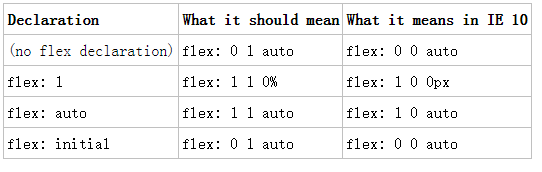
基本上在 IE10 ap 元素中,当“方向”是一行时,它的文本比它的父元素更宽,会溢出,然后将任何其他兄弟元素推出容器。换行在列模式下似乎工作正常(您可以在 Chrome 中查看相同的 jsfiddle 并查看其行为是否符合预期)。

<div id="flex-one">
    <p>Some extra long content (for the container) that correctly wraps!</p>
    <aside>Content</aside>
</div>

<div id="flex-two">
    <p>Some extra long content (for the container) that incorrectly wraps!</p>
    <aside>Content</aside>
</div>

div {
    width: 250px;
    padding: 1em;
    background: blue;
    display: -webkit-flex;
    display: -ms-flexbox;
    margin-bottom: 1em;
}

#flex-one {
    -webkit-flex-flow: column;
    -ms-flex-direction: column;
}

#flex-two {
    -webkit-flex-flow: row;
    -ms-flex-direction: row;
}

p {
    margin: 0;
    padding: 0;
    background: yellow;
}

aside {
    background: red;
}

关于如何纠正这种行为以使其不会溢出容器的任何想法?(不提供固定的,因为它用于流体布局)。

4

5 回答 5

64

这对我来说没有任何意义,但是在 IE10 中添加-ms-flex: 0 1 auto-ms-flex: 1 1 auto到段落并放在一边更正它。默认情况下,元素应该flex: 0 1 auto在它们成为弹性项目时应用到它们。

http://jsfiddle.net/pvJRK/3/

于 2013-05-30T01:08:04.877 回答
30

对我来说,在它开始为我工作之前我需要这样做:

(为清楚起见使用类,为简洁起见不包括前缀)

HTML:

<a class="flex">
    <span class="flex-child">Text that isn't wrapping in IE10</span>
</a>

CSS:

.flex {
    display: flex;
}

.flex-child {
    display: block;
    max-width: 100%;
    flex-shrink: 1;
}

请注意,您需要将自然内联子元素设置为内联以外的其他内容(主要是display:blockdisplay:inline-block),以便修复工作。

感谢以前的答案让我大部分时间都在那里:)

更新:

如果将 flex-direction 设置为 column,则上述技术不起作用。

我对将 flex-direction 设置为 column 的建议是使用最小宽度媒体查询在桌面上分配最大宽度。

.flex {
    display: flex;
    flex-direction: column;
}

//a media query targeting desktop sort of sized screens
@media screen and (min-width: 980px) {
    .flex-child {
        display: block;
        max-width: 500px;//maximimum width of the element on a desktop sized screen
        flex-shrink: 1;
    }
}
于 2015-11-19T04:07:16.840 回答
11

接受的答案对我不起作用。

我的问题(http://jsfiddle.net/Hoffmeyer/xmjs1rmq/)已按照 flexbugs https://github.com/philipwalton/flexbugs#2-column-flex-items-set-to-align-itemscenter-中的描述解决溢出他们的容器

max-width: 100%
于 2015-10-05T06:06:24.430 回答
3

添加flex-shrink: 1到需要包装的元素的父级已在 IE10 中为我解决了这个问题。

注意:(flex: 1 1 auto-ms-flex)是以下的简写:

flex-grow: 1
flex-shrink: 1
flex-basis: auto

在这种情况下,它将专门flex-shrink解决问题。这个属性应该是1默认的,所以我认为这是 IE10 弹性盒子实现的一个错误,通过显式设置它的值,它修复了这个错误。

于 2015-08-18T01:46:23.967 回答
3

在此处输入图像描述

这张图显示了 IE 10 中的默认 flex 均值,IE10 中的 flex-shrink 默认为 0;所以如果代码是:

.title {
   display: flex;
   justify-content: space-between;
}

<div class="title">
    <span class="title-name">some word word word</span>
    <label >some one checkbox</label>
</div>

但跨度不会在 IE10 中换行,所以代码需要是这样的:

.title {
    display: flex;
    justify-content: space-between;
}
.title-name{
    display: block;
    flex-shrink: 1;
}
于 2018-06-06T09:05:34.823 回答