我只想让图像的边缘拉伸屏幕的宽度。不寻找它是一个完整的背景。
我的网站是 www.jobspark.ca
<div class="fullWidthSectionBG">
<div class="fullWidthSection">
<div class="myLeftColumn">
<p>
</p>
</div>
<div class="myRightColumn">
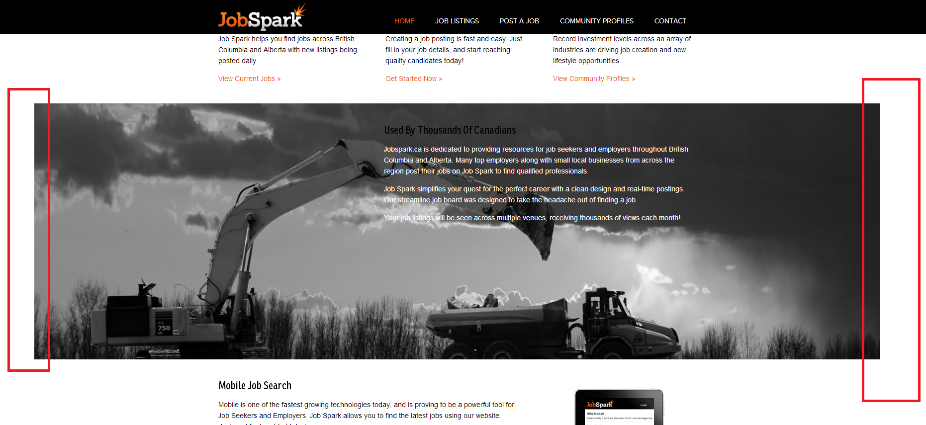
<h2>Used By Thousands Of Canadians</h2>
<p>Jobspark.ca is dedicated to providing resources for job seekers and employers throughout British Columbia and Alberta. Many top employers along with small local businesses from across the region post their jobs on Job Spark to find qualified professionals.</p>
<p>Job Spark simplifies your quest for the perfect career with a clean design and real-time postings. Our streamline job board was designed to take the headache out of finding a job.</p>
<p>Your job listings will be seen across multiple venues, receiving thousands of views each month! </p></div>
</div>
</div>
CSS
.fullWidthSectionBG {
background-image: url('http://static.squarespace.com/static/513d5347e4b0abff73be5264/t/519c45c4e4b084baf13d7e27/1369195972115/rocktruck2.jpg');
background-position:center;
background-repeat: no-repeat;
height:575px;
margin-left: -1600px;
margin-right: -1600px;
}
这个答案很接近,但是网站的其余部分不是图像扩展全屏。
#site > .wrapper {
max-width: 960px;
padding: 0 50px;
margin: 0 auto;
position: relative;
}
将 960 像素更改为 100%
& 摆脱
margin-left: -1600px;
margin-right: -1600px;
几天来我一直在与这个问题作斗争,很高兴能弄清楚一些事情。可能需要缩小才能看到问题。