1

I'm new to HTML & CSS and one of my first steps is creating a normal layout like

/----------------\
|     Header     |
|----------------|
| N  |           |
| a  |   Content |
| v  |           |
|----------------|
|   Foot         |
\----------------/

In order to be flexible, Navs width shouldn't be fixed and the Content should never float around it. In other words, Nav and Content should behave like table columns just that the use of tables for formatting are a big no no in HTML. My current code looks like this:
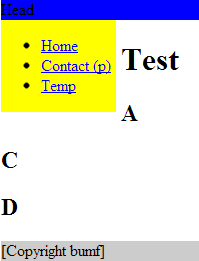
<!DOCTYPE html>
<html>
    <head>
      <title>Todo list</title>
        <style type="text/css">
        nav {
            float: left;
            padding-right: 5px;
            margin-right: 5px;
            background: yellow;
            height: auto;       /* auto | inherit | 100% */
            width: auto;
        }

        #content {
             margin: 5px;
             padding-left: 5px;
        }

        header {
            background: blue;
        }

        footer {
            clear: both;
            background: #ccc;
        }

        .clearfix:after {
                content: ".";
                display: block;
                clear: both;
                visibility: hidden;
                line-height: 0;
                height: 0;
                }
        </style>
    </head> 


  <body>
    <header>
        Head
    </header>

    <nav id="main_nav">
        <ul>
            <li><a href="/">Home</a></li>
            <li><a href="/contact">Contact (p)</a></li> 
            <li><a href="/temp">Temp</a></li>   
        </ul>
    </nav>

    <div id="content" class="clearfix">
        <h1>Test</h1>
        <h2>A</h2><h2>C</h2><h2>D</h2>
    </div>

    <footer>
        <p>[Copyright bumf]</p>
    </footer>
  </body>
</html>

Which results in

uglyNav

Most solutions I found used either a fixed width for Nav or for the Content margin, which isn't a clean. It seems that CSS Multi-column Layout Module or CSS Flexible Box Layout Module could help, but they are both "Candidate Recommendation" so I can't use them safely. What's the proper way to solve my problem?

4

6 回答 6

3

您的标记存在一些严重问题,body标记应包含所有页面元素,基本标记应遵循:

<!DOCTYPE html>
<html>
    <head>
        <!-- meta tags etc -->
    </head> 
    <body>
        <!-- page content -->
    </body>
</html>

至于样式问题,#contentdiv 也只需要向左浮动。还有其他方法,但这可能就足够了。

<!DOCTYPE html>
<html>
    <head>
      <title>Todo list</title>
        <style type="text/css">
        nav {
            float: left;
            padding-right: 5px;
            margin-right: 5px;
            background: yellow;
            height: auto;       /* auto | inherit | 100% */
            width: auto;
        }

        #content {
             margin: 5px;
             padding-left: 5px;
             float: left;
        }

        header {
            background: blue;
        }

        footer {
            clear: both;
            background: #ccc;
        }
        </style>
    </head> 
<body>
    <header>
        Head
    </header>

    <nav id="main_nav">
        <ul>
            <li><a href="/">Home</a></li>
            <li><a href="/contact">Contact (p)</a></li> 
            <li><a href="/temp">Temp</a></li>   
        </ul>
    </nav>


        <div id="content">
    <h1>Test</h1>
    <h2>A</h2><h2>C</h2><h2>D</h2>
    </div>
    <footer>
    <p>[Copyright bumf]</p>
    </footer>

  </body>
</html>
于 2013-05-16T23:02:19.857 回答
2

导航和内容应该表现得像表格列

如果您的意思是字面意思,您可以使用表格布局模型(如Holf 所述)。

请参阅此 jsFiddle或以下代码:

nav {
    display: table-cell;
    padding-right: 5px;
    background: yellow;
    white-space: nowrap; /* Prevent nav from ever inserting line breaks between words (like before "(p)"). */
}

#content {
    display: table-cell;
    padding-left: 5px;
    width: 100%; /* Because of table layout, this will shrink nav to the smallest width its content can handle (similarly to how float widths work). */
}

header {
    background: blue;
}

#main {
    display: table;
    width: 100%;
}

footer {
    background: #ccc;
}
<header>
    Head
</header>

<div id="main">
    <nav id="main_nav">
        <ul>
            <li><a href="/">Home</a></li>
            <li><a href="/contact">Contact (p)</a></li> 
            <li><a href="/temp">Temp</a></li>   
        </ul>
    </nav>

    <div id="content" class="clearfix">
        <h1>Test</h1>
        <h2>A</h2><h2>C</h2><h2>D</h2>
    </div>
</div>

<footer>
    <p>[Copyright bumf]</p>
</footer>
于 2013-05-16T23:43:15.407 回答
2

现在可以在 CSS3 中仅使用纯 CSS 来完成与基于 HTML 的表格布局等效的操作。(见评论)。

自 2.1 版以来,基于 HTML 的表格布局的纯 CSS 等效项已在 CSS 规范中。现在大多数浏览器都很好地支持它们。这是一篇很好的文章。

对 IE7 及以下版本的支持有限

于 2013-05-16T22:54:31.580 回答
1

我会这样做:

示例:jsFiddle

HTML:

<div id="header">Header</div>
<div id="main">
  <div id="nav">
    <div class="wrapper">Nav</div>
  </div>
  <div id="content">
    <div class="wrapper">Content</div>
  </div>
</div>
<div id="footer">Footer</div>

CSS:

<style>
html, body{height:100%; margin:0; padding: 0; background:#ccc;}
#header{ background: #0cc; height:50px; position: absolute; width:100%;}
#main, #content, #nav{ width:100%; height:100%;}
#content{ background: #555; width:75%; float:left;}
#nav{ background: transparent; width:25%; float:left;}
.wrapper{padding: 50px 15px;}
#footer{background: #fcc;  height: 50px; position: fixed; bottom: 0; width: 100%;}
</style>
于 2013-05-16T23:08:30.543 回答
0

那么你需要更好地理解<div>标签和三种定位方案——相对、绝对和固定。

我冒昧地编辑你的代码我的风格,虽然它不包括定位。

<!DOCTYPE HTML PUBLIC "-//W3C//DTD HTML 4.01//EN"
        "http://www.w3.org/TR/html4/strict.dtd">
<html lang="en">
<head>
    <meta http-equiv="Content-Type" content="text/html; charset=utf-8">

    <style type="text/css">
    body,
    html {
        margin:0;
        padding:0;
        color:#000;
        background:#a7a09a;
    }
    #wrap {
        width:750px;
        margin:0 auto;
        background:#99c;
    }
    #header {
        padding:5px 10px;
        background:#ddd;
    }
    h1 {
        margin:0;
    }
    #nav {
        padding:5px 10px;
        background:grey;
    }
    #nav ul {
        margin:0;
        padding:0;
        list-style:none;
    }
    #nav li {
        display:inline;
        margin:0;
        padding:0;
    }
    #sidebar {
        float:left;
        width:230px;
        padding:10px;
        background:yellow;
        height:100%;
    }
    h2 {
        margin:0 0 1em;
    }
    #main {
        float:right;
        width:480px;
        padding:10px;
        background:red;
    }
    #footer {
        clear:both;
        padding:5px 10px;
        background:#cc9;
    }
    #footer p {
        margin:0;
    }
    * html #footer {
        height:1px;
    }
    </style>
</head>
<body>
<div id="wrap">
    <div id="header"><h1>header goes here</h1></div>
    <div id="nav">
        <ul>
            <li><a href="/">Options</a></li>

        </ul>
    </div>
    <div id="sidebar">
        <h2>Siidebar</h2>
        <p><a href="/">Home</a></p>
        <p><a href="/">Content</a></p>
        <p><a href="/">Content</a></p>
        <p><a href="/">Content</a></p></div>

    <div id="main">
        <h2>Main Content</h2>
        <p>Hello</p>
        <ul>
            <li><a href="/">Link 1</a></li>
            <li><a href="/">Link 2</a></li>
            <li><a href="/">Link 3</a></li>

        </ul>
    </div>
    <div id="footer">
        <p>Footer</p>
    </div>
</div>
</body>
</html>
于 2013-05-16T23:53:46.553 回答
0

看看这个页面,我认为它会解决你的问题。

http://www.tutorialrepublic.com/html-tutorial/html-layout.php

于 2013-05-20T05:41:29.817 回答