3

我在 html 中使用 clip:rect() 来调整图像大小,但是当我调整图像大小并检查它时,它会显示其原始高度和宽度。我还描述了我想做什么。

  • 当屏幕宽度 = 1024 时,全屏显示
  • 当屏幕宽度 = 768 时,应仅显示图像的中心部分。
  • 我想使用单个图像来完成此操作。

我还粘贴了该图像的屏幕截图。

图像(屏幕宽度 = 1024)

在此处输入图像描述

图像(屏幕宽度 = 768)旋转 768*1024

在此处输入图像描述

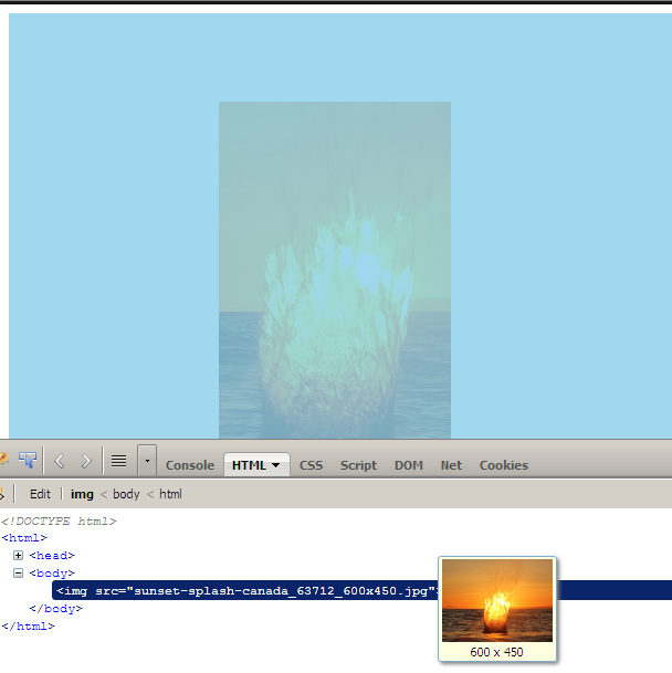
但是当我检查图像@width = 768时,它会显示它的原始高度和宽度

在此处输入图像描述

所以我无法完美地放置我的其他代码。

这是我的代码。

HTML

<!DOCTYPE html>
<html>
    <head>
    <style>


    @media screen and (max-width: 1024px){
    img 
        {
            position:absolute;
            clip:rect(0px,600px,450px,0px);
        }
    }

    @media screen and (max-width: 768px){
    img 
        {
            position:absolute;
            clip:rect(80px,400px,400px,190px);
        }
    }


    </style>

    </head>

    <body>
    <img src="sunset-splash-canada_63712_600x450.jpg"/>
    </body>
</html>

使用来自@BASarat 的代码后

在此处输入图像描述

4

2 回答 2

1

如果您使用剪辑和绝对位置,最好的办法是在剪辑后重新定位具有负顶部和左侧值的图像。

这里描述了你是如何做到的: http ://css-tricks.com/css-sprites-with-inline-images/

于 2013-11-22T14:04:40.993 回答
0

它将继续以这种方式在检查中显示。除了剪裁之外,最好的办法是设置图像宽度/高度。

您可以为此使用 jquery 或直接使用 css:

@media screen and (max-width: 1024px){
img 
    {
        position:absolute;
        width: 600px; /* what ever height / width you want */ 
        height:450px;
        clip:rect(0px,600px,450px,0px);
    }
}

@media screen and (max-width: 768px){
img 
    {
        position:absolute;
        width: 320px; /* what ever height / width you want */ 
        height: 210px;
        clip:rect(80px,400px,400px,190px);
    }
}
于 2013-05-11T11:35:36.877 回答