I need to create a page layout like in the following illustration with twitter bootstrap:
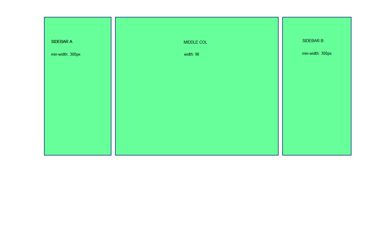 The left and right sidebars should have a width of at least lets say 300px. If there is more space they can grow but they should not shrink (elsewhere navigation links will get cut).
The middle column should fill the entire space left.
The left and right sidebars should have a width of at least lets say 300px. If there is more space they can grow but they should not shrink (elsewhere navigation links will get cut).
The middle column should fill the entire space left.
I have tried it by assigning a min-width to the sidebar spans, but in this case the last sidebar (b) will switch to the next line if the browser content area width gets below 1300px. I`m not using responsive twitter bs css.
Is there a way to avoid this ? I have already found some approaches, but only without bootstrap, which do not work for me.
As the site I am talking about is already running I will not paste code here but please take a look at it live at http://kunden.tommy-computer.at/fsv_noetsch/ (german)
Thank you for your help !
Best regards, Thomas