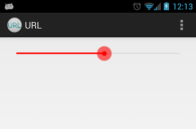
252

我想设计一个搜索栏,如下图所示。

在此处输入图像描述

通过使用默认搜索栏,我会得到这样的东西:

在此处输入图像描述

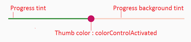
所以我需要的是只改变颜色。我不需要额外的样式。是否有任何直接的方法可以做到这一点,或者我应该构建我的自定义可绘制对象。?

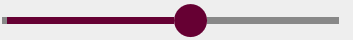
我尝试构建自定义一个,但我无法获得如上所示的确切一个。使用自定义drawable后,我得到如下所示:

在此处输入图像描述

如果我需要构建自定义的,那么请建议如何减少进度线的宽度以及形状。

我的自定义实现:

background_fill.xml:

<?xml version="1.0" encoding="UTF-8"?>
<shape xmlns:android="http://schemas.android.com/apk/res/android" >

    <gradient
        android:angle="90"
        android:centerColor="#FF555555"
        android:endColor="#FF555555"
        android:startColor="#FF555555" />

    <corners android:radius="1dp" />

    <stroke
        android:width="1dp"
        android:color="#50999999" />
    <stroke
        android:width="1dp"
        android:color="#70555555" />

</shape>

进度填充.xml

<?xml version="1.0" encoding="UTF-8"?>
<shape xmlns:android="http://schemas.android.com/apk/res/android" >

    <gradient
        android:angle="90"
        android:centerColor="#FFB80000"
        android:endColor="#FFFF4400"
        android:startColor="#FF470000" />

    <corners android:radius="1dp" />

    <stroke
        android:width="1dp"
        android:color="#50999999" />
    <stroke
        android:width="1dp"
        android:color="#70555555" />

</shape>

进度.xml

<?xml version="1.0" encoding="utf-8"?>
<layer-list xmlns:android="http://schemas.android.com/apk/res/android" >

    <item
        android:id="@android:id/background"
        android:drawable="@drawable/background_fill"/>
    <item android:id="@android:id/progress">
        <clip android:drawable="@drawable/progress_fill" />
    </item>

</layer-list>

拇指.xml

<?xml version="1.0" encoding="UTF-8"?>
<shape xmlns:android="http://schemas.android.com/apk/res/android"
    android:shape="oval" >

    <gradient
        android:angle="270"
        android:endColor="#E5492A"
        android:startColor="#E5492A" />

    <size
        android:height="20dp"
        android:width="20dp" />

</shape>

搜索栏:

<SeekBar
        android:id="@+id/seekBarDistance"
        android:layout_width="match_parent"
        android:layout_height="wrap_content"
        android:layout_alignParentLeft="true"
        android:layout_alignParentTop="true"
        android:layout_marginTop="88dp"
        android:progressDrawable="@drawable/progress"
        android:thumb="@drawable/thumb" >
    </SeekBar>
4

25 回答 25

309

我将从 Android 源代码中提取可绘制对象和 xml,并将其颜色更改为红色。这是我如何为 mdpi drawables 完成此操作的示例:

自定义red_scrubber_control.xml(添加到 res/drawable):

<selector xmlns:android="http://schemas.android.com/apk/res/android">

    <item android:drawable="@drawable/red_scrubber_control_disabled_holo" android:state_enabled="false"/>
    <item android:drawable="@drawable/red_scrubber_control_pressed_holo" android:state_pressed="true"/>
    <item android:drawable="@drawable/red_scrubber_control_focused_holo" android:state_selected="true"/>
    <item android:drawable="@drawable/red_scrubber_control_normal_holo"/>
</selector>

风俗:red_scrubber_progress.xml

<layer-list xmlns:android="http://schemas.android.com/apk/res/android" >

    <item
        android:id="@android:id/background"
        android:drawable="@drawable/red_scrubber_track_holo_light"/>
    <item android:id="@android:id/secondaryProgress">
        <scale
            android:drawable="@drawable/red_scrubber_secondary_holo"
            android:scaleWidth="100%" />
    </item>
    <item android:id="@android:id/progress">
        <scale
            android:drawable="@drawable/red_scrubber_primary_holo"
            android:scaleWidth="100%" />
    </item>

</layer-list>

然后从 Android 源代码中复制所需的可绘制对象,我从这个链接中获取

最好为每个 hdpi、mdpi、xhdpi 复制这些可绘制对象。例如我只使用 mdpi:

然后使用 Photoshop 将颜色从蓝色变为红色:

red_scrubber_control_disabled_holo.png: red_scrubber_control_disabled_holo

red_scrubber_control_focused_holo.png: red_scrubber_control_focused_holo

red_scrubber_control_normal_holo.png: red_scrubber_control_normal_holo

red_scrubber_control_pressed_holo.png: red_scrubber_control_pressed_holo

red_scrubber_primary_holo.9.png: red_scrubber_primary_holo.9

red_scrubber_secondary_holo.9.png: red_scrubber_secondary_holo.9

red_scrubber_track_holo_light.9.png: red_scrubber_track_holo_light.9

将 SeekBar 添加到布局中:

<SeekBar
    android:id="@+id/seekBar1"
    android:layout_width="match_parent"
    android:layout_height="wrap_content"
    android:progressDrawable="@drawable/red_scrubber_progress"
    android:thumb="@drawable/red_scrubber_control" />

结果:

在此处输入图像描述

于 2013-04-23T09:15:51.897 回答
101

Android seekbar 自定义材质样式,用于其他 seekbar 自定义http://www.zoftino.com/android-seekbar-and-custom-seekbar-examples

<style name="MySeekBar" parent="Widget.AppCompat.SeekBar">
    <item name="android:progressBackgroundTint">#f4511e</item>
    <item name="android:progressTint">#388e3c</item>
    <item name="android:thumbTint">#c51162</item>
</style>

seekbar 自定义材质样式

更新:colorControlActivatedthumbTint现在。

于 2017-09-25T13:15:59.460 回答
74

我的答案灵感来自 Andras Balázs Lajtha 的答案,它允许在没有 xml 文件的情况下工作

seekBar.getProgressDrawable().setColorFilter(Color.RED, PorterDuff.Mode.SRC_IN);
seekBar.getThumb().setColorFilter(Color.RED, PorterDuff.Mode.SRC_IN);
于 2015-12-09T17:55:58.427 回答
61

如果您想要完全相同但为红色的条形,您可以通过编程方式添加 PorterDuff 滤色器。您可以通过ProgressBar基类的方法获取要着色的每个可绘制对象。然后为它设置一个滤色器

mySeekBar.getProgressDrawable().setColorFilter(new PorterDuffColorFilter(srcColor, PorterDuff.Mode.MULTIPLY));

如果无法通过 Porter Duff 滤镜进行所需的颜色调整,您可以指定自己的颜色滤镜

于 2013-08-24T05:26:44.563 回答
46

谷歌在 SDK 21 中使这更容易。现在我们有用于指定拇指色调颜色的属性:

android:thumbTint
android:thumbTintMode
android:progressTint

http://developer.android.com/reference/android/widget/AbsSeekBar.html#attr_android:thumbTint http://developer.android.com/reference/android/widget/AbsSeekBar.html#attr_android:thumbTintMode

于 2014-12-02T20:54:38.923 回答
43

只需用您的颜色替换颜色属性

背景.xml

<shape xmlns:android="http://schemas.android.com/apk/res/android"
    android:shape="line">

    <stroke android:width="1dp" android:color="#D9D9D9"/>
    <corners android:radius="1dp" />

</shape>

进度.xml

<shape xmlns:android="http://schemas.android.com/apk/res/android"
     android:shape="line">

    <stroke android:width="1dp" android:color="#2EA5DE"/>
    <corners android:radius="1dp" />

</shape>

样式.xml

<layer-list xmlns:android="http://schemas.android.com/apk/res/android" >

    <item
        android:id="@android:id/background"
        android:drawable="@drawable/seekbar_background"/>
    <item android:id="@android:id/progress">
        <clip android:drawable="@drawable/seekbar_progress" />
    </item>

</layer-list>

拇指.xml

<shape xmlns:android="http://schemas.android.com/apk/res/android"
    android:shape="oval">

    <size android:height="30dp" android:width="30dp"/>
    <stroke android:width="18dp" android:color="#882EA5DE"/>
    <solid android:color="#2EA5DE" />
    <corners android:radius="1dp" />

</shape>
于 2014-11-20T09:01:10.970 回答
23

所有这些答案都已弃用。

在 2019 年,将您的搜索栏更改为您喜欢的颜色会更ProgressBar容易

<SeekBar
            android:id="@+id/seekBar"
            android:layout_width="match_parent"
            android:layout_height="wrap_content"
            android:progressTint="#36970f"
            android:thumbTint="#36970f"
            />

以编程方式设置搜索栏颜色的样式尝试以下代码

        seekBar.getProgressDrawable().setColorFilter(Color.RED, PorterDuff.Mode.SRC_IN);
        seekBar.getThumb().setColorFilter(Color.RED, PorterDuff.Mode.SRC_IN);
于 2019-03-07T13:10:09.707 回答
14

对于 API < 21(和 >= 21),您可以使用@Ahamadullah Saikathttps://www.lvguowei.me/post/customize-android-seekbar-color/的答案。

在此处输入图像描述

<SeekBar
    android:id="@+id/seekBar"
    android:layout_width="match_parent"
    android:layout_height="wrap_content"
    android:maxHeight="3dp"
    android:minHeight="3dp"
    android:progress="50"
    android:progressDrawable="@drawable/seek_bar_ruler"
    android:thumb="@drawable/seek_bar_slider"
    />

可绘制/seek_bar_ruler.xml:

<?xml version="1.0" encoding="utf-8"?>
<layer-list xmlns:android="http://schemas.android.com/apk/res/android">
    <item android:id="@android:id/background">
        <shape android:shape="rectangle">
            <solid
                android:color="#94A3B3" />
            <corners android:radius="2dp" />
        </shape>
    </item>
    <item android:id="@android:id/progress">
        <clip>
            <shape android:shape="rectangle">
                <solid
                    android:color="#18244D" />
                <corners android:radius="2dp" />
            </shape>
        </clip>
    </item>
</layer-list>

可绘制/seek_bar_slider.xml:

<?xml version="1.0" encoding="utf-8"?>
<shape xmlns:android="http://schemas.android.com/apk/res/android"
    android:shape="oval"
    >

    <solid android:color="#FFFFFF" />
    <stroke
        android:width="4dp"
        android:color="#18244D"
        />
    <size
        android:width="25dp"
        android:height="25dp"
        />
</shape>
于 2019-05-24T12:41:17.740 回答
13

刚设置

android:maxHeight="3dp"
android:minHeight="3dp"

就这样

于 2013-09-05T09:37:39.873 回答
13

输出:

在此处输入图像描述

更改进度颜色:

int normalColor = ContextCompat.getColor(context, R.color.normal_color);
int selectedColor = ContextCompat.getColor(context, R.color.selected_color);
Drawable normalDrawable = new ColorDrawable(normalColor);
Drawable selectedDrawable = new ColorDrawable(selectedColor);
ClipDrawable clipDrawable = new ClipDrawable(selectedDrawable, Gravity.LEFT, ClipDrawable.HORIZONTAL);
Drawable[] layers = {normalDrawable, clipDrawable, clipDrawable};
LayerDrawable seekbarDrawable = new LayerDrawable(layers);
seekBar.setProgressDrawable(seekbarDrawable);

更改拇指颜色:

int thumbColor = ContextCompat.getColor(context, R.color.thumb_color);
Drawable unwrappedDrawable = AppCompatResources.getDrawable(context, R.drawable.ic_seekbar_thumb);
assert unwrappedDrawable != null;
Drawable wrappedDrawable = DrawableCompat.wrap(unwrappedDrawable);
DrawableCompat.setTint(wrappedDrawable, thumbColor);
seekBar.setThumb(wrappedDrawable);
于 2018-04-28T09:27:23.113 回答
12

如上所述(@andrew),使用此站点创建自定义 SeekBar 非常容易 - http://android-holo-colors.com/

只需在此处启用 SeekBar,选择颜色,然后接收所有资源并复制到项目。然后在xml中应用它们,例如:

  android:thumb="@drawable/apptheme_scrubber_control_selector_holo_light"
  android:progressDrawable="@drawable/apptheme_scrubber_progress_horizontal_holo_light"
于 2015-04-25T01:43:29.883 回答
11
<SeekBar
android:id="@+id/seekBar1"
android:layout_width="match_parent"
android:layout_height="wrap_content"
android:layout_gravity="center"
android:progressTint="@color/red"
android:thumbTint="@color/red" />

工作方式与选择的答案相同。无需制作任何可绘制文件或其他。(仅限 IN 5.0)问候

于 2014-12-19T11:30:47.130 回答
8
LayerDrawable progressDrawable = (LayerDrawable) mSeekBar.getProgressDrawable();

// progress bar line *progress* color
Drawable processDrawable = progressDrawable.findDrawableByLayerId(android.R.id.progress);

// progress bar line *background* color
Drawable backgroundDrawable = progressDrawable.findDrawableByLayerId(android.R.id.background);

// progress bar line *secondaryProgress* color
Drawable secondaryProgressDrawable = progressDrawable.findDrawableByLayerId(android.R.id.secondaryProgress);
processDrawable.setColorFilter(Color.RED, PorterDuff.Mode.SRC_IN);

// progress bar line all color
mSeekBar.getProgressDrawable().setColorFilter(Color.BLUE, PorterDuff.Mode.SRC_IN);

// progress circle color
mSeekBar.getThumb().setColorFilter(Color.GREEN, PorterDuff.Mode.SRC_IN);
于 2017-03-23T08:38:56.743 回答
6

默认情况下,android 会将滑块的进度颜色与

`<item name="colorAccent">`

您的styles.xml中的值。然后,要设置自定义滑块缩略图,只需在SeekBar xml 布局的块中使用此代码:

android:thumb="@drawable/slider"
于 2015-09-28T16:54:25.897 回答
4

如果您使用的是 android Sdk 提供的默认 SeekBar,那么它们是一种更改其颜色的简单方法。只需转到 /res/values/colors.xml 中的 color.xml 并更改 colorAccent。

<resources>
    <color name="colorPrimary">#212121</color>
    <color name="colorPrimaryDark">#1e1d1d</color>
     <!-- change below line -->
    <color name="colorAccent">#FF4081</color>
</resources>
于 2015-10-24T14:38:00.063 回答
3

更改搜索栏颜色的简单方法...

 <ProgressBar
            android:id="@+id/progress"
            android:layout_width="wrap_content"
            android:layout_height="wrap_content"
            android:layout_gravity="center"
            android:theme="@style/Progress_color"/>

风格 : Progress_color

 <style name="Progress_color">
    <item name="colorAccent">@color/white</item> <!-- Whatever color you want-->
</style>

java类更改ProgressDrawable()

seek_bar.getProgressDrawable().setColorFilter(getResources().getColor(R.color.white), PorterDuff.Mode.MULTIPLY);
于 2017-02-14T06:06:12.277 回答
2

我改变background_fill.xml

<?xml version="1.0" encoding="UTF-8"?>
  <shape xmlns:android="http://schemas.android.com/apk/res/android"
android:shape="line" >
<size android:height="1dp" />
<gradient
    android:angle="0"
    android:centerColor="#616161"
    android:endColor="#616161"
    android:startColor="#616161" />
<corners android:radius="0dp" />
<stroke
    android:width="1dp"
    android:color="#616161" />
<stroke
    android:width="1dp"
    android:color="#616161" />
</shape>

progress_fill.xml

<?xml version="1.0" encoding="UTF-8"?>
<shape xmlns:android="http://schemas.android.com/apk/res/android"
android:shape="line" >
<size android:height="1dp" />
<gradient
    android:angle="0"
    android:centerColor="#fafafa"
    android:endColor="#fafafa"
    android:startColor="#fafafa" />
<corners android:radius="1dp" />
<stroke
    android:width="1dp"
    android:color="#cccccc" />
<stroke
    android:width="1dp"
    android:color="#cccccc" />
 </shape>

制作背景和进度1dp高度。

于 2015-02-25T00:17:36.333 回答
1

如果您查看 Android 资源,搜索栏实际上使用图像。

您必须制作一个在顶部和底部透明的可绘制对象,例如 10px 并且中心 5px 线可见。

参考附图。您需要将其转换为 NinePatch。

在此处输入图像描述

于 2013-04-23T08:17:02.823 回答
1

使用材料组件库 1.2.0 版,您可以使用新Slider组件。

 <com.google.android.material.slider.Slider
       android:valueFrom="0"
       android:valueTo="300"
       android:value="200"
       android:theme="@style/slider_red"
       />

您可以使用以下内容覆盖默认颜色:

  <style name="slider_red">
    <item name="colorPrimary">#......</item>
  </style>

在此处输入图像描述

否则,您可以在布局中使用这些属性来定义颜色或颜色选择器:

   <com.google.android.material.slider.Slider
       app:activeTrackColor="@color/...."
       app:inactiveTrackColor="@color/...."
       app:thumbColor="@color/...."
       />

或者您可以使用自定义样式:

 <style name="customSlider" parent="Widget.MaterialComponents.Slider">
    <item name="activeTrackColor">@color/....</item>
    <item name="inactiveTrackColor">@color/....</item>
    <item name="thumbColor">@color/....</item>
  </style>
于 2019-10-21T22:59:21.803 回答
0

对于那些使用数据绑定的人:

  1. 将以下静态方法添加到任何类

    @BindingAdapter("app:thumbTintCompat")
    public static void setThumbTint(SeekBar seekBar, @ColorInt int color) {
        seekBar.getThumb().setColorFilter(color, PorterDuff.Mode.SRC_IN);
    }
    
  2. app:thumbTintCompat属性添加到您的 SeekBar

    <SeekBar
           android:id="@+id/seek_bar"
           style="@style/Widget.AppCompat.SeekBar"
           android:layout_width="wrap_content"
           android:layout_height="wrap_content"
           app:thumbTintCompat="@{@android:color/white}"
    />
    

就是这样。现在您可以使用app:thumbTintCompat任何SeekBar. 可以以相同的方式配置进度色调。

注意:此方法也与棒棒糖前的设备兼容。

于 2017-03-16T11:54:35.463 回答
0

@arnav-rao 对答案的小修正:

要确保拇指正确着色,请使用:

<style name="MySeekBar" parent="Widget.AppCompat.SeekBar">
    <item name="android:progressBackgroundTint">@color/colorBgTint</item>
    <item name="android:progressTint">@color/colorProgressTint</item>
    <item name="android:thumbTint">@color/colorThumbTint</item>
</style>

这里 android:thumbTint 实际上为“拇指”着色

于 2018-05-10T21:45:47.787 回答
0

检查本教程非常好

https://www.lvguowei.me/post/customize-android-seekbar-color/

简单的 :

<SeekBar
                android:id="@+id/seekBar"
                android:layout_width="match_parent"
                android:layout_height="wrap_content"
                android:max="100"
                android:maxHeight="3dp"
                android:minHeight="3dp"
                android:progressDrawable="@drawable/seekbar_style"
                android:thumbTint="@color/positive_color"/>

然后是样式文件:

<?xml version="1.0" encoding="utf-8"?>
<layer-list xmlns:android="http://schemas.android.com/apk/res/android" >
    <item android:id="@android:id/background">
        <shape android:shape="rectangle" >
            <solid
                android:color="@color/positive_color" />
        </shape>
    </item>
    <item android:id="@android:id/progress">
        <clip>
            <shape android:shape="rectangle" >
                <solid
                    android:color="@color/positive_color" />
            </shape>
        </clip>
    </item>
</layer-list>
于 2018-05-16T08:09:41.740 回答
0

我想为搜索栏创建一个样式,然后将该样式添加到主题中,以便我可以将其应用于整个主题,同时仍允许子样式覆盖它。这是我所做的:

<!-- Blue App Theme -->
    <style name="AppTheme.Blue" parent="BaseTheme.Blue">        
        <item name="android:seekBarStyle">@style/SeekbarStyle.Blue</item>
        <item name="seekBarStyle">@style/SeekbarStyle.Blue</item> <!--This is essential for some devices, e.g. Samsung-->
</style>

<!-- Slider Styles -->
<style name="SeekbarStyle.Blue" parent="Widget.AppCompat.SeekBar">
        <item name="android:progressBackgroundTint">@color/material_blue_a700_pct_30</item>
        <item name="android:thumbTint">@color/material_blue_a700</item>
        <item name="android:thumbTintMode">src_in</item>
        <item name="android:progressTint">@color/material_blue_a700</item>
</style>

<style name="SeekbarStyle.Green" parent="Widget.AppCompat.SeekBar">
        <item name="android:progressBackgroundTint">@color/material_green_a700_pct_30</item>
        <item name="android:thumbTint">@color/material_green_a700</item>
        <item name="android:thumbTintMode">src_in</item>
        <item name="android:progressTint">@color/material_green_a700</item>
</style>

以上将所有 21 岁以上设备的 Theme seekbar 样式设置为蓝色,包括三星(除了 android:seekBarStyle 之外还需要应用 seekBarStyle;不知道为什么,但我亲眼看到了这个问题)。如果您希望所有搜索栏保持主题样式并且仅将绿色搜索栏样式应用于一些小部件,则将以下内容添加到您想要的小部件中:

<SeekBar
            android:layout_width="match_parent"
            android:layout_height="wrap_content"
            android:theme="@style/AppTheme.Green"/>
于 2018-11-13T16:33:32.953 回答
0

现在它变得非常容易,使用材质滑块并使用它来自定义颜色:

   app:thumbColor="@color/colorPrimary"
   app:trackColorInactive="@color/grey"
   app:trackColorActive="@color/colorPrimary"
于 2021-09-27T11:02:43.300 回答
-1

你也可以这样:

<SeekBar
    android:id="@+id/redSeekBar"
    android:layout_width="match_parent"
    android:layout_height="wrap_content"
    android:progressDrawable="@color/red"
    android:maxHeight="3dip"/>

希望它会有所帮助!

于 2015-12-06T16:23:20.323 回答