68

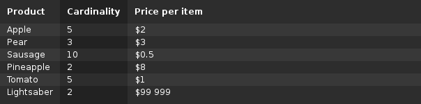
假设我有一张只有三个小列的表。将一张又窄又高的桌子紧贴在屏幕的左侧(示例)看起来很不整洁和不平衡,所以我希望桌子能覆盖页面的宽度。但是,当我将表格宽度设置为 100% 时,所有列也会被拉伸,所以现在我的数据在屏幕上散布得很薄,看起来也很不整齐(示例)。

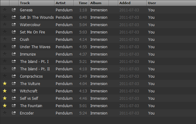
我正在寻找的是一个解决方案,其中所有列的大小与如果表是 的大小相同width: auto,但最后一列填充屏幕上的剩余空间。这就是 Spotify 所做的,例如:

Spotify

无论如何,“用户”列将覆盖剩余的宽度。有没有一种相对简单的方法可以通过 HTML 表格和 CSS 实现这一点?

4

2 回答 2

83

我找到了一个简单的解决方案:

table td:last-child {
    width: 100%;
}

结果:

截屏

body {
    font: 12px "Sans serif";
}

table {
    width: 100%;

    background-color: #222222;
    color: white;
    border-collapse: collapse;
}

table th {
    padding: 10px;
    text-align: left;
}

table td {
    padding: 2px 10px;
}

table td:last-child {
    width: 100%;
}

table td:nth-child(odd), table th:nth-child(odd) {
    background-color: rgba(255, 255, 255, 0.05);
}

table tr:nth-child(even) {
    background-color: rgba(255, 255, 255, 0.05);
}

table tr:last-child td {
    padding-bottom: 10px;
}
<table>
    <tr>
        <th>Product</th>
        <th>Cardinality</th>
        <th>Price per item</th>
    </tr>
    <tr>
        <td>Apple</td>
        <td>5</td>
        <td>$2</td>
    </tr>
    <tr>
        <td>Pear</td>
        <td>3</td>
        <td>$3</td>
    </tr>
    <tr>
        <td>Sausage</td>
        <td>10</td>
        <td>$0.5</td>
    </tr>
    <tr>
        <td>Pineapple</td>
        <td>2</td>
        <td>$8</td>
    </tr>
    <tr>
        <td>Tomato</td>
        <td>5</td>
        <td>$1</td>
    </tr>
    <tr>
        <td>Lightsaber</td>
        <td>2</td>
        <td>$99 999</td>
    </tr>
</table>

这似乎在我当前的情况下有效,但它看起来可能会在其他情况下导致不必要的副作用。如果我偶然发现,我会编辑这个答案。

可能的副作用

  • 多字表格单元格将被包装成多行以使列尽可能窄。一种解决方案是white-space: nowrap在表格单元格上使用,但这会阻碍包含大量文本的单元格在应该换行时进行换行。
于 2013-04-22T00:52:55.250 回答
23

如果这是你的意思:图片

然后我可以使用具有以下 css 的标准 html 表结构来实现这一点:

table {
  width:auto;
}
td {
  white-space:nowrap;
}
td:last-child {
  width:100%;
}

--编辑:使用你的 jsfiddle

于 2013-04-22T00:52:27.540 回答