我正在为客户做一个复杂的项目。我设计了一个全屏登录页面,需要在所有大小的 windows/mobile 上兼容(响应式)。目前我无法定位图像以覆盖整个页面。div (slider-full-width) 需要跨越整个窗口。我提供了一张图片来展示我想要实现的目标。我正在使用骨架框架。http://www.getskeleton.com/在这个全屏登陆页面之后,您必须能够继续向下滚动才能看到页面的其余内容。
我的 HTML:
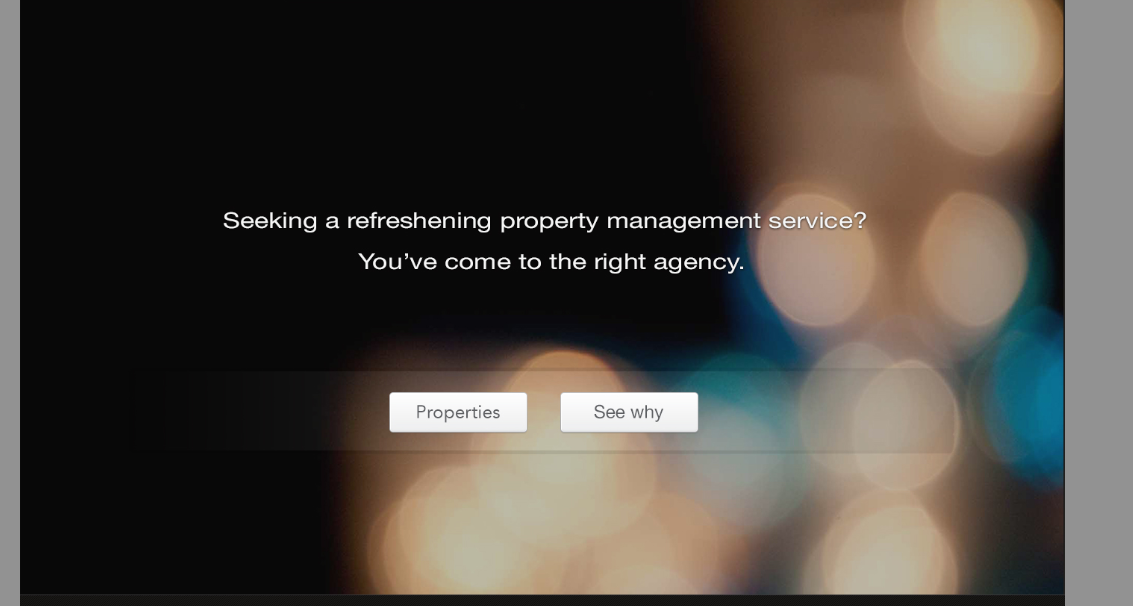
  <div id="slider-full-width">
<div class="container">
  <h2>Seeking a refreshening management service?</h2>
  <h2>You've come to the right place</h2>
  <div id="button-bg">
  <a href="properties.html" class="presentation-button">Properties</a>
  <a href="#body-span-class" class="presentation-button">See why</a>
</div>
我的 CSS:
    #slider-full-width{
width: 100%;
background-image: url('../img/slide-01.jpg');
position:relative;
text-align: center;}
    #slider-full-width h2 {
color: #efefef;
}
非常感谢您!