8

假设我在表格中的列是idnamedescriptionphone。该description列是 1-255 个字符,但 id 最多只有 3 个字符。

我希望列的大小适当,而不是每列的大小相同。description当窗口太小而无法完全容纳内容时,我希望该列溢出到省略号。

table-layout:fixed;是进行text-overflow: ellipsis;工作的标准方法,但它将所有列的大小调整为相同的大小。我宁愿保持宽度auto而不是固定的。

你能帮我吗?

这是我的jsFiddle:http: //jsfiddle.net/RQhkk/1/

这是我正在处理的屏幕截图:

表格列

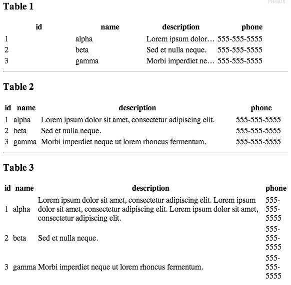
请注意如何Table 1使所有列的大小相同?那是糟糕的。

请注意如何Table 2根据内容调整列的大小?那挺好的。除非内容太长:Table 3. 然后就不合适了。在那种情况下,我希望它溢出到省略号。

这是我的 html 表格和 css 代码:

<div id="t1">
<table>
    <thead>
        <tr>
            <th>id</th>
            <th>name</th>
            <th class="ellipsis">description</th>
            <th>phone</th>
        </tr>
    </thead>
    <tbody>
        <tr>
            <td>1</td>
            <td>alpha</td>
            <td class="ellipsis">Lorem ipsum dolor sit amet, consectetur adipiscing elit.</td>
            <td>555-555-5555</td>
        </tr>
        <tr>
            <td>2</td>
            <td>beta</td>
            <td class="ellipsis">Sed et nulla neque.</td>
            <td>555-555-5555</td>
        </tr>
        <tr>
            <td>3</td>
            <td>gamma</td>
            <td class="ellipsis">Morbi imperdiet neque ut lorem rhoncus fermentum.</td>
            <td>555-555-5555</td>
        </tr>
    </tbody>
</table>
</div>

<style>
#t1 table {
    table-layout:fixed;
    width:100%;
}
#t1 td {
    white-space: nowrap;
}
#t1 td.ellipsis {
    overflow: hidden;
    white-space: nowrap;
    text-overflow: ellipsis;
    word-break: break-all;
    word-wrap: break-word;
}
</style>

如果我删除table-layout: fixed;列宽是您所期望的 - 根据内容调整大小。不幸的是,如果没有固定的布局,我就无法让省略号工作。我哪里错了?

4

3 回答 3

13

我找到的解决方案是将您的单元格设置为如下样式:

td{
    white-space: nowrap;
}

td.description{
    overflow: hidden;
    text-overflow: ellipsis;
    max-width: 1px;    
    width: 100%;
}

第一部分将强制每一列尽可能地收缩,并椭圆化任何单元格中的任何剪切文本。但是,它们不会收缩到 1px,因为您可以使用表头来提供最小宽度。它还可以防止表格内的换行。

第二部分确保所有空闲空间都被描述列占用,而不是在所有列之间均匀分布。

最后,如果您想在描述列上施加真正的最小宽度,请将最小宽度放在列标题而不是列单元格上,因为除了最大宽度之外,单元格不能收缩到比标题。

有关实现,请参见http://jsfiddle.net/BCZTB/

于 2013-12-05T22:37:11.043 回答
3

如果您指定一个max-widthfor ,它应该可以工作td.ellipsis

于 2013-04-09T15:28:26.477 回答
1

我的解决方案是使用 jquery 获取列中文本的最大宽度并将它们分配给内容宽度,省略号列除外,它将是最大大小。

我的 jsfiddle 示例可以在这里找到http://jsfiddle.net/qt7eQ/1/

<script type="text/javascript">
$(function() {
    //add a innerParagraph block element to all columns except for the one that has the class ellipsis
    $( "#t3 tr td:not(.ellipsis)" ).wrapInner(function() {
          return "<p class='innerParagraph'></p>";
    });

    //get the first column and assign it the width of the elements in the first column
    $( "#t3 tr th:nth-child(1)" ).width( getMaxWidthOf( "#t3 tr>td:nth-child(1) p" ) );
    $( "#t3 tr td:nth-child(1)" ).width( getMaxWidthOf( "#t3 tr>td:nth-child(1) p" ) );

    //get the second column and assign it the width of the elements in the second column
    $( "#t3 tr th:nth-child(2)" ).width( getMaxWidthOf( "#t3 tr>td:nth-child(2) p" ) );
    $( "#t3 tr td:nth-child(2)" ).width( getMaxWidthOf( "#t3 tr>td:nth-child(2) p" ) );

    //get the fourth column and assign it the width of the elements in the forth column
    $( "#t3 tr th:nth-child(4)" ).width( getMaxWidthOf( "#t3 tr>td:nth-child(4) p" ) );
    $( "#t3 tr td:nth-child(4)" ).width( getMaxWidthOf( "#t3 tr>td:nth-child(4) p" ) );
});


function getMaxWidthOf(selector){
    var maxWidth = 0;
    //go through each paragraph in the right column and find the widest value.
    $(selector).each(function() {
        if(maxWidth < $(this).width()){
            maxWidth = $(this).width();
        }
    });
    // assign max width to column
    return maxWidth;
}
</script>

<!-- add this style -->
<style type="text/css">
#t3 table {
    table-layout:fixed;
{
.innerParagraph {
    margin:0;
    display:inline-block;
}
</style>
于 2013-10-06T20:17:02.467 回答