12

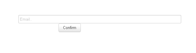
我对 Bootstrap 有一些问题。我通过使用使表单和按钮居中span6 offset3,但现在不知道如何在此表单下居中按钮。我试过了,text-align: center但它仍然在左边。

<div class="container">
    <div class="row">
        <div class="span6 offset3">
            <form>
                <input class="input-xxlarge" type="text" placeholder="Email..">
                <p style="line-height: 70px; text-align: center;"><button type="submit" class="btn">Confirm</button></p>
            </form>
        </div>
    </div>
</div>

4

11 回答 11

23

删除该<p>标签并在其中添加按钮,<div class="form-actions">如下所示:

<div class="form-actions">
    <button type="submit" class="btn">Confirm</button>
</div>

然后增加 CSS 类:

.form-actions {
    margin: 0;
    background-color: transparent;
    text-align: center;
}

这是一个 JS Bin 演示:http: //jsbin.com/ijozof/2


form-actions在此处查找Bootstrap文档:

http://twitter.github.io/bootstrap/base-css.html#buttons

于 2013-04-07T21:03:22.117 回答
15

使用 Bootstrap 3,您可以使用 'text-center' 样式属性。

<div class="col-md-3 text-center"> 
  <button id="button" name="button" class="btn btn-primary">Press Me!</button> 
</div>
于 2015-04-23T18:07:46.320 回答
2

如果您使用的是Bootstrap 4,请尝试以下操作:

<div class="mx-auto text-center">
    <button id="button" name="button" class="btn btn-primary">Press Me!</button>
</div>
于 2018-10-15T08:33:52.727 回答
1

Width:100%并且text-align:center会根据我的经验工作

<p style="display:block; line-height: 70px; width:100%; text-align:center; margin:0 auto;"><button type="submit" class="btn">Confirm</button></p>
于 2013-04-07T21:11:09.903 回答
1

尝试添加此类

class="pager"

<p class="pager" style="line-height: 70px;">
    <button type="submit" class="btn">Confirm</button>
</p>

我在其中尝试了我的<div class=pager><button etc etc></div> ,效果很好

请参阅http://getbootstrap.com/components/查看分页 -> 寻呼机

这看起来像正确的引导类以将其居中,text-align: center;用于文本而不是图像和块等。

于 2014-02-02T14:02:29.933 回答
1

我这样做<center></center>

<div class="form-actions">
            <center>
                    <button type="submit" class="submit btn btn-primary ">
                        Sign In <i class="icon-angle-right"></i>
                    </button>
            </center>
</div>
于 2015-08-11T16:57:38.227 回答
1

你可以用这个

<button type="submit" class="btn btn-primary btn-block w-50 mx-auto">Search</button>

看起来像这样 在此处输入图像描述

完整的表格代码 -

<form id="submit">
    <input type="text" class="form-control mt-5" id="search-city" 
           placeholder="Search City">
    <button type="submit" class="btn btn-primary mt-3 btn-sm btn-block w-50 
            mx-auto">Search</button>
   </form>
于 2020-11-23T12:17:11.423 回答
0

使用Bootstrap,正确的方法是使用offset类。使用数学来确定左偏移。示例:您希望移动设备上的按钮全宽,但宽度为 1/3,并以平板电脑、台式机、大型台式机为中心。

因此,在 12 个“引导”列中,您使用 4 进行偏移,4 用于按钮,然后 4 右侧为空白。

看看有没有用!

于 2016-02-22T14:17:31.700 回答
0

使用 Bootstrap,您可以简单地使用 class text-center

<div class="container">
    <div class="row">
        <form>
            <input class="input-xxlarge" type="text" placeholder="Email..">
        </form>

        <div class="text-center">
            <button type="submit" class="btn">Confirm</button>
        </div>
    </div>
</div>

演示

于 2016-11-03T23:00:27.420 回答
-1

尝试给予

默认宽度,以块显示并以边距居中:0自动;

像这样:

<p style="display:block; line-height: 70px; width:200px; margin:0 auto;"><button type="submit" class="btn">Confirm</button></p>
于 2013-04-07T21:02:41.907 回答
-1

它完全可以试试这个:

<div class="button pull-left" style="padding-left:40%;" >
于 2018-11-27T11:32:56.980 回答