117

我需要创建一个带有固定标题和固定第一列的 html 表(或类似的外观)。

到目前为止我看到的每个解决方案都使用 Javascript 或jQuery设置 scrollTop/scrollLeft,但它在移动浏览器上运行不顺畅,所以我正在寻找一个纯 CSS 解决方案。

我在这里找到了固定列的解决方案:jsfiddle.net/C8Dtf/20/但我不知道如何增强它以使标题也固定。

我希望它在 webkit 浏览器上工作或使用一些css3功能,但我再说一遍,我不想Javascript用于滚动。

编辑:这是我想要实现的行为示例:https ://web.archive.org/web/20130829032141/http://datatables.net/release-datatables/extras/FixedColumns/css_size.html

4

22 回答 22

182

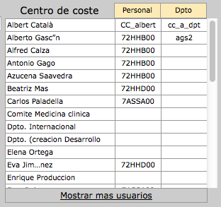
具有固定标题行和第一列的纯 CSS 解决方案

在现代版本的 Chrome、Firefox 和 Edge 中,该position: sticky属性支持顶部和侧面。这可以与div具有overflow: scroll属性的 a 相结合,为您提供一个带有固定标题的表格,该表格可以放置在页面上的任何位置。

把你的桌子放在一个容器里:

<div class="container">
  <table></table>
</div>

在您的容器上使用overflow: scroll以启用滚动:

div.container {
  overflow: scroll;
}

正如Dagmar在评论中指出的那样,容器还需要 amax-width和 a max-height

用于position: sticky让表格单元格粘在边缘和top, right, 或left选择要粘在哪个边缘:

thead th {
  position: -webkit-sticky; /* for Safari */
  position: sticky;
  top: 0;
}

tbody th {
  position: -webkit-sticky; /* for Safari */
  position: sticky;
  left: 0;
}

正如评论中提到的MarredCheese,如果您的第一列包含<td>元素而不是<th>元素,则可以tbody td:first-child在 CSS 中使用而不是tbody th

要将第一列中的标题固定在左侧,请使用:

thead th:first-child {
  left: 0;
  z-index: 1;
}

/* Use overflow:scroll on your container to enable scrolling: */

div {
  max-width: 400px;
  max-height: 150px;
  overflow: scroll;
}


/* Use position: sticky to have it stick to the edge
 * and top, right, or left to choose which edge to stick to: */

thead th {
  position: -webkit-sticky; /* for Safari */
  position: sticky;
  top: 0;
}

tbody th {
  position: -webkit-sticky; /* for Safari */
  position: sticky;
  left: 0;
}


/* To have the header in the first column stick to the left: */

thead th:first-child {
  left: 0;
  z-index: 2;
}


/* Just to display it nicely: */

thead th {
  background: #000;
  color: #FFF;
  /* Ensure this stays above the emulated border right in tbody th {}: */
  z-index: 1;
}

tbody th {
  background: #FFF;
  border-right: 1px solid #CCC;
  /* Browsers tend to drop borders on sticky elements, so we emulate the border-right using a box-shadow to ensure it stays: */
  box-shadow: 1px 0 0 0 #ccc;
}

table {
  border-collapse: collapse;
}

td,
th {
  padding: 0.5em;
}
<div>
  <table>
    <thead>
      <tr>
        <th></th>
        <th>headheadhead</th>
        <th>headheadhead</th>
        <th>headheadhead</th>
        <th>headheadhead</th>
        <th>headheadhead</th>
        <th>headheadhead</th>
        <th>headheadhead</th>
      </tr>
    </thead>
    <tbody>
      <tr>
        <th>head</th>
        <td>body</td>
        <td>body</td>
        <td>body</td>
        <td>body</td>
        <td>body</td>
        <td>body</td>
        <td>body</td>
      </tr>
      <tr>
        <th>head</th>
        <td>body</td>
        <td>body</td>
        <td>body</td>
        <td>body</td>
        <td>body</td>
        <td>body</td>
        <td>body</td>
      </tr>
      <tr>
        <th>head</th>
        <td>body</td>
        <td>body</td>
        <td>body</td>
        <td>body</td>
        <td>body</td>
        <td>body</td>
        <td>body</td>
      </tr>
      <tr>
        <th>head</th>
        <td>body</td>
        <td>body</td>
        <td>body</td>
        <td>body</td>
        <td>body</td>
        <td>body</td>
        <td>body</td>
      </tr>
      <tr>
        <th>head</th>
        <td>body</td>
        <td>body</td>
        <td>body</td>
        <td>body</td>
        <td>body</td>
        <td>body</td>
        <td>body</td>
      </tr>
      <tr>
        <th>head</th>
        <td>body</td>
        <td>body</td>
        <td>body</td>
        <td>body</td>
        <td>body</td>
        <td>body</td>
        <td>body</td>
      </tr>
    </tbody>
  </table>
</div>

https://jsfiddle.net/qwubvg9m/1/

于 2018-05-24T18:50:37.133 回答
39

如今,这可以通过仅使用带有属性的CSS来实现。position: sticky

这是一个片段:

(jsFiddle:https ://jsfiddle.net/hbqzdzdt/5/ )

.grid-container {
  display: grid; /* This is a (hacky) way to make the .grid element size to fit its content */
  overflow: auto;
  height: 300px;
  width: 600px;
}
.grid {
  display: flex;
  flex-wrap: nowrap;
}
.grid-col {
  width: 150px;
  min-width: 150px;
}

.grid-item--header {
  height: 100px;
  min-height: 100px;
  position: sticky;
  position: -webkit-sticky;
  background: white;
  top: 0;
}

.grid-col--fixed-left {
  position: sticky;
  left: 0;
  z-index: 9998;
  background: white;
}
.grid-col--fixed-right {
  position: sticky;
  right: 0;
  z-index: 9998;
  background: white;
}

.grid-item {
  height: 50px;
  border: 1px solid gray;
}
<div class="grid-container">
  <div class="grid">
    <div class="grid-col grid-col--fixed-left">
      <div class="grid-item grid-item--header">
        <p>HEAD</p>
      </div>
      <div class="grid-item">
        <p>Hello</p>
      </div>
      <div class="grid-item">
        <p>Hello</p>
      </div>
      <div class="grid-item">
        <p>Hello</p>
      </div>
      <div class="grid-item">
        <p>Hello</p>
      </div>
      <div class="grid-item">
        <p>Hello</p>
      </div>
      <div class="grid-item">
        <p>Hello</p>
      </div>
      <div class="grid-item">
        <p>Hello</p>
      </div>
      <div class="grid-item">
        <p>Hello</p>
      </div>
      <div class="grid-item">
        <p>Hello</p>
      </div>
      <div class="grid-item">
        <p>Hello</p>
      </div>
    </div>

    <div class="grid-col">
      <div class="grid-item grid-item--header">
        <p>HEAD</p>
      </div>
      <div class="grid-item">
        <p>P</p>
      </div>
      <div class="grid-item">
        <p>P</p>
      </div>
      <div class="grid-item">
        <p>P</p>
      </div>
      <div class="grid-item">
        <p>P</p>
      </div>
      <div class="grid-item">
        <p>P</p>
      </div>
      <div class="grid-item">
        <p>P</p>
      </div>
      <div class="grid-item">
        <p>P</p>
      </div>
      <div class="grid-item">
        <p>P</p>
      </div>
      <div class="grid-item">
        <p>P</p>
      </div>
      <div class="grid-item">
        <p>P</p>
      </div>
    </div>

    <div class="grid-col grid-col--fixed-right">
      <div class="grid-item grid-item--header">
        <p>HEAD</p>
      </div>
      <div class="grid-item">
        <p>9</p>
      </div>
      <div class="grid-item">
        <p>9</p>
      </div>
      <div class="grid-item">
        <p>9</p>
      </div>
      <div class="grid-item">
        <p>9</p>
      </div>
      <div class="grid-item">
        <p>9</p>
      </div>
      <div class="grid-item">
        <p>9</p>
      </div>
      <div class="grid-item">
        <p>9</p>
      </div>
      <div class="grid-item">
        <p>9</p>
      </div>
      <div class="grid-item">
        <p>9</p>
      </div>
      <div class="grid-item">
        <p>9</p>
      </div>
    </div>

  </div>
</div>

关于兼容性。它适用于所有主流浏览器,但不适用于 IE。有一个 polyfill,position: sticky但我从未尝试过。

于 2017-10-24T20:32:09.960 回答
15

所有这些建议都很棒,但它们要么只修复标题或列,而不是两者,要么使用 javascript。原因 - 它不相信它可以在纯 CSS 中完成。原因:

如果可以做到这一点,您需要将多个可滚动的 div 嵌套在另一个内部,每个 div 都有一个不同方向的滚动。然后你需要将你的表格分成三部分——固定的标题、固定的列和其余的数据。

美好的。但是现在的问题 - 你可以让其中一个在滚动时保持原状,但另一个嵌套在 first 的滚动区域内,因此会被滚动到视线之外,因此无法固定在屏幕。'啊哈'你说'但我可以以某种方式使用绝对或固定位置来做到这一点' - 不,你不能。一旦你这样做,你将失去滚动该容器的能力。这是一个先有鸡还是先有蛋的情况——你不能两者兼得,它们会相互抵消。

我相信唯一的解决方案是通过 javascript。您需要完全分离出三个元素并通过 javascript 保持它们的位置同步。此页面上的其他帖子中有很好的示例。这个也值得一看:

http://tympanus.net/codrops/2014/01/09/sticky-table-headers-columns/

于 2014-09-23T21:42:12.487 回答
15

这绝非易事。

以下链接是一个工作演示:

链接根据 lanoxx 的评论更新

http://jsfiddle.net/C8Dtf/366/

只要记住添加这些:

<script type="text/javascript" charset="utf-8" src="http://datatables.net/release-datatables/media/js/jquery.js"></script>
<script type="text/javascript" charset="utf-8" src="http://datatables.net/release-datatables/media/js/jquery.dataTables.js"></script>
<script type="text/javascript" charset="utf-8" src="http://datatables.net/release-datatables/extras/FixedColumns/media/js/FixedColumns.js"></script>

我没有看到任何其他方式来实现这一目标。尤其不是仅使用 css。

这要经历很多。希望这可以帮助 :)

于 2013-04-05T05:39:01.450 回答
9

仅使用 CSS 的示例:

.table {
  table-layout: fixed;
  width: 500px;
  border-collapse: collapse;
}

.header th {
  font-family: Calibri;
  font-size: small;
  font-weight: lighter;
  border-left: 1px solid #000;
  background: #d0d0d0;
}

.body_panel {
  display: inline-block;
  width: 520px;
  height: 300px;
  overflow-y: scroll;
}

.body tr {
  border-bottom: 1px solid #d0d0d0;
}

.body td {
  border-left: 1px solid #d0d0d0;
  padding-left: 3px;
  font-family: Calibri;
  font-size: small;
  overflow: hidden;
  white-space: nowrap;
  text-overflow: ellipsis;
}
<body>

  <table class="table">

    <thead class="header">

      <tr>
        <th style="width:20%;">teste</th>
        <th style="width:30%;">teste 2</th>
        <th style="width:50%;">teste 3</th>
      </tr>

    </thead>
  </table>

  <div class="body_panel">

    <table class="table">
      <tbody class="body">

        <tr>
          <td style="width:20%;">asbkj k kajsb ksb kabkb</td>
          <td style="width:30%;">2</td>
          <td style="width:50%;">3</td>
        </tr>

        <tr>
          <td style="width:20%;">2</td>
          <td style="width:30%;">2</td>
          <td style="width:50%;">3</td>
        </tr>

        <tr>
          <td style="width:20%;">2</td>
          <td style="width:30%;">2</td>
          <td style="width:50%;">3</td>
        </tr>

        <tr>
          <td style="width:20%;">2</td>
          <td style="width:30%;">2</td>
          <td style="width:50%;">3</td>
        </tr>

        <tr>
          <td style="width:20%;">2</td>
          <td style="width:30%;">2</td>
          <td style="width:50%;">3</td>
        </tr>

        <tr>
          <td style="width:20%;">2</td>
          <td style="width:30%;">2</td>
          <td style="width:50%;">3</td>
        </tr>

        <tr>
          <td style="width:20%;">2</td>
          <td style="width:30%;">2</td>
          <td style="width:50%;">3</td>
        </tr>

        <tr>
          <td style="width:20%;">2</td>
          <td style="width:30%;">2</td>
          <td style="width:50%;">3</td>
        </tr>

        <tr>
          <td style="width:20%;">2</td>
          <td style="width:30%;">2</td>
          <td style="width:50%;">3</td>
        </tr>

        <tr>
          <td style="width:20%;">2</td>
          <td style="width:30%;">2</td>
          <td style="width:50%;">3</td>
        </tr>

        <tr>
          <td style="width:20%;">2</td>
          <td style="width:30%;">2</td>
          <td style="width:50%;">3</td>
        </tr>

        <tr>
          <td style="width:20%;">2</td>
          <td style="width:30%;">2</td>
          <td style="width:50%;">3</td>
        </tr>

        <tr>
          <td style="width:20%;">2</td>
          <td style="width:30%;">2</td>
          <td style="width:50%;">3</td>
        </tr>

        <tr>
          <td style="width:20%;">2</td>
          <td style="width:30%;">2</td>
          <td style="width:50%;">3</td>
        </tr>

        <tr>
          <td style="width:20%;">2</td>
          <td style="width:30%;">2</td>
          <td style="width:50%;">3</td>
        </tr>

        <tr>
          <td style="width:20%;">2</td>
          <td style="width:30%;">2</td>
          <td style="width:50%;">3</td>
        </tr>

        <tr>
          <td style="width:20%;">2</td>
          <td style="width:30%;">2</td>
          <td style="width:50%;">3</td>
        </tr>

        <tr>
          <td style="width:20%;">2</td>
          <td style="width:30%;">2</td>
          <td style="width:50%;">3</td>
        </tr>

      </tbody>
    </table>

  </div>

</body>

于 2013-10-16T02:37:19.307 回答
9

我在 jsfiddle 中做了一些更改。这可能是你想要做的。

http://jsfiddle.net/C8Dtf/81/

我对标题进行了硬编码,如下所示:

<table id="left_table" class="freeze_table">
    <tr class='tblTitle'>
         <th>Title 1</th>
         <th>Title 2</th>
    </tr>
</table>

我还添加了一些样式。

.tblTitle{
   position:absolute;
    top:0px;
    margin-bottom:30px;
    background:lightblue;
}
td, th{
    padding:5px;
    height:40px;
    width:40px;
    font-size:14px;
}

希望这是你想要的:)

于 2013-04-04T13:06:26.950 回答
4

要修复标题和列,您可以使用以下插件:


2019 年 7 月更新

最近还出现了一个纯 CSS 解决方案,它基于应用于每个项目(而不是它们的父容器)的CSS 属性position: sticky;这里有更多详细信息)TH

于 2014-08-14T09:13:00.693 回答
4

我为这个问题找到了 Paul O'Brien 的出色解决方案,并希望分享链接: https ://codepen.io/paulobrien/pen/LBrMxa

我删除了页脚的样式:

html {
  box-sizing: border-box;
}
*,
*:before,
*:after {
  box-sizing: inherit;
}
.intro {
  max-width: 1280px;
  margin: 1em auto;
}
.table-scroll {
  position: relative;
  width:100%;
  z-index: 1;
  margin: auto;
  overflow: auto;
  height: 350px;
}
.table-scroll table {
  width: 100%;
  min-width: 1280px;
  margin: auto;
  border-collapse: separate;
  border-spacing: 0;
}
.table-wrap {
  position: relative;
}
.table-scroll th,
.table-scroll td {
  padding: 5px 10px;
  border: 1px solid #000;
}
.table-scroll thead th {
  position: -webkit-sticky;
  position: sticky;
  top: 0;
}

th:first-child {
  position: -webkit-sticky;
  position: sticky;
  left: 0;
  z-index: 2;
  background: #ccc;
}
thead th:first-child {
  z-index: 5;
}
于 2019-07-25T09:39:04.587 回答
2

我最近不得不创建一个具有固定标题组和固定第一列的解决方案。我将表拆分为 div 并使用 jquery 来捕获窗口滚动。

http://jsfiddle.net/TinT/EzXub/2346/

var prevTop = 0;
var prevLeft = 0;

$(window).scroll(function(event){
  var currentTop = $(this).scrollTop();
  var currentLeft = $(this).scrollLeft();

  if(prevLeft !== currentLeft) {
    prevLeft = currentLeft;
    $('.header').css({'left': -$(this).scrollLeft()})
  }
  if(prevTop !== currentTop) {
    prevTop = currentTop;
    $('.leftCol').css({'top': -$(this).scrollTop() + 40})
  }
});
于 2016-07-07T14:39:18.780 回答
1

经过两天与 Internet Explorer 9 + Chrome + Firefox (Windows) 和 Safari (Mac) 的斗争,我找到了一个系统

  • 兼容所有这些浏览器
  • 不使用 javascript
  • 仅使用 une div 和一张表
  • 固定页眉和页脚(IE 除外),正文可滚动。具有相同列宽的标题和正文

结果: 在此处输入图像描述

HTML:

  <thead>
    <tr>
      <th class="nombre"><%= f.label :cost_center %></th>
      <th class="cabecera cc">Personal</th>
      <th class="cabecera cc">Dpto</th>
    </tr>
  </thead>
  <tbody>
    <% @cost_centers.each do |cc| %>
    <tr>
      <td class="nombre"><%= cc.nombre_corto %></td>
      <td class="cc"><%= cc.cacentrocoste %></td>
      <td class="cc"><%= cc.cacentrocoste_dpto %></td>
    </tr>
    <% end %>
  </tbody>
  <tfoot>
    <tr>
      <td colspan="3"><a href="#">Mostrar mas usuarios</a></td>
    </tr>
  </tfoot>
</table>

CSS:

div.cost_center{
  width:320px;
  font-size:75%;
  margin-left:5px;
  margin-top:5px;
  margin-bottom: 2px;
  float: right;
  display: inline-block;
  overflow-y: auto;
  overflow-x: hidden;
  max-height:300px;  
}

div.cost_center label { 
  float:none;
  font-size:14px;
}

div.cost_center table{
  width:300px;
  border-collapse: collapse; 
  float:right;
  table-layout:fixed;
}

div.cost_center table tr{
  height:16px;
}
div.cost_center th{
  font-weight:normal;
}

div.cost_center table tbody{
  display: block;
  overflow: auto;
  max-height:240px;
}

div.cost_center table thead{
  display:block;
}

div.cost_center table tfoot{
  display:block;
}
div.cost_center table tfoot td{
  width:280px;
}
div.cost_center .cc{
  width:60px;
  text-align: center; 
  border: 1px solid #999;
}

div.cost_center .nombre{
  width:150px;
}
div.cost_center tbody .nombre{
  border: 1px solid #999;
}

div.cost_center table tfoot td{
 text-align:center;  
 border: 1px solid #999; 
} 

div.cost_center table th, 
div.cost_center table td { 
  padding: 2px;
  vertical-align: middle; 
}

div.cost_center table tbody td {
  white-space: normal;
  font:  .8em/1.4em Verdana, sans-serif;
  color: #000;
  background-color: white;
}
div.cost_center table th.cabecera { 
  font:  0.8em/1.4em Verdana, sans-serif;
  color: #000;
  background-color: #FFEAB5;
}
于 2014-03-06T16:18:02.837 回答
1

我和一位同事刚刚发布了一个新的 GitHub 项目,该项目提供了一个 Angular 指令,您可以使用该指令用固定标题装饰您的表格:https ://github.com/objectcomputing/FixedHeader

它仅依赖于 css 和 angular,并带有添加一些 div 的指令。不需要 jQuery。

此实现不像其他一些实现那样功能齐全,但如果您的需要只是添加固定表,我们认为这可能是一个不错的选择。

于 2014-02-25T03:39:21.440 回答
1

现有答案将适合大多数人,但对于那些希望在固定标题下和第一(固定)列右侧添加阴影的人,这是一个工作示例(纯 css):

http://jsbin.com/nayifepaxo/1/edit?html,输出

使其工作的主要技巧是使用在::aftereach 中的每个第一个的右侧添加阴影:tdtr

tr td:first-child:after {
  box-shadow: 15px 0 15px -15px rgba(0, 0, 0, 0.05) inset;
  content: "";
  position:absolute;
  top:0;
  bottom:0;
  right:-15px;
  width:15px;
}

我花了一段时间(太长了......)才能让它全部工作,所以我想我会为那些处于类似情况的人分享。

于 2018-09-27T12:27:51.750 回答
1

/* Use overflow:scroll on your container to enable scrolling: */

div {
  max-width: 400px;
  max-height: 150px;
  overflow: scroll;
}


/* Use position: sticky to have it stick to the edge
 * and top, right, or left to choose which edge to stick to: */

thead th {
  position: -webkit-sticky; /* for Safari */
  position: sticky;
  top: 0;
}

tbody th {
  position: -webkit-sticky; /* for Safari */
  position: sticky;
  left: 0;
}


/* To have the header in the first column stick to the left: */

thead th:first-child {
  left: 0;
  z-index: 1;
}


/* Just to display it nicely: */

thead th {
  background: #000;
  color: #FFF;
}

tbody th {
  background: #FFF;
  border-right: 1px solid #CCC;
}

table {
  border-collapse: collapse;
}

td,
th {
  padding: 0.5em;
}
<div>
  <table>
    <thead>
      <tr>
        <th></th>
        <th>headheadhead</th>
        <th>headheadhead</th>
        <th>headheadhead</th>
        <th>headheadhead</th>
        <th>headheadhead</th>
        <th>headheadhead</th>
        <th>headheadhead</th>
      </tr>
    </thead>
    <tbody>
      <tr>
        <th>head</th>
        <td>body</td>
        <td>body</td>
        <td>body</td>
        <td>body</td>
        <td>body</td>
        <td>body</td>
        <td>body</td>
      </tr>
      <tr>
        <th>head</th>
        <td>body</td>
        <td>body</td>
        <td>body</td>
        <td>body</td>
        <td>body</td>
        <td>body</td>
        <td>body</td>
      </tr>
      <tr>
        <th>head</th>
        <td>body</td>
        <td>body</td>
        <td>body</td>
        <td>body</td>
        <td>body</td>
        <td>body</td>
        <td>body</td>
      </tr>
      <tr>
        <th>head</th>
        <td>body</td>
        <td>body</td>
        <td>body</td>
        <td>body</td>
        <td>body</td>
        <td>body</td>
        <td>body</td>
      </tr>
      <tr>
        <th>head</th>
        <td>body</td>
        <td>body</td>
        <td>body</td>
        <td>body</td>
        <td>body</td>
        <td>body</td>
        <td>body</td>
      </tr>
      <tr>
        <th>head</th>
        <td>body</td>
        <td>body</td>
        <td>body</td>
        <td>body</td>
        <td>body</td>
        <td>body</td>
        <td>body</td>
      </tr>
    </tbody>
  </table>
</div>

需要修复页眉页脚

于 2019-05-06T15:00:55.570 回答
0

纯 CSS 示例:

<div id="cntnr">
    <div class="tableHeader">
        <table class="table-header table table-striped table-bordered">
            <thead>
                <tr>
                    <th>this</th>
                    <th>transmission</th>
                    <th>is</th>
                    <th>coming</th>
                    <th>to</th>
                    <th>you</th>
                </tr>
            </thead>
            <tbody>
                <tr>
                    <td>we've got it...</td>
                    <td>alright you are go</td>
                    <td>uh, we see the Earth now</td>
                    <td>we've got it...</td>
                    <td>alright you are go</td>
                    <td>uh, we see the Earth now</td>
                </tr>
            </tbody>
        </table>
    </div>


    <div class="tableBody">
        <table class="table-body table table-striped table-bordered">
            <thead>
                <tr>
                    <th>this</th>
                    <th>transmission</th>
                    <th>is</th>
                    <th>coming</th>
                    <th>to</th>
                    <th>you</th>
                </tr>
            </thead>
            <tbody>
                <tr>
                    <td>we've got it...</td>
                    <td>alright you are go</td>
                    <td>uh, we see the Earth now</td>
                    <td>we've got it...</td>
                    <td>alright you are go</td>
                    <td>uh, we see the Earth now</td>
                </tr>
            </tbody>
        </table>
    </div>

</div>

#cntnr {
    width: auto;
    height: 200px;
    border: solid 1px #444;
    overflow: auto;
}

.tableHeader {
    position: fixed;
    height: 40px;
    overflow: hidden;
    margin-right: 18px;
    background: white;
}

.table-header tbody {
    height: 0;
    visibility: hidden;
}

.table-body thead {
    height: 0;
    visibility: hidden;
}

http://jsfiddle.net/cCarlson/L98m854d/

缺点:固定的标头结构/逻辑相当依赖于特定维度,因此抽象可能不是一个可行的选择

于 2014-11-11T01:08:55.293 回答
0

像这样的东西可能对你有用......它可能需要你为标题行设置列宽。

thead { 
    position: fixed;
}

http://jsfiddle.net/vkhNC/

更新:

我不相信您提供的示例仅使用 CSS 即可。我希望有人能证明我错了。 这是我到目前为止所拥有的。它不是成品,但它可能是您的开始。我希望这可以为您指明一个有用的方向,无论它在哪里。

于 2013-04-04T12:55:34.533 回答
0

另一种解决方案是使用 AngularJS。AngularUI 模块有一个名为的指令ng-grid,它支持称为列固定的功能。它不是 100% 纯 CSS,但也不是其他解决方案。

http://angular-ui.github.io/ng-grid/#columnPinning

于 2013-09-25T17:11:46.860 回答
0

这是我有点困惑后刚刚提出的解决方案。似乎需要设置一些 z-index 属性才能使其正常工作,我的解决方案并非完美无缺,但它适用于我的应用程序:

CSS(在 SCSS 中)的关键是首先设置非粘性元素的属性以建立 z-index 属性。

.wrapper {
position: relative;
white-space: nowrap;
overflow: auto;
height: 200px;
table {
    border-collapse: collapse;
    tbody {
        tr {
            td {
                padding: .5em .75em;
                box-shadow: inset 0px -1px 0px 0px #000000;
                position: relative;
                z-index: -9999;
                background: white;
                &:first-of-type {
                    position: -webkit-sticky;
                    position: sticky;
                    left: 0px;
                    background: #eee;
                    z-index: -999;
                    box-shadow: inset -1px -1px 0px 0px #000000;
                }
            }
            &:first-of-type {
                position: sticky;
                top: 0;
                td {
                    background: #eee; 
                    &:first-of-type {
                        left: 0;
                        top: 0;
                        background: #eee;
                        z-index: 999;
                    }
                }
            }
            &:nth-of-type(2) {
                position: sticky;
                top: calc(1em + 1em + 2px);
                background: white;
                td:first-of-type {
                    position: sticky;
                    left: 0;
                    z-index: 998;
                }
            }
        }
    }
}

}

https://codepen.io/the_Northway/pen/VwMmwXG

于 2021-12-11T22:50:12.327 回答
0

这是我刚刚根据此处的答案使用 css 网格构建的另一个解决方案:

https://codesandbox.io/s/sweet-resonance-m733i

于 2021-02-15T08:34:07.353 回答
0

Position : sticky 不适用于 chrome 中的 (thead) 和其他 webkit 浏览器(如 safari)中的某些元素。

但它适用于 (th)

body {
  background-color: rgba(0, 255, 200, 0.1);
}

.intro {
  color: rgb(228, 23, 23);
}

.wrapper {
  overflow-y: scroll;
  height: 300px;
}

.sticky {
  position: sticky;
  top: 0;
  color: black;
  background-color: white;
}
<div class="container intro">
  <h1>Sticky Table Header</h1>
  <p>Postion : sticky doesn't work for some elements like (thead) in chrome and other webkit browsers like safari. </p>
  <p>But it works fine with (th)</p>
</div>
<div class="container wrapper">
  <table class="table table-striped">
    <thead>
      <tr>
        <th class="sticky">Firstname</th>
        <th class="sticky">Lastname</th>
        <th class="sticky">Email</th>
      </tr>
    </thead>
    <tbody>
      <tr>
        <td>James</td>
        <td>Vince</td>
        <td>james@example.com</td>
      </tr>
      <tr>
        <td>Jonny</td>
        <td>Bairstow</td>
        <td>jonny@example.com</td>
      </tr>
      <tr>
        <td>James</td>
        <td>Anderson</td>
        <td>james@example.com</td>
      </tr>
      <tr>
        <td>Stuart</td>
        <td>Broad</td>
        <td>stuart@example.com</td>
      </tr>
      <tr>
        <td>Eoin</td>
        <td>Morgan</td>
        <td>eoin@example.com</td>
      </tr>
      <tr>
        <td>Joe</td>
        <td>Root</td>
        <td>joe@example.com</td>
      </tr>
      <tr>
        <td>Chris</td>
        <td>Woakes</td>
        <td>chris@example.com</td>
      </tr>
      <tr>
        <td>Liam</td>
        <td>PLunkett</td>
        <td>liam@example.com</td>
      </tr>
      <tr>
        <td>Jason</td>
        <td>Roy</td>
        <td>jason@example.com</td>
      </tr>
      <tr>
        <td>Alex</td>
        <td>Hales</td>
        <td>alex@example.com</td>
      </tr>
      <tr>
        <td>Jos</td>
        <td>Buttler</td>
        <td>jos@example.com</td>
      </tr>
      <tr>
        <td>Ben</td>
        <td>Stokes</td>
        <td>ben@example.com</td>
      </tr>
      <tr>
        <td>Jofra</td>
        <td>Archer</td>
        <td>jofra@example.com</td>
      </tr>
      <tr>
        <td>Mitchell</td>
        <td>Starc</td>
        <td>mitchell@example.com</td>
      </tr>
      <tr>
        <td>Aaron</td>
        <td>Finch</td>
        <td>aaron@example.com</td>
      </tr>
      <tr>
        <td>David</td>
        <td>Warner</td>
        <td>david@example.com</td>
      </tr>
      <tr>
        <td>Steve</td>
        <td>Smith</td>
        <td>steve@example.com</td>
      </tr>
      <tr>
        <td>Glenn</td>
        <td>Maxwell</td>
        <td>glenn@example.com</td>
      </tr>
      <tr>
        <td>Marcus</td>
        <td>Stoinis</td>
        <td>marcus@example.com</td>
      </tr>
      <tr>
        <td>Alex</td>
        <td>Carey</td>
        <td>alex@example.com</td>
      </tr>
      <tr>
        <td>Nathan</td>
        <td>Coulter Nile</td>
        <td>nathan@example.com</td>
      </tr>
      <tr>
        <td>Pat</td>
        <td>Cummins</td>
        <td>pat@example.com</td>
      </tr>
      <tr>
        <td>Adam</td>
        <td>Zampa</td>
        <td>zampa@example.com</td>
      </tr>
    </tbody>
  </table>
</div>

访问我的 codepen 示例

于 2019-06-09T15:06:34.263 回答
-1

我认为这会对您有所帮助: https ://datatables.net/release-datatables/extensions/FixedHeader/examples/header_footer.html

简而言之,如果你知道如何创建一个数据表,你只需要在你的底部添加这个 jQuery 行:

$(document).ready(function() {
    var table = $('#example').DataTable();

    new $.fn.dataTable.FixedHeader( table, {
        bottom: true
    } );
} );

bottom: true // 用于固定底部标题。

于 2014-08-28T15:15:35.843 回答
-2

如果您只想使用纯 HTML 和 CSS,我有一个解决您的问题的方法:
在这个jsFiddle 中,您可以看到一个非脚本解决方案,它提供了一个带有固定标题的表格。为固定的第一列调整标记也应该不是问题。您只需要为hWrapper-div 内的第一列创建一个绝对定位表并重新定位vWrapper-div。
使用服务器端或浏览器端的诱人引擎提供动态内容应该不是问题,我的解决方案适用于所有现代浏览器和 IE8 以后的旧浏览器。

于 2014-07-26T18:55:36.517 回答
-2

只需要将样式更改为

<table style="position: relative;">
   <thead>
      <thead>
        <tr>
           <th></th>
        </tr>
      </thead>
   </thead>
   <tbody style="position: absolute;height: 300px;overflow:auto;">
      <tr>
         <td></td>
      </tr>
   </tbody>
</table>

演示:https ://plnkr.co/edit/Qxy5RMJBXmkaJAOjBtQn?p=preview

于 2017-03-21T13:52:56.230 回答