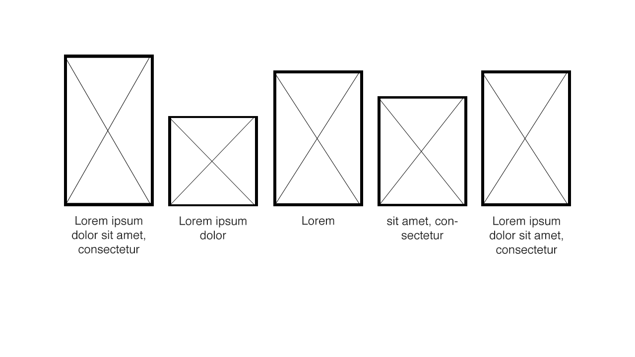
我想将多张图片与每张图片下方的一些文字对齐。文本可以有多行并居中对齐。图像可以具有不同的高度,但始终具有相同的宽度。图像的底部应处于相同的高度,文本框的顶部应处于相同的高度。
为了更好地说明这一点:
您可以使用CSS表格布局来实现此目的:(更新为简化版本)工作示例
诀窍是坚持baseline垂直对齐。这将创建一个(视觉)基线,在该基线上方将显示每个图像。兼容性同display: table,即IE8+。
CSS:
.row {
    display: table;
    table-layout: fixed;
    border: 1px solid grey;
}
.pic {
    display: table-cell;
    padding-left: 20px;
    vertical-align: baseline;
}
.pic:first-child {
    padding-left: 0;
}
.pic img {
    vertical-align: bottom; /* only needed for removing a few pixel gap between image and paragraph */
    border: 1px solid red;
}
.pic p {
    margin: 0;
    text-align: center;
    border: 1px solid #000;
}
HTML:
<div class="row">
    <div class="pic">
        <img src="http://dummyimage.com/100x60/000/fff" alt="ALT">
        <p>Lorem<br>ipsum</p>
    </div>
    <div class="pic">
        <img src="http://dummyimage.com/100x80/000/fff" alt="ALT">
        <p>Lorem</p>
    </div>
    <div class="pic">
        <img src="http://dummyimage.com/100x20/000/fff" alt="ALT">
        <p>Lorem<br>ipsum<br>trying to break<br>everything</p>
    </div>
    <div class="pic">
        <img src="http://dummyimage.com/100x40/000/fff" alt="ALT">
        <p>Lorem<br>ipsum</p>
    </div>
</div>
制作包装 div position: relative;,然后给图像这个 CSS:
#wrapper .img_class {
    position: absolute;
    bottom: 0px;
    left: 20px; /* variable value */
}
这对我有用... JsFiddle它不会在 jsfiddle 中运行 js,但如果你将它复制到 html 文件中它就可以工作。
    <!DOCTYPE HTML PUBLIC "-//W3C//DTD HTML 4.01 Transitional//EN">
<html>
<head>
<title>images</title>
<meta http-equiv="Content-Type" content="text/html; charset=ISO-8859-1">
<link type="text/css" rel="stylesheet" href="css/site.css"/>
<script type="text/javascript">
var maxHeight;

function getMaxHeight(){
    var imgs=document.getElementsByClassName("bottomAlignedImage");

    if(imgs.length>0){
        maxHeight=imgs[0].height;
        for( var i=1; i<imgs.length; i++){
         var currImg = imgs[i];
            if(currImg.height>maxHeight)
              maxHeight = currImg.height;
              }
        }

}

function applyMarginToImages(){

    var imgs=document.getElementsByClassName("bottomAlignedImage");

    for( var i=0; i<imgs.length; i++){
        var currImg = imgs[i];
        currImg.style.marginTop = maxHeight-currImg.height;
        }
}

</script>
</head>

<body onLoad="getMaxHeight();applyMarginToImages();">
<table>
<tr id="imgRow">
    <td><img class="bottomAlignedImage" style="" src="http://dummyimage.com/100x300/000/fff"/></td>
    <td><img class="bottomAlignedImage" style="" src="http://dummyimage.com/100x100/000/fff"/></td>
    <td><img class="bottomAlignedImage" style="" src="http://dummyimage.com/100x150/000/fff"/></td>
</tr>
<tr id="imgTextRow">
<td class="center"><p>Big</p></td>
<td class="center"><p>Small</p></td>
<td class="center"><p>Medium</p></td>
</tr>
</table>
</body>
</html>