所以我对编写代码很陌生(大约几周),我在为我的网站编写代码时碰壁了。我想要这样的布局:
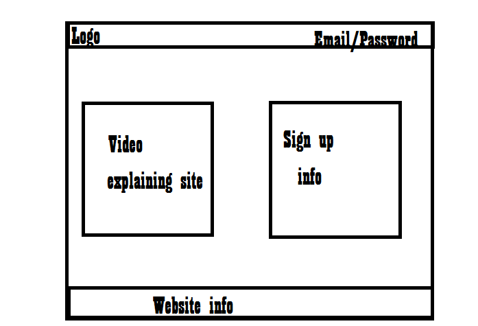 但我不知道如何将两个盒子并排放置。一个盒子是解释我的网站的视频,而另一个盒子是注册表格。我希望这些盒子彼此相邻,它们之间有大约一英寸的间隔。
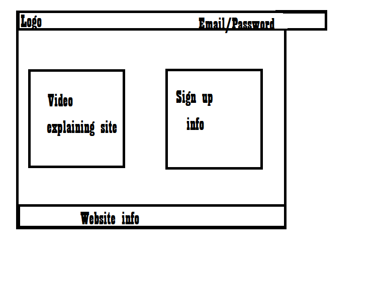
我还需要有关网站标题宽度的帮助。现在看起来标题不适合页面,导致水平滚动。有点像这样:
 我想让整个网站就像一个大盒子,所有的内容都在那个盒子里。有人可以帮帮我吗?非常感激。先感谢您。
http://jsfiddle.net/kkobold/qMQL5/
#header {
    width: 100%;
    background-color: red;
    height: 30px;
}

#container {
    width: 300px;
    background-color: #ffcc33;
    margin: auto;
}
#first {
    width: 100px;
    float: left;
    height: 300px;
        background-color: blue;
}
#second {
    width: 200px;
    float: left;
    height: 300px;
    background-color: green;
}
#clear {
    clear: both;
}
<div id="header"></div>
<div id="container">
<div id="first"></div>
<div id="second"></div>
<div id="clear"></div>
</div>这将起作用
<div style="width:800px;">
  <div style="width:300px; float:left;"></div>
  <div style="width:300px; float:right;"></div>
</div>
<div style="clear: both;"></div>
<div style="display: inline">
    <div style="width:80%; display: inline-block; float:left; margin-right: 10px;"></div>
    <div style="width: 19%; display: inline-block; border: 1px solid red"></div>
</div>
我只是并排给出两个响应式 div 的代码
*{
  margin: 0;
  padding: 0;
}

#parent {
  display: flex;
  justify-content: space-around;
}

#left {
  border: 1px solid lightgray;
  background-color: red;
  width: 40%;
}

#right {
  border: 1px solid lightgray;
  background-color: green;
  width: 40%;
}
<!DOCTYPE html>
<html lang="en">
<head>
<meta charset="UTF-8">
<meta name="viewport" content="width=device-width, initial-scale=1.0">
<title>Document</title>
</head>
<body>
<div id="parent">
<div id="left">
lorem ipsum dolor sit emet
</div>
<div id="right">
lorem ipsum dolor sit emet
</div>
</div>
</body>
</html>这只是您提供的线框的简单(非响应式)HTML/CSS 翻译。
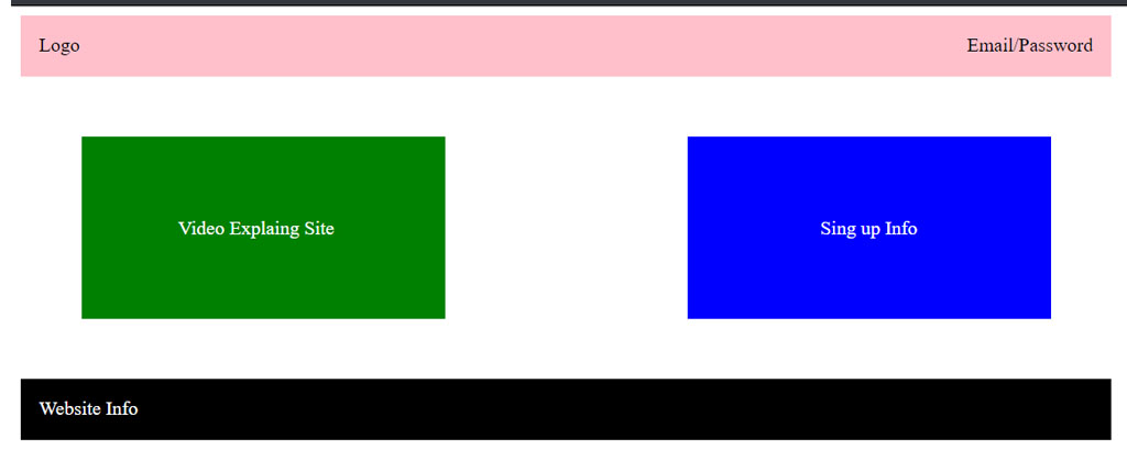
HTML
<div class="container">

  <header>
    <div class="logo">Logo</div>
    <div class="menu">Email/Password</div>
  </header>

  <div class="first-box">
    <p>Video Explaning Site</p>
  </div>

  <div class="second-box">
    <p>Sign up Info</p>
  </div>

  <footer>
    <div>Website Info</div>
  </footer>

</div>
CSS
.container {
  width:900px;
  height: 150px;
}

header {
  width:900px;
  float:left;
  background: pink;
  height: 50px;
}

.logo {
  float: left;
  padding: 15px
}

.menu {
  float: right;
  padding: 15px
}

.first-box {
  width:300px;
  float:left;
  background: green;
  height: 150px;
  margin: 50px
}

.first-box p {
  color: #ffffff;
  padding-left: 80px;
  padding-top: 50px;
}

.second-box {
  width:300px;
  height: 150px;
  float:right;
  background: blue;
  margin: 50px
}

.second-box p {
  color: #ffffff;
  padding-left: 110px;
  padding-top: 50px;
}

footer {
  width:900px;
  float:left;
  background: black;
  height: 50px;
  color: #ffffff;
}

footer div {
  padding: 15px;
}
你可以通过三种方式做到这一点:
浮动法
<div class="float-container">
  <div class="float-child">
    <div class="green">Float Column 1</div>
  </div>
  <div class="float-child">
    <div class="blue">Float Column 2</div>
  </div>
</div>

.float-container {
    border: 3px solid #fff;
    padding: 20px;
}

.float-child {
    width: 50%;
    float: left;
    padding: 20px;
    border: 2px solid red;
}
弹性盒方法
<div class="flex-container">
  <div class="flex-child magenta">
    Flex Column 1
  </div>
  <div class="flex-child green">
    Flex Column 2
  </div>
</div>
.flex-container {
    display: flex;
}

.flex-child {
    flex: 1;
    border: 2px solid yellow;
}

.flex-child:first-child {
    margin-right: 20px;
}
CSS 网格方法
<div class="grid-container">
    <div class="grid-child purple">
        Grid Column 1
    </div>
    <div class="grid-child green">
        Grid Column 2
    </div>
</div>
.grid-container {
    display: grid;
    grid-template-columns: 1fr 1fr;
    grid-gap: 20px;
}
深入了解 CSS 和 HTML,您就会明白这一点。它只是左右浮动框,这些框需要在同一个 div 内。http://www.w3schools.com/html/html_layout.asp可能是一个很好的资源。
关于您网站的宽度,您需要考虑使用包装类来包围您的内容(这应该有助于限制您的元素宽度并防止它们超出内容范围):
<style>
.wrapper {
  width: 980px;
}
</style>

<body>
  <div class="wrapper">
    //everything else
  </div>
</body>
就内容框而言,我建议尝试使用
<style>
.boxes {
  display: inline-block;
  width: 360px;
  height: 360px;
}
#leftBox {
  float: left;
}
#rightBox {
  float: right;
}
</style>
我会花一些时间研究盒子对象模型和所有“显示”属性。他们将永远有帮助。特别关注“inline-block”,我几乎每天都在使用它。