748

我想稍微更改标准 Android 按钮的颜色,以便更好地匹配客户的品牌。

到目前为止,我发现做到这一点的最好方法是将Button's drawable 更改为位于以下位置的 drawable res/drawable/red_button.xml

<?xml version="1.0" encoding="utf-8"?>    
<selector xmlns:android="http://schemas.android.com/apk/res/android">
    <item android:state_pressed="true" android:drawable="@drawable/red_button_pressed" />
    <item android:state_focused="true" android:drawable="@drawable/red_button_focus" />
    <item android:drawable="@drawable/red_button_rest" />
</selector>

但要做到这一点,我实际上需要为我想要自定义的每个按钮创建三个不同的可绘制对象(一个用于静止按钮,一个用于聚焦时,一个用于按下时)。这似乎比我需要的更复杂和非干燥。

我真正想做的就是对按钮应用某种颜色变换。有没有比我更简单的方法来改变按钮的颜色?

4

20 回答 20

738

我发现这一切都可以很容易地在一个文件中完成。将类似以下代码的内容放在名为的文件中custom_button.xml,然后background="@drawable/custom_button"在按钮视图中设置:

<?xml version="1.0" encoding="utf-8"?>
<selector
    xmlns:android="http://schemas.android.com/apk/res/android">

    <item android:state_pressed="true" >
        <shape>
            <gradient
                android:startColor="@color/yellow1"
                android:endColor="@color/yellow2"
                android:angle="270" />
            <stroke
                android:width="3dp"
                android:color="@color/grey05" />
            <corners
                android:radius="3dp" />
            <padding
                android:left="10dp"
                android:top="10dp"
                android:right="10dp"
                android:bottom="10dp" />
        </shape>
    </item>

    <item android:state_focused="true" >
        <shape>
            <gradient
                android:endColor="@color/orange4"
                android:startColor="@color/orange5"
                android:angle="270" />
            <stroke
                android:width="3dp"
                android:color="@color/grey05" />
            <corners
                android:radius="3dp" />
            <padding
                android:left="10dp"
                android:top="10dp"
                android:right="10dp"
                android:bottom="10dp" />
        </shape>
    </item>

    <item>        
        <shape>
            <gradient
                android:endColor="@color/blue2"
                android:startColor="@color/blue25"
                android:angle="270" />
            <stroke
                android:width="3dp"
                android:color="@color/grey05" />
            <corners
                android:radius="3dp" />
            <padding
                android:left="10dp"
                android:top="10dp"
                android:right="10dp"
                android:bottom="10dp" />
        </shape>
    </item>
</selector>
于 2009-11-13T00:19:34.667 回答
312

继 Tomasz 的回答之后,您还可以使用 PorterDuff 乘法模式以编程方式设置整个按钮的阴影。这将改变按钮颜色而不仅仅是色调。

如果您从标准的灰色阴影按钮开始:

button.getBackground().setColorFilter(0xFFFF0000, PorterDuff.Mode.MULTIPLY);

会给你一个红色阴影按钮,

button.getBackground().setColorFilter(0xFF00FF00, PorterDuff.Mode.MULTIPLY);

会给你一个绿色阴影按钮等,其中第一个值是十六进制格式的颜色。

它通过将当前按钮颜色值乘以您的颜色值来工作。我相信您还可以使用这些模式做更多的事情。

于 2010-08-15T01:35:43.090 回答
151

迈克,你可能对彩色滤光片感兴趣。

一个例子:

button.getBackground().setColorFilter(new LightingColorFilter(0xFFFFFFFF, 0xFFAA0000));

试试这个以获得你想要的颜色。

于 2010-08-09T23:28:12.603 回答
88

这是我的解决方案,从 API 15开始完美运行。此解决方案保留所有默认按钮单击效果,例如 material RippleEffect。我没有在较低的 API 上测试过它,但它应该可以工作。

您需要做的就是:

1)创建一个只改变的样式colorAccent

<style name="Facebook.Button" parent="ThemeOverlay.AppCompat">
    <item name="colorAccent">@color/com_facebook_blue</item>
</style>

我建议使用ThemeOverlay.AppCompat或您的 mainAppTheme作为父级,以保留其余样式。

2)将这两行添加到您的button小部件:

style="@style/Widget.AppCompat.Button.Colored"
android:theme="@style/Facebook.Button"

有时您的新colorAccent应用没有显示在 Android Studio Preview 中,但是当您在手机上启动应用时,颜色会发生变化。


示例按钮小部件

<Button
    android:id="@+id/sign_in_with_facebook"
    style="@style/Widget.AppCompat.Button.Colored"
    android:layout_width="match_parent"
    android:layout_height="wrap_content"
    android:layout_gravity="center"
    android:text="@string/sign_in_facebook"
    android:textColor="@android:color/white"
    android:theme="@style/Facebook.Button" />

具有自定义颜色的示例按钮

于 2016-07-19T20:42:26.300 回答
66

您现在还可以将 appcompat-v7 的AppCompatButtonbackgroundTint属性一起使用:

<android.support.v7.widget.AppCompatButton
    xmlns:app="http://schemas.android.com/apk/res-auto"
    android:layout_width="match_parent"
    android:layout_height="wrap_content"
    app:backgroundTint="#ffaa00"/>
于 2016-01-16T20:20:40.867 回答
24

我喜欢@conjugatedirection 和@Tomasz 先前答案中的滤色器建议;但是,我发现到目前为止提供的代码并不像我预期的那么容易应用。

首先,没有提到在哪里应用和清除滤色器。可能还有其他好地方可以做到这一点,但我想到的是OnTouchListener

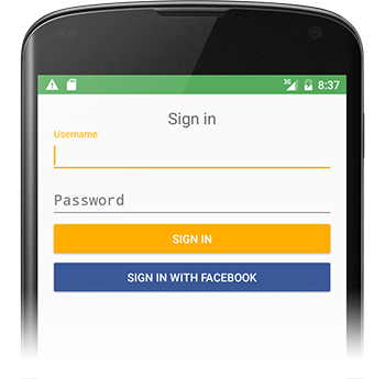
根据我对原始问题的阅读,理想的解决方案是不涉及任何图像的解决方案。如果这是您的目标,使用来自@emmby 的 custom_button.xml 接受的答案可能比滤色器更合适。就我而言,我从 UI 设计师的 png 图像开始,该图像应该是按钮的外观。如果我将按钮背景设置为此图像,则默认的高亮反馈将完全丢失。此代码用程序化变暗效果替换了该行为。

button.setOnTouchListener(new OnTouchListener() {
    @Override
    public boolean onTouch(View v, MotionEvent event) {
        switch (event.getAction()) {
            case MotionEvent.ACTION_DOWN:
                // 0x6D6D6D sets how much to darken - tweak as desired
                setColorFilter(v, 0x6D6D6D);
                break;
            // remove the filter when moving off the button
            // the same way a selector implementation would 
            case MotionEvent.ACTION_MOVE:
                Rect r = new Rect();
                v.getLocalVisibleRect(r);
                if (!r.contains((int) event.getX(), (int) event.getY())) {
                    setColorFilter(v, null);
                }
                break;
            case MotionEvent.ACTION_OUTSIDE:
            case MotionEvent.ACTION_CANCEL:
            case MotionEvent.ACTION_UP:
                setColorFilter(v, null);
                break;
        }
        return false;
    }

    private void setColorFilter(View v, Integer filter) {
        if (filter == null) v.getBackground().clearColorFilter();
        else {
            // To lighten instead of darken, try this:
            // LightingColorFilter lighten = new LightingColorFilter(0xFFFFFF, filter);
            LightingColorFilter darken = new LightingColorFilter(filter, 0x000000);
            v.getBackground().setColorFilter(darken);
        }
        // required on Android 2.3.7 for filter change to take effect (but not on 4.0.4)
        v.getBackground().invalidateSelf();
    }
});

我将它提取为一个单独的类,用于多个按钮的应用程序 - 显示为匿名内部类只是为了了解这个想法。

于 2012-06-17T10:56:40.310 回答
17

如果您使用 XML 制作颜色按钮,您可以通过在单独的文件中指定焦点和按下状态并重用它们来使代码更简洁。我的绿色按钮如下所示:

<?xml version="1.0" encoding="utf-8"?>
<selector xmlns:android="http://schemas.android.com/apk/res/android">

    <item android:state_focused="true" android:drawable="@drawable/button_focused"/>
    <item android:state_pressed="true" android:drawable="@drawable/button_pressed"/>

    <item>
        <shape>
            <gradient android:startColor="#ff00ff00" android:endColor="#bb00ff00" android:angle="270" />
            <stroke android:width="1dp" android:color="#bb00ff00" />
            <corners android:radius="3dp" />
            <padding android:left="10dp" android:top="10dp" android:right="10dp" android:bottom="10dp" />
        </shape>
    </item>

</selector>
于 2011-12-16T11:23:24.447 回答
14

适用于任何 Android 版本的最短解决方案:

<Button
     app:backgroundTint="@color/my_color"

备注/要求

  • 使用app:命名空间而不是命名android:空间!
  • appcompat 版本 > 24.2.0

    依赖{编译'com.android.support:appcompat-v7:25.3.1'}

说明在此处输入图像描述

于 2017-05-04T12:21:31.443 回答
12

我正在使用这种方法

样式.xml

<!-- Base application theme. -->
<style name="AppTheme" parent="Theme.AppCompat.Light.NoActionBar">
    <item name="android:colorPrimaryDark">#413152</item>
    <item name="android:colorPrimary">#534364</item>
    <item name="android:colorAccent">#534364</item>
    <item name="android:buttonStyle">@style/MyButtonStyle</item>
</style>

<style name="MyButtonStyle" parent="Widget.AppCompat.Button.Colored">
    <item name="android:colorButtonNormal">#534364</item>
    <item name="android:textColor">#ffffff</item>
</style>

从上面可以看出,我正在为我的按钮使用自定义样式。按钮颜色对应于强调色。我发现这比设置好得多,android:background因为我不会失去谷歌提供的连锁反应。

于 2015-11-05T13:23:43.943 回答
10

以这种方式使用它:

buttonOBJ.getBackground().setColorFilter(Color.parseColor("#YOUR_HEX_COLOR_CODE"), PorterDuff.Mode.MULTIPLY);
于 2015-07-23T10:21:28.023 回答
9

现在有一个更简单的方法:android-holo-colors.com

它可以让您轻松更改所有全息可绘制对象(按钮、微调器等)的颜色。您选择颜色,然后下载一个包含所有分辨率的可绘制文件的 zip 文件。

于 2013-06-14T12:45:53.670 回答
5

<Button>使用android:background="#33b5e5"中。或更好android:background="@color/navig_button"

于 2014-03-01T06:31:52.960 回答
4

DroidUX组件库有一个小部件,其颜色可以通过 xml 定义和在运行时以编程方式轻松更改,因此如果您的应用程序允许,您甚至可以让用户设置按钮的颜色/主题ColorButton

于 2011-08-05T12:53:26.517 回答
4

您还可以使用此在线工具自定义您的按钮http://angrytools.com/android/button/ 并用于android:background="@drawable/custom_btn"在您的布局中定义自定义按钮。

于 2014-05-11T11:21:13.537 回答
2

您可以将按钮的主题设置为此

<style name="AppTheme.ButtonBlue" parent="Widget.AppCompat.Button.Colored">
 <item name="colorButtonNormal">@color/HEXColor</item>
 <item name="android:textColor">@color/HEXColor</item>
</style>
于 2016-10-07T10:30:57.253 回答
1

一种简单的方法是定义一个自定义按钮类,该类接受您想要的所有属性,如半径、渐变、按下颜色、正常颜色等,然后​​在 XML 布局中使用它,而不是使用 XML 设置背景。样品在这里

如果您有许多具有相同属性(如半径、选定颜色等)的按钮,这将非常有用。您可以自定义继承的按钮来处理这些附加属性。

结果(未使用背景选择器)。

普通按钮

正常图像

按下按钮

在此处输入图像描述

于 2015-01-13T14:13:11.440 回答
1

值\styles.xml

<style name="AppTheme" parent="Theme.AppCompat.Light.DarkActionBar">
    <item name="colorPrimary">@color/colorPrimary</item>
    <item name="colorPrimaryDark">@color/colorPrimaryDark</item>
    <item name="colorAccent">@color/colorAccent</item>
</style>

<style name="RedAccentButton" parent="ThemeOverlay.AppCompat.Light">
    <item name="colorAccent">#ff0000</item>
</style>

然后:

<Button
    style="@style/Widget.AppCompat.Button.Colored"
    android:layout_width="match_parent"
    android:layout_height="wrap_content"
    android:text="text" />

<Button
    style="@style/Widget.AppCompat.Button.Colored"
    android:layout_width="match_parent"
    android:layout_height="wrap_content"
    android:enabled="false"
    android:text="text" />

<Button
    style="@style/Widget.AppCompat.Button.Colored"
    android:layout_width="match_parent"
    android:layout_height="wrap_content"
    android:text="text"
    android:theme="@style/RedAccentButton" />

<Button
    style="@style/Widget.AppCompat.Button.Colored"
    android:layout_width="match_parent"
    android:layout_height="wrap_content"
    android:enabled="false"
    android:text="text"
    android:theme="@style/RedAccentButton" />

结果

于 2017-04-06T17:37:10.480 回答
1

根据材料设计指南,您需要使用如下代码的样式

<style name="MyButton" parent="Theme.AppCompat.Light>
    <item name="colorControlHighlight">#F36F21</item>
    <item name="colorControlHighlight">#FF8D00</item>
</style>

并在布局中将此属性添加到您的按钮

    android:theme="@style/MyButton"
于 2019-03-21T10:31:06.733 回答
0

我做一个效果很好的不同样式按钮的方法是子类化 Button 对象并应用颜色过滤器。这还通过对按钮应用 alpha 来处理启用和禁用状态。

import android.annotation.TargetApi;
import android.content.Context;
import android.graphics.Color;
import android.graphics.ColorFilter;
import android.graphics.LightingColorFilter;
import android.graphics.drawable.Drawable;
import android.graphics.drawable.LayerDrawable;
import android.os.Build;
import android.util.AttributeSet;
import android.widget.Button;

public class DimmableButton extends Button {

    public DimmableButton(Context context) {
        super(context);
    }

    public DimmableButton(Context context, AttributeSet attrs) {
        super(context, attrs);
    }

    public DimmableButton(Context context, AttributeSet attrs, int defStyle) {
        super(context, attrs, defStyle);
    }

    @SuppressWarnings("deprecation")
    @Override
    public void setBackgroundDrawable(Drawable d) {
        // Replace the original background drawable (e.g. image) with a LayerDrawable that
        // contains the original drawable.
        DimmableButtonBackgroundDrawable layer = new DimmableButtonBackgroundDrawable(d);
        super.setBackgroundDrawable(layer);
    }

    @TargetApi(Build.VERSION_CODES.JELLY_BEAN)
    @Override
    public void setBackground(Drawable d) {
        // Replace the original background drawable (e.g. image) with a LayerDrawable that
        // contains the original drawable.
        DimmableButtonBackgroundDrawable layer = new DimmableButtonBackgroundDrawable(d);
        super.setBackground(layer);
    }

    /**
     * The stateful LayerDrawable used by this button.
     */
    protected class DimmableButtonBackgroundDrawable extends LayerDrawable {

        // The color filter to apply when the button is pressed
        protected ColorFilter _pressedFilter = new LightingColorFilter(Color.LTGRAY, 1);
        // Alpha value when the button is disabled
        protected int _disabledAlpha = 100;
        // Alpha value when the button is enabled
        protected int _fullAlpha = 255;

        public DimmableButtonBackgroundDrawable(Drawable d) {
            super(new Drawable[] { d });
        }

        @Override
        protected boolean onStateChange(int[] states) {
            boolean enabled = false;
            boolean pressed = false;

            for (int state : states) {
                if (state == android.R.attr.state_enabled)
                    enabled = true;
                else if (state == android.R.attr.state_pressed)
                    pressed = true;
            }

            mutate();
            if (enabled && pressed) {
                setColorFilter(_pressedFilter);
            } else if (!enabled) {
                setColorFilter(null);
                setAlpha(_disabledAlpha);
            } else {
                setColorFilter(null);
                setAlpha(_fullAlpha);
            }

            invalidateSelf();

            return super.onStateChange(states);
        }

        @Override
        public boolean isStateful() {
            return true;
        }
    }

}
于 2016-07-25T08:48:21.997 回答
-1

很简单..在你的项目中添加这个依赖并创建一个按钮 1. 任何形状 2. 任何颜色 3. 任何边框 4. 带有材质效果

https://github.com/manojbhadane/QButton

<com.manojbhadane.QButton
       android:layout_width="match_parent"
       android:layout_height="wrap_content"
       android:text="OK"
       app:qb_backgroundColor="@color/green"
       app:qb_radius="100"
       app:qb_strokeColor="@color/darkGreen"
       app:qb_strokeWidth="5" />
于 2019-04-01T07:41:26.327 回答