我正在尝试使这个 WordPress 网站更流畅或响应更快,这样它就不会在不同的屏幕分辨率下重叠。
我知道@media 属性,但我不确定如何在我的主题中实现它。
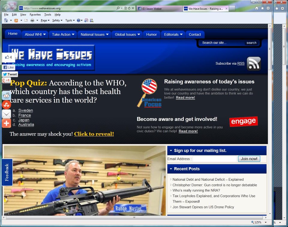
是否有一个快速的“1-2-3”,还是更复杂?我正在处理的网站是我们有问题,我不确定它是否响应或流畅,但根据这张截图,我认为不是。
社交图标和反馈不应与文本重叠。
感谢任何人都可以提供的任何帮助!
我正在尝试使这个 WordPress 网站更流畅或响应更快,这样它就不会在不同的屏幕分辨率下重叠。
我知道@media 属性,但我不确定如何在我的主题中实现它。
是否有一个快速的“1-2-3”,还是更复杂?我正在处理的网站是我们有问题,我不确定它是否响应或流畅,但根据这张截图,我认为不是。
社交图标和反馈不应与文本重叠。
感谢任何人都可以提供的任何帮助!
要使任何网站或 wordpress 网站具有响应性,请使用 css 媒体查询。
将此添加到 head 标签上方的 header.php 文件中
<meta name="viewport" content="width=device-width, initial-scale=1.0">
然后在您的 css 文件中添加媒体查询
@media all and (max-width: 699px) and (min-width: 520px), (min-width: 1151px) {
 body {
  background: #000;
 }
}
然后您的网站现在可以响应了,当然您必须根据每种尺寸设置您的网站样式,但以上内容应该可以帮助您入门。另请查看这篇文章,其中解释了更多。
这是一个非常棘手的话题。您要问的第一个问题是您是否发现您的网站有使用移动设备的流量?
我建议使用网络分析来研究您的流量,例如谷歌自己的网络分析。它为您提供浏览器、操作系统、技术、位置等信息。
然后你真的必须决定它是否值得。有几种工具,我通常推荐:http ://www.abookapart.com/products/responsive-web-design
这是一本好书,作者是一个非常棒的人。
As for doing this fast. There's no fast way to do responsive design the right way. It's about targeting the responsiveness to the proper needs.
Is there a quick "1-2-3" to this, or is it much more intricate?
Much more intricate I'm afraid.
The theme you are running "Flexibility 3" is not adaptive or responsive.
As @coletrain mentions, you may set the initial viewport size using meta tag (note: this does not make your site responsive, it merely sets the initial scale of your site within the devices veiwport).
To make your website play nice on varied viewport sizes you have a few options:
At each of these breakpoints you would have to specify the new dimensions for all elements on your site that need to scale down (e.g. reducing the width of your #wrap div).
This approach is losing popularity largely because it is fundamentally flawed by only targeting a finite number of viewport sizes, but for those less experienced it may be an accessably low hanging fruit http://uxdesign.smashingmagazine.com/2012/11/08/ux-design-qa-with-christian-holst/.
A VERY crude example here - given a rigid two column layout like your .postwrap & #sidebar you could change to employ fluid values like:
.postwrap {
width: 60%;
}
#sidebar {
 width: 35%;
}
Responsive is highly recommended as when implemented correctly, it "future proofs" for the increasingly varied mobile landscape.
有大量的免费响应式 WP 主题,真的没有理由不拥有一个设计良好且对移动设备友好的主题。去谷歌上查询。
此外,至于您的社交图标重叠问题 - 再次利用 WP 的力量来发挥您的优势,如果您正在寻找“1-2-3”解决方案,请尝试一些不同的插件。
编辑:正如@stepquick 所提到的,Ethan Marcottte 的响应式网页设计是一本很好的读物(根据我的经验,A Book Apart 书籍往往是一个很好的“无毛病”资源)。此外,如果您想要更多地动手而不是简单地实现一个打包的主题,您还可以从使用诸如基础http://foundation.zurb.com/之类的框架开始构建您自己的。