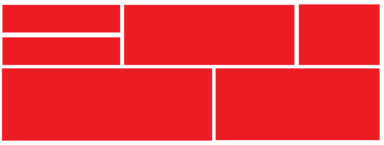
我正在尝试创建一个像这样的模块网格:
我有一个单一模块的样式,我有所有不同大小的盒子的类,我根据我想要的大小添加到每个盒子的 div 类中:(100%/50%/33%/25% 宽度和高度)。
我正在尝试堆叠您在上图左上角看到的盒子。我想我必须创建另一个或两个类来覆盖周围盒子的浮动,但我不知道该怎么做。这是我的代码:
HTML:
<div class="box width_25 container_150">
    <div class="header">Half Size Title</div>
    <div class="content">
        Top box
    </div>
</div>
<div class="box width_25 container_150">
    <div class="header">Half Size Title 2</div>
    <div class="content">
        Box right below
    </div>
</div>

<div class="box width_50 container_300">
    <div class="header">Total Mentions</div>
    <div class="content">
        Center div
    </div>
</div>

<div class="box width_25 container_300">
    <div class="header">Title</div>
    <div class="content">
        Right div
    </div>
</div>
CSS:
/* Variable Widths */

.box {
    display:block;
    -moz-box-sizing: border-box;
    -webkit-box-sizing: border-box;
    box-sizing: border-box;
    margin: 1%;

    background: #FFF;
    color: #333;
    border:1px solid #DDD;
    box-shadow:0px 0px 5px 1px #DDD;
}

.width_100 {
    display: inline-block;
    float: left;
    width: 98%;
}

.width_50 {
    display: inline-block;
    float: left;
    width: 48%;
}

.width_33 {
    display: inline-block;
    float: left;
    width: 31.33%;
}

.width_25 {
    display: inline-block;
    float: left;
    width: 23%;
}

.container_150 {
    height:130px; // not 150px to compensate for margins
}
.container_200 {
    height:200px;
}
.container_250 {
    height:250px;
}
.container_300 {
    height:300px;
}
.container_400 {
    height:400px;
}