1

我有一个 1387 像素宽的联系栏 (.png) 和四个相同的 div,其中包含覆盖它的联系信息(电子邮件、twr、fb)。这应该是这样的:

页脚

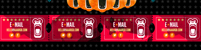
问题: 无论窗口大小如何,我如何平均分配联系人 div 并将它们锚定到背景图像?

结构:

<div id="footer">
    <div id="contact-row">
        <div class="contact">
            <a class="email" href="mailto:#">email</a>  
            <a class="tw" href="http://twitter.com/#" target="_blank"></a> 
            <a class="fb" href="http://www.facebook.com/pages/#" target="_blank"></a>            
        </div>
        ...+ 3 more divs with class of "contact"
    </div>
</div>

款式:

#footer {
    width: 100%;
    height: 178px;
    background: url('../img/contact-bg.png') no-repeat center; 
    position: relative;
    clear: both;
}

#contact-row {  
   width: 100%;  
   height: 178px;
   border: solid 1px #aaa;  
   text-align: center;  
   overflow: hidden;  
   margin: 0 auto 0 auto;
}  

.contact {  
    width: 150px;  
    height: 25px;  
    border: solid 1px #ccc;  
    display: inline-block;  
    margin: 0 50px;
}  

我尝试了许多不同的解决方案,但没有一个与背景图像相关联或适应较小的浏览器窗口。工作副本可以在这里找到:aaargb!!!

我会很感激一些新鲜的眼睛。谢谢!

4

2 回答 2

0

我认为主要问题是您将 #contact-row 设置为width: 100%. 您应该将其设置为,width: 1387px因为这将始终是多宽。然后你应该能够.contact在不担心窗口大小的情况下平均分配你的 div。

于 2013-02-07T21:16:09.323 回答
0

问题是,#footer 并被 #contact-row设置为width:100%. 取消相对 100% 的宽度阻止了它相对于父宽度调整大小。

事实证明,#contact-row是不必要的。摆脱它并继续:

<div id="footer">
    <div class="contact">
         <a class="email" href="mailto:#">email</a>  
         <a class="tw" href="http://twitter.com/#" target="_blank"></a> 
         <a class="fb" href="http://www.facebook.com/pages/#" target="_blank"></a>            
    </div>
        ...+ 3 more divs with class of "contact"
</div>

这些样式.contact同样以 div 为中心:

#footer {
    width:1400px;
    height:178px;
    background:url('../img/contact-bg.png') no-repeat center;
    margin:0 auto; 
    position:relative;
    clear:both;
    overflow:hidden;
}

.contact {  
    width:225px;  
    height:25px;    
    display:inline-block;  
    margin:0 50px 0 68px;
}
于 2013-02-08T17:57:46.677 回答