168

我找到了这个线程——如何在保持图像纵横比的同时拉伸图像以填充 <div>?——这不完全是我想要的。

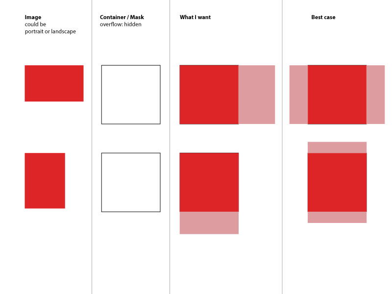
我有一个特定大小的 div 和里面的图像。无论图像是横向还是纵向,我都想始终用图像填充 div。并且图像是否被截断也没关系(div本身已隐藏溢出)。

因此,如果图像是纵向的,我希望它width是这样100%的,height:auto所以它保持成比例。如果图像是横向的,我希望height100%width to beauto`。听起来很复杂吧?

<div class="container">
   <img src="some-image.jpg" alt="Could be portrait or landscape"/>
</div>

因为我不知道该怎么做,所以我只是简单地创建了一个我的意思的快速图像。我什至无法恰当地描述它。

在此处输入图像描述

所以,我想我不是第一个问这个的人。但是我真的找不到解决方案。也许有一些新的 CSS3 方法可以做到这一点 - 我正在考虑 flex-box。任何想法?也许它比我预期的更容易?

4

16 回答 16

209

如果我正确理解你想要什么,你可以离开图像的宽度和高度属性以保持纵横比并使用 flexbox 为你做居中。

.fill {
    display: flex;
    justify-content: center;
    align-items: center;
    overflow: hidden
}
.fill img {
    flex-shrink: 0;
    min-width: 100%;
    min-height: 100%
}
<div class="fill">
    <img src="https://picsum.photos/id/237/320/240" alt="" />
</div>

JSFiddle在这里

我在 IE9、Chrome 31 和 Opera 18 上测试成功。但没有测试其他浏览器。与往常一样,您必须考虑您的特定支持要求。

于 2013-12-03T02:06:40.410 回答
75

有点晚了,但我遇到了同样的问题,最后在另一个 stackoverflow 帖子(https://stackoverflow.com/a/29103071)的帮助下解决了这个问题。

img {
   object-fit: cover;
   width: 50px;
   height: 100px;
}

希望这仍然可以帮助某人。

Ps:也可以与max-heightmax-widthmin-widthmin-height css 属性一起使用。使用100%100vh / 100vw等长度单位来填充容器或整个浏览器窗口非常方便。

于 2016-08-25T16:08:01.947 回答
16

下面的所有答案都有固定的宽度和高度,这使得解决方案“没有响应”。

为了达到结果但保持图像响应,我使用了以下内容:

  1. 在容器内放置一个具有所需比例的透明 gif 图像
  2. 使用要调整大小和裁剪的图像为图像标记内联 css 背景

HTML:

<div class="container">
    <img style="background-image: url("https://i.imgur.com/XOmNCwY.jpg");" src="img/blank.gif">
</div> 


.container img{
   width: 100%;
   height: auto;
   background-size: cover;
   background-repeat: no-repeat;
   background-position: center;
}​
于 2018-07-23T21:20:15.733 回答
13

这应该这样做:

img {    
min-width: 100%;
min-height: 100%;
width: auto;
height: auto;
}
于 2016-08-05T08:54:02.280 回答
8

一个老问题,但值得更新,因为现在有办法。

正确的基于 CSS 的答案是使用object-fit: cover,它的工作方式类似于background-size: cover. 定位将由object-position属性处理,默认为居中。

但是任何 IE / Edge 浏览器或 Android < 4.4.4 都不支持它。此外,object-positionSafari、iOS 或 OSX 也不支持。Polyfills 确实存在,object-fit-images似乎提供了最好的支持。

有关该属性如何工作的更多详细信息,请参阅CSS 技巧文章以object-fit获取解释和演示。

于 2016-06-02T09:59:10.403 回答
7

您可以使用 css flex 属性来实现这一点。请看下面的代码

.img-container {
  border: 2px solid red;
  justify-content: center;
  display: flex;
  flex-direction: row;
  overflow: hidden;
  
}
.img-container .img-to-fit {
  flex: 1;
  height: 100%;
}
<div class="img-container">
  <img class="img-to-fit" src="https://images.pexels.com/photos/8633/nature-tree-green-pine.jpg" />
</div>

于 2018-09-11T17:24:35.603 回答
6

我想出的一个简单方法是object-fit: cover在容器内的 img 上使用

<div class="container"> 
  <img class="image" src="https://mymodernmet.com/wp/wp-content/uploads/2020/11/International-Landscape-Photographer-Year-PhotographER-1st-KelvinYuen-2.jpg">
</div>
.image { 
  height: 100%;
  width: 100%;
  object-fit: cover
}

.container {
  height: 100px; /*Set any dimensions you like*/
  width: 50px;
}

据我测试,无论要使用的图像尺寸如何,这都有效,并且满足您在问题中所述的“最佳情况”,因为结果是垂直和水平居中的。

于 2021-05-18T18:16:55.877 回答
4

考虑将background-size: cover(IE9+) 与background-image. 对于 IE8-,有一个polyfill

于 2013-01-03T16:07:56.967 回答
3

这是一个支持 IE 使用的答案,object-fit因此您不会失去比率

使用一个简单的 JS 片段来检测是否 object-fit支持,然后替换imgsvg

//ES6 version
if ('objectFit' in document.documentElement.style === false) {
  document.addEventListener('DOMContentLoaded', () => {
    document.querySelectorAll('img[data-object-fit]').forEach(image => {
      (image.runtimeStyle || image.style).background = `url("${image.src}") no-repeat 50%/${image.currentStyle ? image.currentStyle['object-fit'] : image.getAttribute('data-object-fit')}`
      image.src = `data:image/svg+xml,%3Csvg xmlns='http://www.w3.org/2000/svg' width='${image.width}' height='${image.height}'%3E%3C/svg%3E`
    })
  })
}

//ES5 version
if ('objectFit' in document.documentElement.style === false) {
  document.addEventListener('DOMContentLoaded', function() {
    Array.prototype.forEach.call(document.querySelectorAll('img[data-object-fit]').forEach(function(image) {
      (image.runtimeStyle || image.style).background = "url(\"".concat(image.src, "\") no-repeat 50%/").concat(image.currentStyle ? image.currentStyle['object-fit'] : image.getAttribute('data-object-fit'));
      image.src = "data:image/svg+xml,%3Csvg xmlns='http://www.w3.org/2000/svg' width='".concat(image.width, "' height='").concat(image.height, "'%3E%3C/svg%3E");
    }));
  });
}
img {
  display: inline-flex;
  width: 175px;
  height: 175px;
  margin-right: 10px;
  border: 1px solid red
}


/*for browsers which support object fit */

[data-object-fit='cover'] {
  object-fit: cover
}

[data-object-fit='contain'] {
  object-fit: contain
}
<img data-object-fit='cover' src='//picsum.photos/1200/600' />
<img data-object-fit='contain' src='//picsum.photos/1200/600' />
<img src='//picsum.photos/1200/600' />


注意:还有一些object-fitpolyfill 可以object-fit正常工作。

这里有一些例子:

于 2020-04-04T11:16:45.290 回答
2

.image-wrapper{
    width: 100px;
    height: 100px;
    border: 1px solid #ddd;
}
.image-wrapper img {
    object-fit: contain;
    min-width: 100%;
    min-height: 100%;
    width: auto;
    height: auto;
    max-width: 100%;
    max-height: 100%;
}
<div class="image-wrapper">
  <img src="">
</div>

于 2019-01-12T15:13:44.620 回答
2

我实现描述的“最佳情况”场景的唯一方法是将图像作为背景:

<div class="container"></div>​
.container {
    width: 150px;
    height: 100px;
    background-image: url("http://i.stack.imgur.com/2OrtT.jpg");
    background-size: cover;
    background-repeat: no-repeat;
    background-position: 50% 50%;
}​
于 2018-07-19T16:32:33.427 回答
1

尝试这个:

img {
  position: relative;
  left: 50%;
  min-width: 100%;
  min-height: 100%;
  transform: translateX(-50%);
}

希望这可以帮助

于 2016-08-07T02:28:54.457 回答
0

您可以使用 div 来实现这一点。没有 img 标签 :) 希望这会有所帮助。

.img{
	width:100px;
	height:100px;
	background-image:url('http://www.mandalas.com/mandala/htdocs/images/Lrg_image_Pages/Flowers/Large_Orange_Lotus_8.jpg');
	background-repeat:no-repeat;
	background-position:center center;
	border:1px solid red;
	background-size:cover;
}
.img1{
	width:100px;
	height:100px;
	background-image:url('https://images.freeimages.com/images/large-previews/9a4/large-pumpkin-1387927.jpg');
	background-repeat:no-repeat;
	background-position:center center;
	border:1px solid red;
	background-size:cover;
}
<div class="img">	
</div>
<div class="img1">	
</div>

于 2017-11-29T09:11:07.627 回答
0

这里有我的工作示例。我使用了一个技巧,将图像设置为具有 background-size:cover 和 background-position:center center 的 div 容器的背景

我已经放置了宽度:100% 和不透明度:0 的图像,使其不可见。请注意,我展示我的图像只是因为我对调用子点击事件特别感兴趣。

请注意,我使用的 angular 完全无关紧要。

<div class="foto-item" ng-style="{'background-image':'url('+foto.path+')'}">
    <img class="materialboxed" ng-class="foto.picid" ng-src="{{foto.path}}" style="opacity: 0;filter: alpha(opacity=0);" width="100%" onclick="$('.materialboxed')/>
 </div>
<style>
.foto-item {
height: 75% !important;
width: 100%;
position: absolute;
top: 0;
left: 0;
overflow:hidden;
background-size: cover;
background-position: center center;
}
</style>

结果是您在所有情况下都定义为最佳的结果

于 2016-05-26T12:47:42.793 回答
0

CSSobject-fit: coverobject-position: left center属性值现在解决了这个问题。

于 2018-06-08T07:46:56.120 回答
-3

只需修复图像的高度并提供 width = auto

img{
    height: 95vh;
    width: auto;
}
于 2019-07-21T12:50:49.840 回答