因为您可以像这样在 CSS 中为任何文本添加下划线:
h4 {
  text-decoration: underline;
}
然后你怎么能编辑绘制的“线”,你在线上得到的颜色很容易指定,color: red但是如何编辑线的高度,即厚度?
这是实现此目的的一种方法:
HTML:
<h4>This is a heading</h4>

<h4><u>This is another heading</u></h4>
CSS:
u {
text-decoration: none;
border-bottom: 10px solid black;
}
这是一个例子:http: //jsfiddle.net/AQ9rL/
最近我不得不处理 FF 下划线太粗并且离 FF 中的文本太远的问题,并找到了一个更好的方法来使用一对 box-shadows 来处理它:
.custom-underline{
  box-shadow: inset 0 0px 0 white, inset 0 -1px 0 black
}
第一个阴影放在第二个阴影之上,这就是您可以通过改变两者的“px”值来控制第二个阴影的方法。
加:各种颜色、粗细和下划线位置
减号:不能在非纯色背景上使用
在这里我做了几个例子:http: //jsfiddle.net/xsL6rktx/
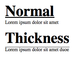
有text-decoration-thickness,目前是CSS 文本装饰模块 Level 4的一部分。它处于“编辑草稿”阶段 - 所以它是一项正在进行中的工作,可能会发生变化。截至 2020 年 1 月,它仅在 Firefox 和 Safari 中受支持。
text-decoration-thickness CSS 属性设置元素中文本上使用的装饰线的粗细或宽度,例如穿线、下划线或上划线。
a {
  text-decoration-thickness: 2px;
}
Codepen:https ://codepen.io/mrotaru/pen/yLyLOgr (仅限火狐)
还有text-decoration-color,它是CSS 文本装饰模块 Level 3的一部分。这是更成熟的(候选推荐),大多数主流浏览器都支持(Edge 和 IE 除外)。当然它不能用来改变线条的粗细,但可以用来实现更“柔和”的下划线(也显示在 codepen 中)。
非常简单……在“span”元素外,字体和下划线较小,在“font”元素内,字体较大。
<span style="font-size:1em;text-decoration:underline;">
 <span style="font-size:1.5em;">
   Text with big font size and thin underline
 </span>
</span>另一种方法是在要下划线的元素上使用“:after”(伪元素)。
h2 {
  position:relative;
  display:inline-block;
  font-weight:700;
  font-family:arial,sans-serif;
  text-transform:uppercase;
  font-size:3em;
}
h2:after {
  content:"";
  position:absolute;
  left:0;
  bottom:0;
  right:0;
  margin:auto;
  background:#000;
  height:1px;
}
我会做一些简单的事情,比如:
.thickness-underline {
  display: inline-block;
  text-decoration: none;
  border-bottom: 1px solid black;
  margin-bottom: -1px;
}
line-height或padding-bottom设置它们之间的位置display: inline在某些情况下使用演示:http: //jsfiddle.net/5580pqe8/
background-image也可用于创建下划线。此方法处理换行符。
它必须通过向下移动background-position并水平重复。background-size可以使用(背景限于元素的内容框)在一定程度上调整线宽。
.underline
{
    --color: green;
    font-size: 40px;
    background-image: linear-gradient(var(--color) 0%, var(--color) 100%);
    background-repeat: repeat-x;
    background-position: 0 1.05em;
    background-size: 2px 5px;
}
<span class="underline">
Underlined<br/>
Text
</span>a {
text-decoration: none;
position: relative;
}
a.underline {
text-decoration: underline;
}
a.shadow {
   box-shadow: inset 0 -4px 0 white, inset 0 -4.5px 0 blue;
}<h1><a href="#" class="underline">Default: some text alpha gamma<br>the quick brown fox</a></h1>
<p>Working:</p>
<h1><a href="#" class="shadow">Using Shadow: some text alpha gamma<br>the quick brown fox<br>even works with<br>multiple lines</a></h1>
<br>最终解决方案: http ://codepen.io/vikrant-icd/pen/gwNqoM
a.shadow {
box-shadow: inset 0 -4px 0 white, inset 0 -4.5px 0 blue;
}
我的解决方案: https ://codepen.io/SOLESHOE/pen/QqJXYj
{
    display: inline-block;
    border-bottom: 1px solid;
    padding-bottom: 0;
    line-height: 70%;
}
您可以使用 line-height 值调整下划线位置,使用border-bottom 调整下划线粗细和样式。
如果要为 href 下划线,请注意禁用默认下划线行为。
您可以linear-gradient通过将其设置为这样来做到这一点:
h1, a {
    display: inline;
    text-decoration: none;
    color: black;
    background-image: linear-gradient(to top, #000 12%, transparent 12%);
}
<h1>I'm underlined</h1>
<p>Lorem ipsum dolor sit amet, consectetur adipiscing elit, sed do eiusmod tempor incididunt ut labore et dolore magna aliqua. Ut enim ad minim <a href="https://stackoverflow.com">veniam, quis nostrud exercitation ullamco laboris nisi ut aliquip ex ea commodo consequat. Duis aute irure dolor in</a> reprehenderit in voluptate velit esse cillum dolore eu fugiat nulla pariatur. Excepteur sint occaecat cupidatat non proident, sunt in culpa qui officia deserunt mollit anim id est laborum.</p>而且,是的,你可以像这样改变它......
var m = document.getElementById("m");
m.onchange = u;
function u() {
    document.getElementById("a").innerHTML = ":root { --value: " + m.value + "%;";
}
h1, a {
display: inline;
text-decoration: none;
color: black;
background-image: linear-gradient(to top, #000 var(--value), transparent var(--value));
}<h1>I'm underlined</h1>
<p>Lorem ipsum dolor sit amet, consectetur adipiscing elit, sed do eiusmod tempor incididunt ut labore et dolore magna aliqua. Ut enim ad minim <a href="https://stackoverflow.com">veniam, quis nostrud exercitation ullamco laboris nisi ut aliquip ex ea commodo consequat. Duis aute irure dolor in</a> reprehenderit in voluptate velit esse cillum dolore eu fugiat nulla pariatur. Excepteur sint occaecat cupidatat non proident, sunt in culpa qui officia deserunt mollit anim id est laborum.</p>
<style id="a"></style>
<input type="range" min="0" max="100" id="m" />