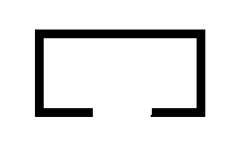
我可以使 div 边框的一部分(从 x1 到 x2)透明吗?
如果不是,您可以建议什么方法?
我的想法 [非常糟糕] 是在画布元素中绘制边框并将其(画布主体是透明的)放在 div 元素上。
我可以使 div 边框的一部分(从 x1 到 x2)透明吗?
如果不是,您可以建议什么方法?
我的想法 [非常糟糕] 是在画布元素中绘制边框并将其(画布主体是透明的)放在 div 元素上。
由于 DIV 只有 4 个元素(上、下、左、右),因此您不能使边框的一部分透明 AFAIK。
但是,您可以创建覆盖您的 div 的元素,并使用相对定位来构建符合您口味的边框。例如:
<style>
 .multiborder{
        border:1px solid black;
        border-top:none;
        width:500px;
        height:100px;
        position:relative;
    }
    .top-border-1{
        border-top:2px solid red;
        width:100px;
        position:absolute;
        top:0px;
        right:0px;
    }
    .top-border-2{
        border-top:3px double blue;
        width:300px;
        position:absolute;
        top:0px;
        left:0px;
    }
</style>
<div class="multiborder">
    <div class="top-border-1"></div>
    <div class="top-border-2"></div>
</div>
这里有两种可能的方法来做到这一点:
两种方法中的requiredHTML将保持不变,如下所示:
HTML:
<div class="box"></div>
方法#01:
border使用css 属性绘制顶部、右侧和左侧边框。linear-gradient使用css 属性绘制底部透明边框。CSS:
.box {
  /* Following css will create bottom border */
  background: linear-gradient(to right, #000 30%, transparent 30%, transparent 70%, black 70%) no-repeat;
  background-size: 100% 8px;
  background-position: 0 100%;

  /* Following css will create top, left and right borders */
  border: solid #000;
  border-width: 8px 8px 0;

  width: 100px;
  height: 50px;
}
html,
body {
  height: 100%;
}
body {
  background: linear-gradient(to top, #ff5a00 0, #ffae00 100%);
  margin: 0;
}
.box {
  background: linear-gradient(to right, #000 30%, transparent 30%, transparent 70%, black 70%) no-repeat;
  background-size: 100% 8px;
  background-position: 0 100%;
  border: solid #000;
  border-width: 8px 8px 0;
  margin: 20px 15px;
  width: 100px;
  height: 50px;
}
<div class="box"></div>方法#02:
border使用css 属性绘制顶部、右侧和左侧边框。:before使用和:after伪元素绘制底部边框。CSS:
.box {
  /* Following css will create top, left and right borders */
  border: solid black;
  border-width: 8px 8px 0;

  position: relative;
  overflow: hidden;
  width: 100px;
  height: 50px;
}

/* Following css will create bottom border */
.box:before,
.box:after {
  position: absolute;
  background: #000;
  content: '';
  height: 8px;
  width: 30%;
  bottom: 0;
  left: 0;
}

.box:after {
  left: auto;
  right: 0;
}
html,
body {
  height: 100%;
}
body {
  background: linear-gradient(to top, #ff5a00 0, #ffae00 100%);
  margin: 0;
}
.box {
  border: solid black;
  border-width: 8px 8px 0;
  position: relative;
  overflow: hidden;
  margin: 15px 10px;
  width: 100px;
  height: 50px;
}

.box:before,
.box:after {
  position: absolute;
  background: #000;
  content: '';
  height: 8px;
  width: 30%;
  bottom: 0;
  left: 0;
}

.box:after {
  left: auto;
  right: 0;
}
<div class="box"></div>