我在 Photoshop 中有一个像这样边缘的形状:
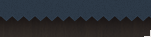
是否可以使用 CSS 将重复的三角形作为边框?
您可以使用渐变来创建锯齿形图案背景,使用::after伪元素将其应用为边框。
.header{
    color: white;
    background-color: #2B3A48;
    text-align: center;
}
.header::after {
    content: " ";
    display: block;
    position: relative;
    top: 0px;
    left: 0px;
    width: 100%;
    height: 36px;
    background: linear-gradient(#2B3A48 0%, transparent 0%), linear-gradient(135deg, #272220 33.33%, transparent 33.33%) 0 0%, #272220 linear-gradient(45deg, #272220 33.33%, #2B3A48 33.33%) 0 0%;
    background-repeat: repeat-x;
    background-size: 0px 100%, 9px 27px, 9px 27px;
}
<div class="header"><h1>This is a header</h1></div>JSFiddle:http: //jsfiddle.net/kA4zK/
对于未来的观众,我发现@extramaster 答案的这种改编更简单一些。
它本质上是相同的,但它使用了更少的背景渐变,并允许支持对象(.navbar在我的标记中)显示出来,而不是将第二种颜色硬编码到之字形中。
JsFiddle:http: //jsfiddle.net/861gjx0b/2/
.header {
  position: relative;
  color: white;
  background-color: #2B3A48;
  text-align: center;
}

.navbar {
  background: #272220;
  height: 20px;
}

.header:after {
  content: "";
  position: absolute;
  display: block;
  height: 10px;
  bottom: -10px;
  /* -height */
  left: 0;
  right: 0;
  /* TODO Add browser prefixes */
  background: linear-gradient( 45deg, transparent 33.333%, #2B3A48 33.333%, #2B3A48 66.667%, transparent 66.667%), linear-gradient( -45deg, transparent 33.333%, #2B3A48 33.333%, #2B3A48 66.667%, transparent 66.667%);
  background-size: 8px 20px;
  /* toothSize doubleHeight */
  background-position: 0 -10px;
  /* horizontalOffset -height */
}
<div class="header">
<h1>This is a header</h1>
</div>
<nav class="navbar"></nav>就个人而言,我认为剪辑路径比复杂的背景渐变更容易使用/理解。
body {
  font-family:Roboto,'Open Sans',Helvetica,sans-serif;
}
.container {
  background:#ddd;
  margin:0 auto;
  max-width:800px;
  padding:30px;
}
h1:first-child {margin:0;}

.jagged-bottom {
  position:relative;
}
.jagged-bottom:after {
  background:#ddd;
  content:"";
  height:2vw;
  position:absolute;
  top:100%;
  left:0;
  right:0;
  clip-path:polygon(
     0 0, 2.5% 100%, 5% 0,  7.5% 100%,
   10% 0,12.5% 100%,15% 0, 17.5% 100%,
   20% 0,22.5% 100%,25% 0, 27.5% 100%,
   30% 0,32.5% 100%,35% 0, 37.5% 100%,
   40% 0,42.5% 100%,45% 0, 47.5% 100%,
   50% 0,52.5% 100%,55% 0, 57.5% 100%,
   60% 0,62.5% 100%,65% 0, 67.5% 100%,
   70% 0,72.5% 100%,75% 0, 77.5% 100%,
   80% 0,82.5% 100%,85% 0, 87.5% 100%,
   90% 0,92.5% 100%,95% 0, 97.5% 100%, 100% 0);
}
<div class="container jagged-bottom">
<h1>Looks Like A Receipt</h1>
<p>Simply adjust the clip path on the pseudo-element if you want more or fewer spikes, and the height if you want them to be taller or shorter.</p>
</div>CSS3 中有一个border-image 属性。也许你可以用你想要的方式解决它。更多在这里:
https://developer.mozilla.org/en-US/docs/Web/CSS/border-image
或者在这里
你可以很容易地使用 CSS 创建一个单独的三角形(只需调整边框属性)。为了使它起作用,您需要自己生成相当多的标记。我建议不要使用这种方法。
相反,您最好使用包含单个三角形(最好是透明的 .png)的单个图像,然后使用background-imageand background-repeat( repeat-x) 属性将其绑定到 div(您的“边框”)。
不幸的是,目前还没有一种直接的方法可以使用纯 CSS 来实现这一点。