5

我正在尝试创建一个像这样的尖按钮:

尖头按钮

到目前为止,我只能做到这一点:

圆形按钮

我认为增加水平边界半径会使它变得尖锐,但它所做的只是使圆度更长。

HTML

<a class="button">Back</a>

CSS

.button {
    display: inline-block;
    height: 3em;
    padding: 0 0.7em 0 1.4em;
    border: 0.1em solid black;
    border-radius: 3em 0.4em 0.4em 3em / 1.5em 0.4em 0.4em 1.5em;
    background: -moz-linear-gradient(
        top,
        #fff,
        #ccc
    );
}
4

3 回答 3

3

您不想使用border-radius它为每个指定的角分配一个四分之一圆形。相反,您可以使用特定属性来破解它border-width,如本网站所示:http: //www.howtocreate.co.uk/tutorials/css/slopes

但是我觉得您以错误的方式解决问题;你所做的最好使用背景图像,这就是 iOS 风格的后退按钮在 iPhone-for-web 样式表中的实现方式。如果您需要与分辨率无关的东西,那么您现在可以使用 SVG 而不会受到惩罚。

于 2012-12-08T03:27:00.510 回答
1

您可以使用并排包裹在锚标签中的 2 个元素来创建这样的效果。

<style type="text/css">
.arrow-left {
        width:0; 
        height:0; 
        border-top:30px solid transparent;
        border-bottom:30px solid transparent;
        border-right:30px solid orange; 
        float:left;
}
.button {
        float:left;
        height:60px;
        background:orange;
        width:50px;
        line-height:60px;
        font-weight:bold; 
        border-top-right-radius:8px;
        border-bottom-right-radius:8px;
}
</style>

<a href='#'><div class="arrow-left"></div><div class="button">Back</div></a>

我不确定它是否是最精致的解决方案,但它肯定看起来与您的概念艺术和预期的功能相同。

于 2012-12-08T03:35:54.387 回答
1

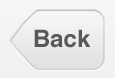
仔细考虑后,这是一个更优雅的解决方案,它允许更有效的样式和仅使用一个 HTML 元素。使用这种方法,我们可以完全实现您的概念中的结果。

HTML

<a href="#" class="button">Back</a>

CSS

a.button {
    text-decoration:none;
    color:#111;
    text-shadow:0 1px 0 #fff;
    font-weight:bold;
    padding:10px 10px;
    font-size:14px;
    border-radius:0 8px 8px 0;
    -webkit-border-radius:0 8px 8px 0;
    float:left;
    margin-left:30px;
    margin-top:20px;
    position:relative;
    font-family:verdana;
    color:#3b3d3c;
    border:1px solid #666;
    border-left:0;
    background: -moz-linear-gradient( top , #eee 0%,#bbb 100%);
    background: -webkit-linear-gradient( top , #eee 0%,#bbb 100%);  
}
a.button:after {
    content:"";
     width:25px;
     height:25px;
     background: -moz-linear-gradient( left top , #eee 0%,#bbb 100%);
     background: -webkit-linear-gradient( left top , #eee 0%,#bbb 100%);
     -moz-transform: rotate(45deg);
     -webkit-transform: rotate(45deg);
     display:block;
     position:absolute;
     top:5px;
     left:-14px;
     z-index:-1;
     border:1px solid  #666;
}
@media screen and (-webkit-min-device-pixel-ratio:0) {
a.button:after{
    border-left:0;
    left:-13px;
}

最后一条规则适用于 Chrome,否则其呈现的结果会略有不同。

希望这可以帮助。

于 2012-12-08T17:04:24.707 回答