0

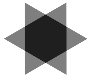
我不擅长数学和几何,所以如果有人可以帮助我创建以下形状,我会很高兴:

形状

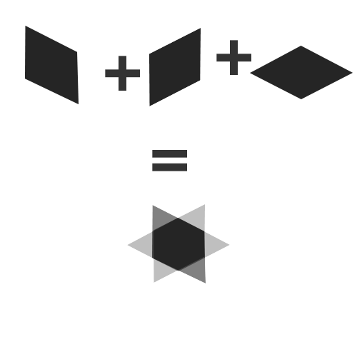
所以基本上形状存在于 3 个矩形中,我让前两个与变换矩阵完美配合,但我无法让最后一个与形状匹配(参见上面的链接以获取 img)

JSFiddle,到目前为止我尝试过的或查看下面的代码

HTML

<div class="shape">
  <div class="shape-rect-one"></div>
  <div class="shape-rect-two"></div>
  <div class="shape-rect-three"></div>
</div>​

CSS

.shape {
  perspective: 1000px;
}

.shape div {
  width: 100px;
  height: 100px;
  opacity: 0.4;
  background-color: #333;
}

.shape-rect-one {
  z-index: 100;

  transform: matrix(1, -0.40, 0, 1, 0, 0);
  -webkit-transform: matrix(1, -0.40, 0, 1, 0, 0);
}

.shape-rect-two {
  z-index: 200;

  transform: matrix(1, -0.40, 0, 1, 0, 0);
  -webkit-transform: matrix(1, 0.40, 0, 1, 0, 0);
}

.shape-rect-three {
  z-index: 300;
}​
4

2 回答 2

6

你可以用一种更简单的方式来完成它,只需要一个元素。

演示

结果

6分星

HTML

<div class='piece'></div>

相关CSS

.piece {
  width: 10em; height: 8.66em; /* 10*sqrt(3)/2 = 8.66 */
  background: rgba(0,0,0,.5);
}
.piece {
  position: relative;
  transform: rotate(-30deg) skewX(30deg);
}
.piece:before, .piece:after {
  position: absolute;
  width: inherit; height: inherit;
  background: inherit;
  content: '';
}
.piece:before { transform: skewX(-30deg) skewX(-30deg); }
.piece:after { transform: skewX(-30deg) rotate(-60deg) skewX(-30deg); }
于 2013-02-15T09:39:47.097 回答
1

这应该创建钻石形状。

transform: matrix(-0.965, 0.45, -0.965, -0.45, 0, 0);
-webkit-transform: matrix(-0.965, 0.45, -0.965, -0.45, 0, 0);
于 2012-11-09T19:36:45.807 回答