volume_overlay3 对我不起作用。因此,我尝试了您的想法,将条形图添加到烛台图。
在为交易量创建双轴后,重新定位该轴(使其变短)并修改烛台 y 数据的范围以避免碰撞。
import numpy as np
import matplotlib
import matplotlib.pyplot as plt
# from matplotlib.finance import candlestick
# from matplotlib.finance import volume_overlay3
# finance module is no longer part of matplotlib
# see: https://github.com/matplotlib/mpl_finance
from mpl_finance import candlestick_ochl as candlestick
from mpl_finance import volume_overlay3
from matplotlib.dates import num2date
from matplotlib.dates import date2num
import matplotlib.mlab as mlab
import datetime

datafile = 'data.csv'
r = mlab.csv2rec(datafile, delimiter=';')

# the dates in my example file-set are very sparse (and annoying) change the dates to be sequential
for i in range(len(r)-1):
    r['date'][i+1] = r['date'][i] + datetime.timedelta(days=1)

candlesticks = zip(date2num(r['date']),r['open'],r['close'],r['max'],r['min'],r['volume'])

fig = plt.figure()
ax = fig.add_subplot(1,1,1)

ax.set_ylabel('Quote ($)', size=20)
candlestick(ax, candlesticks,width=1,colorup='g', colordown='r')

# shift y-limits of the candlestick plot so that there is space at the bottom for the volume bar chart
pad = 0.25
yl = ax.get_ylim()
ax.set_ylim(yl[0]-(yl[1]-yl[0])*pad,yl[1])

# create the second axis for the volume bar-plot
ax2 = ax.twinx()


# set the position of ax2 so that it is short (y2=0.32) but otherwise the same size as ax
ax2.set_position(matplotlib.transforms.Bbox([[0.125,0.1],[0.9,0.32]]))

# get data from candlesticks for a bar plot
dates = [x[0] for x in candlesticks]
dates = np.asarray(dates)
volume = [x[5] for x in candlesticks]
volume = np.asarray(volume)

# make bar plots and color differently depending on up/down for the day
pos = r['open']-r['close']<0
neg = r['open']-r['close']>0
ax2.bar(dates[pos],volume[pos],color='green',width=1,align='center')
ax2.bar(dates[neg],volume[neg],color='red',width=1,align='center')

#scale the x-axis tight
ax2.set_xlim(min(dates),max(dates))
# the y-ticks for the bar were too dense, keep only every third one
yticks = ax2.get_yticks()
ax2.set_yticks(yticks[::3])

ax2.yaxis.set_label_position("right")
ax2.set_ylabel('Volume', size=20)

# format the x-ticks with a human-readable date.
xt = ax.get_xticks()
new_xticks = [datetime.date.isoformat(num2date(d)) for d in xt]
ax.set_xticklabels(new_xticks,rotation=45, horizontalalignment='right')

plt.ion()
plt.show()
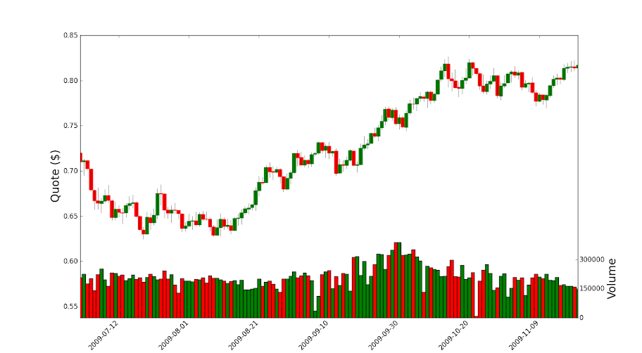
data.csv 在这里:
http ://pastebin.com/5dwzUM6e