6

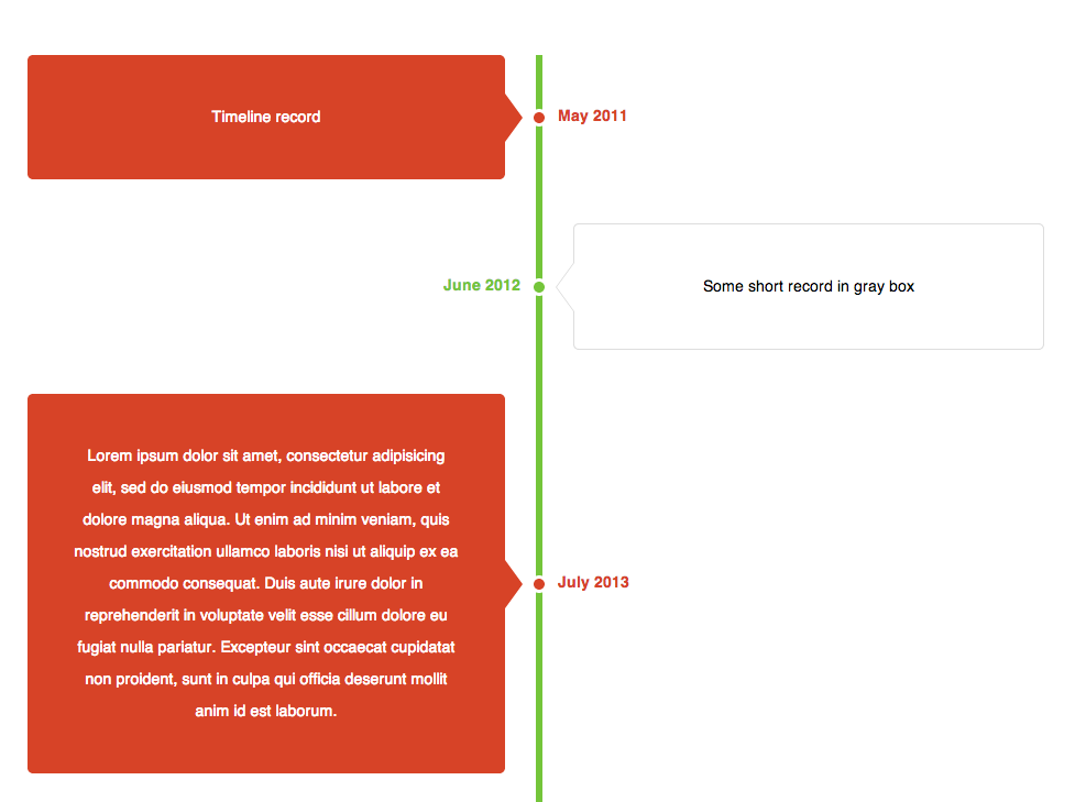
我正在使用 css 制作垂直时间线,任何人都可以提供帮助。左侧部分变得拥挤。左边部分的指针圈与对面的部分重叠。尝试仅使用 css 制作它。我们可以添加任何 java 脚本来使其工作。

http://jsfiddle.net/cdtHx/

代码:

    <!DOCTYPE HTML>
<html>
    <head>
    <meta charset="utf-8">
    <title>Untitled Document</title>
    <style type='text/css'>
.line {
    width:930px;
    margin:0 auto;
}
.line div {
    width: 408px;
    background-color:#ffffff;
    border:solid 1px #B4BBCD;
    min-height:35px;
    text-align:justify;
    word-wrap:break-word;
    list-style:none;
}
.ci {
    position:relative;
    float:right;
}
.cl {
    position: relative;
    text-align:right;
}
.ci, .cl span {
    padding:10px;
}
.line:before {
    content: "";
    position: absolute;
    top: 0;
    left: 50%;
}
.ci:before, .cl:after, .ci span:before, .cl span:after {
    content: "";
    position: absolute;
    top: 0;
    left: 0;
}
.line:before {
    width: 3px;
    top: -20px;
    bottom: -20px;
    background:#000;
}
.ci:before {
    width: 5px;
    height: 5px;
    border: 3px solid #CCC;
    border-radius: 100px;
    margin: 10px 0 0 -38px;
    box-shadow: 0 1px 1px rgba(0,0,0,0.2), inset 0 1px 1px rgba(0,0,0,0.1);
    background: #000;
}
.ci:hover:before {
    background: #090;
}
.ci span:before {
    top: 12px;
    left: -6px;
    width: 9px;
    height: 9px;
    border-width: 0 0 1px 1px;
    border-style: solid;
    border-color: #e5e5e5;
    background: #fff;
    -webkit-transform: rotate(45deg);
    -moz-transform: rotate(45deg);
    -ms-transform: rotate(45deg);
    -o-transform: rotate(45deg);
}
/*gggggg*/
    .cl:after {
    width: 5px;
    height: 5px;
    border: 3px solid #CCC;
    border-radius: 100px;
    margin: 10px 0 0 445px;
    background: #000;
}
.cl:hover:after {
    background: #090;
}
.cl span:after {
    top: 12px;
    left: 404px;
    width: 9px;
    height: 9px;
    border-width: 1px 1px 0 0;
    border-style: solid;
    border-color: #e5e5e5;
    background: #fff;
    -webkit-transform: rotate(45deg);
    -moz-transform: rotate(45deg);
    -ms-transform: rotate(45deg);
    -o-transform: rotate(45deg);
}
​
</style>
    </head>

    <body style="overflow:hidden;">
    <div class="line">
      <div class="ci"><span>one</span></div>
      <div class="cl"><span>two</span></div>
      <div class="ci"><span>one</span></div>
      <div class="cl"><span>two</span></div>
      <div class="ci"><span>one</span></div>
      <div class="cl"><span>two</span></div>
    </div>
</body>
</html>
4

3 回答 3

8

查看我在 Github 上的示例https://gist.github.com/OzzyCzech/6240202

它的垂直时间线元素位于两侧(左侧和右侧)

在此处输入图像描述

于 2013-08-15T11:52:42.620 回答
1

重新定义.ci.cl

.ci {
    position: relative;
    float: right;
    clear: right;/*added*/
}

.cl {
    position: relative;
    /*text-align: right;*//*removed*/
    float: left;/*added*/
    clear: left;/*added*/
}

更改line div.cl span:after

.line div {
    width: 396px;/*changed from 408px*/
    background-color: #ffffff;
    border: solid 1px #B4BBCD;
    min-height: 35px;
    text-align: justify;
    word-wrap: break-word;
    list-style: none;
}

.line:before {
    width: 2px;/*changed from 3px*/
    top: -20px;
    bottom: -20px;
    background: #000;
}

.cl span:after {
    top: 12px;
    left: 392px;/*changed from 404px*/
    width: 9px;
    height: 9px;
    border-width: 1px 1px 0 0;
    border-style: solid;
    border-color: #e5e5e5;
    background: #fff;
    -webkit-transform: rotate(45deg);
    -moz-transform: rotate(45deg);
    -ms-transform: rotate(45deg);
    -o-transform: rotate(45deg);
}​

更新小提琴:http: //jsfiddle.net/cdtHx/1/

那是你要找的吗?

于 2012-10-27T02:42:58.250 回答
0

.wrapper{
  max-width: 200px;
  border-right: 1px solid green;
  padding-right: 10px;
}
.wrapper .element{
  position: relative;
  width: 80%;
  margin-top: -30px;
  padding: 20px;
  border: 1px solid blue;
}

.wrapper .element:before{
  position: absolute;
  content:'';
  width: 20px;
  top: 10px;
  right: -15px;
  border-top: 1px solid red;
}
.wrapper .element:first-child{
  margin-top: 0;
}
.wrapper .element:nth-child(2n){
  margin-left: 110%;
}
.wrapper .element:nth-child(2n):before{
  right: auto;
  left: -15px;
}
<div class="wrapper">
  <div class="element">text text<p>text</p>texttext</div>
  <div class="element">text text<p>text</p>texttext</div>
  <div class="element">text text<p>text</p>texttext</div>
  <div class="element">text text<p>text</p>texttext</div>
  <div class="element">text text<p>text</p>texttext</div>
  <div class="element">text text<p>text</p>texttext</div>
</div>

于 2017-11-28T16:53:39.493 回答