12

所以我正在我的网站上处理用户的个人资料页面。我对 CSS 有一点问题。

我的问题如下:我有四个宽度固定但高度可变的 div 框,我希望它们将一个堆叠在另一个之上。

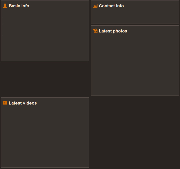
下图是我的问题的截图,标题为“最新视频”的 div 应该粘在标题为“基本信息”的那个上。就像“联系方式”和“最新照片”一样。

我的问题

我的 html 看起来像这样:

<div style="margin-left:-10px">
    <div class="infoBox" style="width:360px;  margin-left:9px">
        Content goes here for basic info
    </div>
    <div class="infoBox" style="width:360px;  margin-left:9px">
        Content goes here for contact info
    </div>
    <div class="infoBox" style="width:360px;  margin-left:9px">
        Content goes here for latest photos
    </div>
    <div class="infoBox" style="width:360px;  margin-left:9px">
        Content goes here for latest videos
    </div>
</div>

信息框的 CSS 类如下所示:

.infoBox {
    width: 100%;
    margin: -1px; 
    background-color:#37312d;
    padding:5px;
    border:#5b504a solid 1px;
    margin-bottom:9px;
    float:left;
}

我该怎么做才能完成这项工作?

4

5 回答 5

6

缺少将div嵌套在列中

<div class="left-column">
    <div class="infoBox">...</div>
    <div class="infoBox">...</div>
</div>
<div class="right-column">
    <div class="infoBox">...</div>
    <div class="infoBox">...</div>
</div>

你可以试试jQuery Masonry。这是一个演示其用途的小提琴。

于 2012-09-10T18:53:03.133 回答
1

您可以像这样将框放在列中。这是一个非常基本的网格系统,但它显示了基本思想:您将框堆叠在形成列的包装器 div 中。

如果您要在整个网站上重复这种模式,您可能需要使用更正式的网格系统。只需搜索“css网格系统”即可找到许多示例。

于 2012-09-10T18:57:09.477 回答
1

我建议您将内容分为两列:

HTML:

<div style="margin-left:-10px">
    <div class="column">
        <div class="infoBox" style="width:360px;  margin-left:9px">
            Content goes here for basic info
        </div>
        <div class="infoBox" style="width:360px;  margin-left:9px">
            Content goes here for latest videos
        </div>
    </div>
    <div class="column">
        <div class="infoBox" style="width:360px;  margin-left:9px">
            Content goes here for contact info
        </div>
        <div class="infoBox" style="width:360px;  margin-left:9px">
            Content goes here for latest photos
        </div>
    </div>
</div>

并在您的 CSS 中添加:

.column{float:left; width:50%;}

更新:如果您使用此解决方案,列内的框不需要浮动

于 2012-09-10T18:59:47.360 回答
1

我为这个问题找到的最佳解决方案是用 .odd 和 .even 或 .left 和 .right 类标记每个帖子,然后简单地向左浮动奇数/左帖子并向右浮动偶数/右帖子。请注意,这仅在帖子的宽度加起来等于其容器的宽度时才有效。然后,要在各种屏幕尺寸上进行这项工作,只需添加一个@media 查询以将偶数/右柱上的浮动更改为留在小于双列容器宽度的屏幕上。

于 2014-03-19T00:36:37.203 回答
0

您可以尝试使用此代码

#bottom{
    width: ???px;
    height: ???px;
    background-color: black;
}
#top{
    width:???px;
    height:???px;
    background-color:red;
    z-index: 999;
}


<div id="bottom">
    <div>......</div>
  <div id="top">......</div>
</div>
于 2012-09-10T18:56:07.053 回答