在 Mac 版 Chrome 中,可以“过度滚动”页面(因为没有更好的词),如下面的屏幕截图所示,以查看“后面是什么”,类似于 iPad 或 iPhone。
我注意到某些页面已禁用它,例如 gmail 和“新标签”页面。
如何禁用“过度滚动”?还有其他方法可以控制“过度滚动”吗?
在 Mac 版 Chrome 中,可以“过度滚动”页面(因为没有更好的词),如下面的屏幕截图所示,以查看“后面是什么”,类似于 iPad 或 iPhone。
我注意到某些页面已禁用它,例如 gmail 和“新标签”页面。
如何禁用“过度滚动”?还有其他方法可以控制“过度滚动”吗?
接受的解决方案对我不起作用。我在仍然能够滚动的同时让它工作的唯一方法是:
html {
    overflow: hidden;
    height: 100%;
}

body {
    height: 100%;
    overflow: auto;
}
在 Chrome 63+、Firefox 59+ 和 Opera 50+ 中,您可以在 CSS 中执行此操作:
body {
  overscroll-behavior-y: none;
}
这会禁用问题屏幕截图中显示的 iOS 上的橡皮筋效果。然而,它也禁用了下拉刷新、发光效果和滚动链接。
但是,您可以选择在过度滚动时实现自己的效果或功能。例如,如果您想模糊页面并添加整洁的动画:
<style>
  body.refreshing #inbox {
    filter: blur(1px);
    touch-action: none; /* prevent scrolling */
  }
  body.refreshing .refresher {
    transform: translate3d(0,150%,0) scale(1);
    z-index: 1;
  }
  .refresher {
    --refresh-width: 55px;
    pointer-events: none;
    width: var(--refresh-width);
    height: var(--refresh-width);
    border-radius: 50%;
    position: absolute;
    transition: all 300ms cubic-bezier(0,0,0.2,1);
    will-change: transform, opacity;
    ...
  }
</style>

<div class="refresher">
  <div class="loading-bar"></div>
  <div class="loading-bar"></div>
  <div class="loading-bar"></div>
  <div class="loading-bar"></div>
</div>

<section id="inbox"><!-- msgs --></section>

<script>
  let _startY;
  const inbox = document.querySelector('#inbox');

  inbox.addEventListener('touchstart', e => {
    _startY = e.touches[0].pageY;
  }, {passive: true});

  inbox.addEventListener('touchmove', e => {
    const y = e.touches[0].pageY;
    // Activate custom pull-to-refresh effects when at the top of the container
    // and user is scrolling up.
    if (document.scrollingElement.scrollTop === 0 && y > _startY &&
        !document.body.classList.contains('refreshing')) {
      // refresh inbox.
    }
  }, {passive: true});
</script>
浏览器支持
在撰写本文时,Chrome 63+、Firefox 59+ 和 Opera 50+ 都支持它。Edge 公开支持它,而 Safari 是未知数。在MDN 文档中跟踪进度和当前浏览器兼容性
更多信息
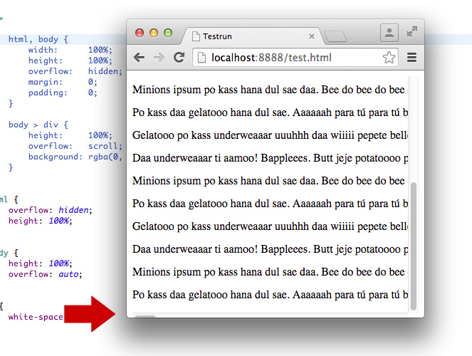
overscroll-behaviorCSS 规范防止这种情况的一种方法是使用以下 CSS:
html, body {
    width: 100%;
    height: 100%;
    overflow: hidden;
}

body > div {
    height: 100%;
    overflow: scroll;
    -webkit-overflow-scrolling: touch;
}
这样,在页面顶部和底部滚动时,正文永远不会溢出,也不会“反弹”。容器将在其中完美滚动其内容。这适用于 Safari 和 Chrome。
编辑
为什么<div>作为包装器的额外元素可能有用:
Florian Feldhaus 的解决方案使用的代码略少,而且工作正常。但是,当涉及到超出视口宽度的内容时,它可能会有些奇怪。在这种情况下,窗口底部的滚动条被移出视口的一半,很难识别/到达。body { margin: 0; }如果合适,可以避免使用。在无法添加此 CSS 的情况下,包装元素很有用,因为滚动条始终完全可见。
在下面找到截图:
您可以使用此代码删除touchmove预定义的操作:
document.body.addEventListener('touchmove', function(event) {
  console.log(event.source);
  //if (event.source == document.body)
    event.preventDefault();
}, false);
html,body {
    width: 100%;
    height: 100%;
}
body {
    position: fixed;
    overflow: hidden;
}
试试这个方法
body {
    height: 100vh;
    background-size: cover;
    overflow: hidden;
}
除非网页高度等于 ,否则不能禁用弹跳效果window.innerHeight,您可以让您的子元素滚动。
html {
    overflow: hidden;
}
position: absolute为我工作。我已经在Chrome 50.0.2661.75 (64-bit)OSX 上进行了测试。
body {
  overflow: hidden;
}

// position is important
#element {
  position: absolute;
  top: 0;
  right: 0;
  bottom: 0;
  left: 0;
  overflow: auto;
}