我有这张图片的代码:
CSS:
section.content {
    min-height: 500px;
    width: 73%;
    float: right;
    margin-bottom:0px;
    padding: 5px;
    background: white;
    -webkit-border-top-left-radius: 100px;
    -webkit-border-bottom-right-radius: 100px;
    -moz-border-radius-topleft: 100px;
    -moz-border-radius-bottomright: 100px;
    border-top-left-radius: 100px;
    border-bottom-right-radius: 100px;
    -webkit-box-shadow: 0px 0px 18px rgba(50, 50, 50, 0.79);
    -moz-box-shadow:    0px 0px 18px rgba(50, 50, 50, 0.79);
    box-shadow:         0px 0px 18px rgba(50, 50, 50, 0.79);
}

#map {
    width: 100%;
    height: 200px;
    margin-top: 15px;
    background: #F6F6F6;
    border-radius: 4px;
}
HTML:
<section class="content" id="contentContact">
    <div id="map"></div>
    <form id="contactForm" /></form>
</section>
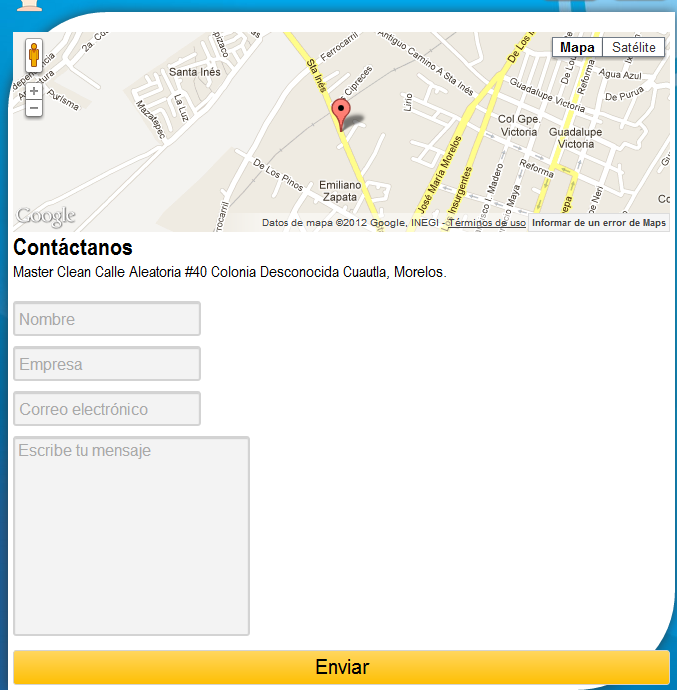
然后,我想根据 div 的边界半径而不是 div 来“切割”元素。我希望我已经解释了!谢谢!