6

我正在尝试创建一个自动适应高度的应用程序页面。跟随页面中使用的 HTML 代码

<div id="main" role="main">
<header class="header">
    <div class="allPageHeaderImg"></div>
    <div class="logo"><img src="images/logo-viva.png" alt="VIVAGREL Logo" /></div>
</header>
<section class="allContent">
    <div class="button-links-subpg">
        <ul class="buttons">
            <li><a href="#"><img src="images/graceButton.png" alt="cardiac-button" /></a></li>
            <li><a href="#"><img src="images/timiButton.png" alt="cardiac-button" /></a></li>      
        </ul>
    </div>
</section>
<footer id="footer">
    <div id="footerBg">
        <div class="footer-links">
            <ul>
                <li><a href="index.html">Home</a></li>
                <li><a href="index.html">Back</a></li>
            </ul>
        </div>
    </div>
</footer>
</div>

使用的 CSS

html {
  height:100%!important;
  width:100%;
  padding:0;
  margin:0;
}

body {
  margin:0;
  padding:0;
  width:100%;
  height:100%!important;
}

#main {
  height:100%;
  margin:100%;
  margin:0 auto;
  padding:0;
  background:#fff;
}

.header {
  height:145px;
  width:100%;
  background:url(../images/header-repbg-320.png) left top repeat-x;
  display:block;
  display:inline-block;
}

.allContent {
  width:100%;
  border:0 solid green;
  height:100%;
  min-height:100%;
  vertical-align:middle;
  display:block;
  display:inline-block;
}

#footer {
  background:url(../images/footer-repbg-320.png) bottom left repeat-x;
  height:90px;
  width:100%;
  display:block;
  display:inline-block;
}

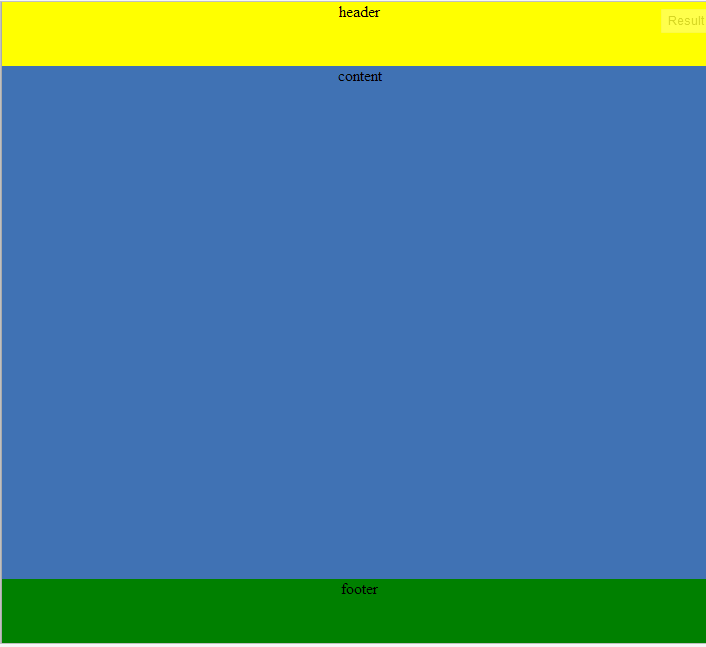
我的问题是,整个页面只占用了页面高度的一半,在页脚下方留下了一个尴尬的空间,

问题:如何使内容自动适应页面的高度?

4

3 回答 3

1

点击 Demo Set Html 和 body 标签, height:100%;你可以给body 标签,也可以给 wrapper div maring:0;padding :0;height:100%;

HTML

<html>
<body>
<div id="Wrapper">  
<div id="header">
    header
</div>     
<div id="content">
    content
</div> 
 <div id="footer">
    footer
</div>  
    </div>
</body>    
</html>

CSS

html{
    height: 100%;

}
body{
 margin: 0;
    padding: 0;

    height: 100%;
}
#Wrapper{
        text-align:center;
        margin: auto;
     height:100%;

    border-left: 1px solid #aaa;
    border-right: 1px solid #aaa;
    background-color:orange;

}
#header{
    height:10%;
   background-color:yellow; 
}
#content{
    height:80%;
   background-color:#4072b4; 
}
#footer{
    height:10%;
   background-color:green; 
}

输出


如果没有为 body 和 html 标记背景图像设置填充将不起作用

不工作的例子工作的例子

你的问题是小提琴

您的背景图片示例

及其输出,它在浏览器调整大小时效果很好

于 2014-05-03T07:23:04.233 回答
0

你几乎拥有它。我简单地修改了前三个选择器的 CSS 如下:

html {
    height: 100%;
}
body {
    margin: 0;
    padding: 0;
    height: 100%;
}

#main {
    margin: auto;
    min-height: 100%;
    background: #ccc;
    width: 960px;
    border-left: 1px solid #aaa;
    border-right: 1px solid #aaa;
}

我只在#main 选择器中添加了背景、宽度和边框以显示它的工作原理。它可以在没有这些属性的情况下工作,但是边距和最小高度是必要的。您还将注意到 !important 值是不必要的,并且作为最佳实践应该主要用于解决继承冲突。

我希望这有帮助。

于 2012-07-25T03:08:05.963 回答
0
#主要的 {

    高度:100%;
    宽度:100%;
    边距:0 自动;
    填充:0;
    背景:#fff;
    位置:相对;

}

.header {

    位置:绝对;
    顶部:0px;
    左:0px;
    右:0px;
    高度:145px;
    宽度:100%;
    背景:url(../images/header-repbg-320.png)左上重复-x;
    显示:块;
    显示:内联块;

}

.allContent {

    位置:绝对;
    顶部:145px;
    左:0px;
    右:0px;
    底部:90px;
    宽度:100%;
    边框:0 纯绿色;
    显示:块;
    显示:内联块;
    溢出:自动;

}

#页脚{

    位置:绝对;
    底部:0px;
    左:0px;
    右:0px;
    背景:url(../images/footer-repbg-320.png) 左下重复-x;
    高度:90 像素;
    宽度:100%;
    显示:块;
    显示:内联块;

}
于 2012-11-19T11:47:24.077 回答