4

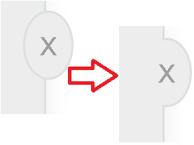
我有两个应该看起来像一个数字的 div。问题出在圆形块的边界上。见图。以下。下面添加了css

需要输入输出

#nameWidgeteMain {
  width: 279px;
  height: 400px;
  top: 0px;
  position: absolute;
  background-color: rgb(237,237,237);
  border: 1px solid #dbe0e3;
  box-shadow: 0 0 20px rgba(0,0,0,0.08)
}
.nameWidgeteCloseArea {
  position: absolute;
  width: 22px;
  height: 31px;
  top: 7px;
  left: 270px;
  background-color: rgb(237,237,237);
  color: white;
  border: 1px solid #dbe0e3;
  border-top-left-radius: 50%;
  border-top-right-radius: 50%;
  border-bottom-right-radius: 50%;
  border-bottom-left-radius: 50%;
  text-align: center;
}

#nameWidgeteCloseTitle {
  padding-top: 5px;
  left: auto;
  font-family: sans-serif;
  font-size: 12pt;
  color: rgb(158, 158, 158);
}
4

3 回答 3

6

也许尝试这样的事情:http: //jsfiddle.net/VNAZA/

使用两个 div:一个只有边框,在矩形下方分层,另一个带有实际内容,在矩形上方分层。这样,您还可以将 css box-shadow 应用于较低的 div。

.container{
        position:relative;
        width: 50px;
        height: 150px;
    }
    
    .rect{
        position:absolute;
        width: 50px;
        height: 150px;
        background: #eee;
        border: 1px solid #000;
        z-index: 5;
        -webkit-box-shadow: 2px 2px 10px 2px #cccccc;
        box-shadow: 2px 2px 10px 2px #cccccc;
    }
    
    .round_content{
        position: absolute;
        top: 50px;
        right: -25px;
        width: 50px;
        line-height: 50px;
        background: #eee;
        z-index: 6;
        text-align:center;
        -webkit-border-radius: 10px;
        -moz-border-radius: 10px;
        border-radius: 10px;
    }
    
    .round_border{
        position: absolute;
        top: 49px;
        right: -26px;
        width: 52px;
        height: 50px;
        line-height: 52px;
        border: 1px solid #000;
        z-index: 4;
        text-align: center;
        -webkit-border-radius: 10px;
        -moz-border-radius: 10px;
        border-radius: 10px;
        -webkit-box-shadow: 2px 2px 10px 2px #cccccc;
        box-shadow: 2px 2px 10px 2px #cccccc;
    }
    <div class="container"> 
      <div class="rect"></div>
      <div class="round_content">x</div>
      <div class="round_border"></div>
    </div>

​</p>

于 2012-06-25T14:03:29.883 回答
1

这在 CSS 中是不可能的。

解决方案 A) 涉及用作背景的图形,解决方案 B) 使用垂直条后面的一层来绘制椭圆,第二层用于条本身,第三个 DIV 用于 X 及其链接。

于 2012-06-25T13:52:53.640 回答
-1

使用z-index 属性

#nameWidgeteMain, #nameWidgeteMain2 {
  width: 279px;
  height: 400px;
  top: 0px;
  position: absolute;
  background-color: rgb(237,237,237);
  box-shadow: 0 0 20px rgba(0,0,0,0.08)
}

#nameWidgeteMain2 {
  z-index: -2;
  border: 1px solid #dbe0e3;
}

.nameWidgeteCloseArea {
  z-index: -1;
  ...
}

这不是合并,但结果是相同的。

于 2012-06-25T13:59:50.957 回答