可能重复:
如何将 <div> 对齐到页面中间
我需要的是在屏幕中间显示网页的内容,无论屏幕大小,大小,分辨率高或低,它总是自动调整到屏幕中间。
我猜你想把盒子垂直和水平居中,不管浏览器窗口的大小。由于盒子的宽度和高度是固定的,因此应该可以:
标记:
<div></div>
CSS:
div {
    height: 200px;
    width: 400px;
    background: black;

    position: fixed;
    top: 50%;
    left: 50%;
    margin-top: -100px;
    margin-left: -200px;
}
即使您调整浏览器的大小,该 div 也应该保持在屏幕的中心。只需将 margin-top 和 margin-left 替换为表格高度和宽度的一半。
编辑:归功于CSS-Tricks,我得到了最初的想法。
您发布的代码的解决方案:
.center{
    position:absolute;
    width:780px;
    height:650px;
    left:50%;
    top:50%;
    margin-left:-390px;
    margin-top:-325px;
}

<table class="center" width="780" border="0" align="center" cellspacing="2" bordercolor="#000000" bgcolor="#FFCC66">
      <tr>
        <td>
        <table width="100%" border="0">
      <tr>
        <td>
        <table width="100%" border="0">
        <tr>
            <td width="150"><img src="images/banners/BAX Company.jpg" width="149" height="130" /></td>
            <td width="150"><img src="images/banners/BAX Location.jpg" width="149" height="130" /></td>
            <td width="300"><img src="images/banners/Closet.jpg" width="300" height="130" /></td>
            <td width="150"><img src="images/banners/BAX Company.jpg" width="149" height="130" /></td>
            <td width="150"><img src="images/banners/BAX Location.jpg" width="149" height="130" /></td>
        </tr>
        </table>
        </td>
      </tr>
</table>
--
这是如何工作的?
示例:http: //jsfiddle.net/953Yj/
<div class="center">
    Lorem ipsum
</div>

.center{
    position:absolute;
    height: X px;
    width: Y px;
    left:50%;
    top:50%;
    margin-top:- X/2 px;
    margin-left:- Y/2 px;
}
要div垂直和水平定位,请将X和Y除以2。
如果你想让内容水平和垂直居中,但事先不知道你的页面会有多高,你必须使用 JavaScript。
HTML:
<body>
    <div id="content">...</div>
</body>
CSS:
#content {
    max-width: 1000px;
    margin: auto;
    left: 1%;
    right: 1%;
    position: absolute;
}
JavaScript(使用 jQuery):
$(function() {
    $(window).on('resize', function resize()  {
        $(window).off('resize', resize);
        setTimeout(function () {
            var content = $('#content');
            var top = (window.innerHeight - content.height()) / 2;
            content.css('top', Math.max(0, top) + 'px');
            $(window).on('resize', resize);
        }, 50);
    }).resize();
});
演示:http: //jsfiddle.net/nBzcb/
HTML
<!DOCTYPE html>
<html>
    <head>
        <title>Center</title>
    </head>
    <body>
        <div id="main_body">
          some text
        </div>
    </body>
</html>
CSS
body
{
width: 100%;
Height: 100%;
}
#main_body
{
background: #ff3333;
width: 200px;
position: absolute;
}
JS ( jQuery )
$(function(){
    var windowHeight = $(window).height();
    var windowWidth = $(window).width();
    var main = $("#main_body");
    $("#main_body").css({ top: ((windowHeight / 2) - (main.height() / 2)) + "px",
                          left:((windowWidth / 2) - (main.width() / 2)) + "px" });
});
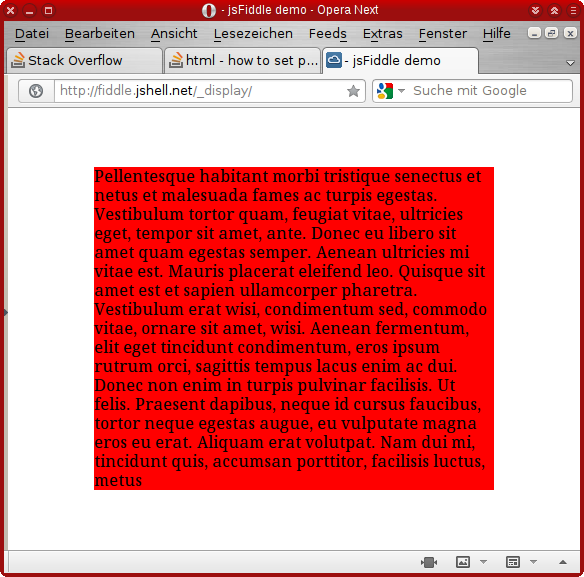
在此处查看示例