我想创建一个形状,我将其描述为“反圆”:
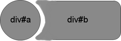
图像在某种程度上不准确,因为黑线应该沿着 div 元素的外边界继续。
这是我目前拥有的演示:http: //jsfiddle.net/n9fTF/
即使CSS没有图像,这也可能吗?
我想创建一个形状,我将其描述为“反圆”:
图像在某种程度上不准确,因为黑线应该沿着 div 元素的外边界继续。
这是我目前拥有的演示:http: //jsfiddle.net/n9fTF/
即使CSS没有图像,这也可能吗?
(对于那些支持它的浏览器——在 FF 和 Chrome 中测试——IE10,Safari 也应该可以工作)。
我最初的答案的一个“问题”是那些没有坚实背景的情况。此更新创建了相同的效果,允许圆之间的透明“间隙”和它的反向切口。
CSS
.inversePair {
    border: 1px solid black;
    display: inline-block;
    position: relative;
    height: 100px;
    text-align: center;
    line-height: 100px;
    vertical-align: middle;
}

#a {
    width: 100px;
    border-radius: 50px;
    background: grey;
    z-index: 1;
}

#b {
    width: 200px;
    /* need to play with margin/padding adjustment
       based on your desired "gap" */
    padding-left: 30px;
    margin-left: -30px;
    /* real borders */
    border-left: none;
    -webkit-border-top-right-radius: 20px;
    -webkit-border-bottom-right-radius: 20px;
    -moz-border-radius-topright: 20px;
    -moz-border-radius-bottomright: 20px;
    border-top-right-radius: 20px;
    border-bottom-right-radius: 20px;
    /* the inverse circle "cut" */
    background-image: -moz-radial-gradient(
        -23px 50%, /* the -23px left position varies by your "gap" */
        circle closest-corner, /* keep radius to half height */
        transparent 0, /* transparent at center */
        transparent 55px, /*transparent at edge of gap */
        black 56px, /* start circle "border" */
        grey 57px /* end circle border and begin color of rest of background */
    );
    background-image: -webkit-radial-gradient(-23px 50%, circle closest-corner, rgba(0, 0, 0, 0) 0, rgba(0, 0, 0, 0) 55px, black 56px, grey 57px);
    background-image: -ms-radial-gradient(-23px 50%, circle closest-corner, rgba(0, 0, 0, 0) 0, rgba(0, 0, 0, 0) 55px, black 56px, grey 57px);
    background-image: -o-radial-gradient(-23px 50%, circle closest-corner, rgba(0, 0, 0, 0) 0, rgba(0, 0, 0, 0) 55px, black 56px, grey 57px);
    background-image: radial-gradient(-23px 50%, circle closest-corner, rgba(0, 0, 0, 0) 0, rgba(0, 0, 0, 0) 55px, black 56px, grey 57px);
}
花费比我预期的更多的努力来使 z-indexing 工作(这似乎忽略了负 z-index),但是,这看起来很干净(在 IE9、FF、Chrome 中测试):
HTML
<div id="a" class="inversePair">A</div>
<div id="b" class="inversePair">B</div>
CSS
.inversePair {
    border: 1px solid black;
    background: grey;
    display: inline-block;
    position: relative;
    height: 100px;
    text-align: center;
    line-height: 100px;
    vertical-align: middle;
}

#a {
    width: 100px;
    border-radius: 50px;
}

#a:before {
    content:' ';
    left: -6px;
    top: -6px;
    position: absolute;
    z-index: -1;
    width: 112px; /* 5px gap */
    height: 112px;
    border-radius: 56px;
    background-color: white;
}

#b {
    width: 200px;
    z-index: -2;
    padding-left: 50px;
    margin-left: -55px;
    overflow: hidden;
    -webkit-border-top-right-radius: 20px;
    -webkit-border-bottom-right-radius: 20px;
    -moz-border-radius-topright: 20px;
    -moz-border-radius-bottomright: 20px;
    border-top-right-radius: 20px;
    border-bottom-right-radius: 20px;
}

#b:before {
    content:' ';
    left: -58px;
    top: -7px;
    position: absolute;
    width: 114px; /* 5px gap, 1px border */
    height: 114px;
    border-radius: 57px;
    background-color: black;
}
此方法使用IE9+ ( canIuse )支持的CSS 框阴影
输出 :
HTML:
<div id="a">
    <div id="b"></div>
</div>
CSS:
#a{
    overflow:hidden;
    border-radius:20px;
    position:relative;
    display:inline-block;
}
#a:before, #a:after{
    content:'';
    width: 100px;
    border-radius: 50%;
}
#a:before {
    height: 100px;
    float:left;
    border: 1px solid black;
    background: grey;
}
#a:after {
    position:absolute;
    left:14px; top:-6px;
    height:114px;
    box-shadow: 1px 0px 0px 0px #000, 110px 0px 0px 68px #808080;
    background:none;
    z-index:-1;
}
#b {
    width: 200px;
    height: 100px;
    background:none;
    margin-left:-15px;
    border: 1px solid black;
    border-left:none;
    float:left;
    border-top-right-radius: 20px;
    border-bottom-right-radius: 20px;
}
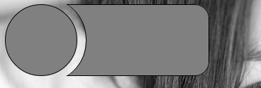
我不能从你的画中看出你想要的点有多圆,但这是一种可能性:http: //jsfiddle.net/n9fTF/6/
如果这些点需要更圆,你需要在末端放一些圆圈,以便它们与大勺融合。
这是一个非常有趣的问题。我最近发布了一篇关于如何在 CSS 中制作反向边框半径的教程(这里),我认为这可以很容易地适应你的情况。
诀窍是使用一个非常简单的概念创建一个生成反向边界的跨度 - 非常厚的边界。并通过隐藏它们来使用内部部分。除了我提供的脚本之外,您还需要在左上角添加另一个边框半径,因为我只使用右上角的。通过绝对定位使跨度与您想要的项目的左侧对齐,并相应地增加跨度的高度/宽度,瞧,您就有了反向边界半径。
引入一个绝对定位的无边界白色圆圈,它位于灰色圆圈后面的偏移处。您需要设置黑圈的 z-index 以确保它位于白圈上方:
#c {
    position: absolute;
    border: 0;
    left: 30px;
    width: 100px;
    height: 100px;
    border-radius: 50px;
    background: white;
}
演示。 </p>